
The CEO Investment Strategy: Part II
Part II of the CEO Investment Strategy project is here, and this time we’re going to be looking at some different sectors’ historical performance. In Part I I focused on the tech sector. For almost all the companies we looked at, they had significantly outperformed our S&P 500 Index in terms of growth. Now we’re going to look at the financial and food sectors, where perhaps less “growth-driven” stocks may not have had such explosive returns over their timeline. Let’s jump back into it.
The Financial Sector

Here we have a collection of big banks, plus Visa (financial services). Unfortunately we do not have as much historical information for these stocks compared to tech, especially for Visa and Goldman Sachs. One apparent and predictable trend we do have, however, is the effect of the 2008 financial crisis. Let’s focus on that for a moment.

The 2008-2009 drop in financial sector stocks is significant - as it is for the entire market as well. The Great Recession was rooted in the financial crisis, and that is readily apparent in the drop to the earth’s core by BAC. Yet we also see an impressive rally by the stock market as the S&P 500 Index recovered its value by 2013. At the same time, we also see the effect of a booming economy (and perhaps tax cuts?) helping along the recovery in 2017 and 2018.

This is a brutal chart to look at. Bank of America was hit hard by the financial crisis, the worst Great Recession performance of any of the stocks I looked at. Credit where it is due, however, to Brian Moynihan. Under his leadership BAC recaptured stable ground and has even been surging in recent years. Still plenty of ground to make up though. Ultimately I see BAC’s chart as a fitting proxy for the pattern of the financial sector in the 21st century. Unsustainable growth followed by a near-fatal crash and then back to fast growth (though more slow and cautious than before the recession).
Note: Although I had historical data on BAC going back to the 1980s, I could only find CEO information going back to Hugh McColl so had to cut off this chart at that point.

Goldman Sachs is an excellent example of two lessons learned from this project. First is that a company’s performance and value extends past just the growth of it’s stock price. While the stock hasn’t hit 4x it’s initial price (which makes it a lower bound for growth compared to many of the other stocks we have observed), it would be difficult to argue Goldman itself hasn’t grown tremendous amounts and become an industry giant in those same 19 years. Other measures are necessary to see those near-two decades of sustained success. The other lesson is that time in the market beats all other investment strategies. Just look at how quickly GS stock rebounded from the financial crisis! While not all stocks recovered quite so rapidly, and some have certainly been losing bets as well, I see this chart as an affirmation of the time-tested investing trope:
“Time in the market beats timing the market”.
Another interesting piece about Goldman Sachs in these charts is that it appears to be outperformed by the S&P 500 in the financial sector charts but outperforms the S&P 500 in this one. Again, this is because I indexed the performance of every stock to the available start date of that stock. So indexing the S&P 500 from the 1980s vs 1999 provides two different interpretations. And again, this is why the one-to-one charts provide a better representation to compare historical performance.

Jamie Dimon is one of the most well-known names in finance today. This chart provides some backing for the reason why. He could not have taken over a major financial institution at a worse time, just before the start of the financial crisis. But in the subsequent years he has navigated JP Morgan to new highs and taken place as not just leader of the big bank but of the entire financial sector.
The Food Sector

Let’s look at one more sector - food! Two of the biggest companies under this category are McDonald’s and PepsiCo. Unlucky for Pepsi to be compared to the fast food giant that has become a common household name. McDonald’s is so prevalent, especially in American culture, that Ronald McDonald ranks among one of the most recognized figures today. Few things are as symbolic of modern culture in the USA as the McDonald’s drive-thru. If they ever make a single museum to represent the power of capitalism, the golden arches should be the gateway to the entrance. But PepsiCo is impressive in its own right and no less talented at branding.
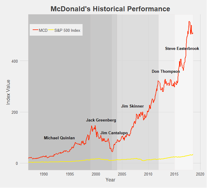
For such a successful company and fast growing stock, McDonald’s sure has gone through a lot of CEOs - five since the turn of the century. The successive chain of leaders attempting to follow Ray Kroc’s path have seen mixed results. The backlash against unhealthy foods in the mid 2000s, exemplified by Morgan Spurlock’s Super Size Me documentary released in 2004, contributed to MCD’s tumble in the early 2000s. However MCD has mostly seen good times and consistent growth, and the rebranding of recent years has really pushed the stock to all-time highs. Such a breakneck growth rate is practically unprecedented for stocks outside the tech sector.

Last but not least we have PepsiCo. It’s tough to place PEP under one label, as the food conglomerate has taken ownership of or become involved in dozens of popular snack foods, beverages, and other household items. What isn’t tough is praising Indra Nooyi’s leadership of the big brand, contributing to her consistently ranking as one of the world’s most powerful women. Her directives to rebrand PEP products and shift focus to more healthy options (though the results may be controversial) have brought the company over a decade of growth. Sadly for PepsiCo Nooyi recently announced her retirement from the CEO position, but she certainly leaves the company in good standing.
Conclusion
Besides all the other disclaimers and cautions I have given throughout these last two posts of the CEO Investment Strategy, one other to keep in mind is survivorship bias. It is easy to look at all the above charts and think that nearly every stock experiences massive growth and incredible success. But keep in mind that what you don’t see are all the companies that ended up failing or have continued to struggle on the market. I did not look at those companies’ historical performances because I wanted to focus on the performance of successful and well-known CEOs for this project. Just the same, the media and popular culture tend to focus on and tell the stories of the most successful and well-known CEOs. Part of this is because they are the leaders of society and often the drivers of change - attributes that tend to draw the attention of others - and part of it is because reporting on a mediocre company with average growth simply doesn’t make for exciting news. Either way, keep in mind that for every company we have looked at there are hundreds of others that haven’t performed nearly as well, at least from a stock-growth perspective. It would make for a good project in the future to take a look at some of these unknown or left-behind companies (Enron? Lehman Brothers?), but for the time being, I think we’ve had enough discussion of historical stock performances.
Final Comments
All historical stock performance data was pulled from yahoo.finance.com. Performance was pulled as monthly data, selecting for closing price. Dates for CEOs were found using simple Google searches, and so may be slightly inaccurate. Start and end dates pulled from official company website where available and found.
Data was then imported in STATA, where I cleaned it and merged in S&P 500 Index data. Values were then indexed to oldest closing date and using a simple growth formula [(closing price at date N)/(closing price at date 1)].
The datasets were then exported and brought into R. All visuals were made in R, using the following packages: readr, ggplot2, dplyr, RColorBrewer, ggthemes, tidyverse, stringr. I styled my charts after one of my favorite websites, FiveThirtyEight, using the ggtheme of the same name.
You may have also noticed that the line colors for each company are that company’s logo colors! Credit to http://www.codeofcolors.com/brand-colors.html for providing the hex color codes for each company. Also credit to http://www.stat.columbia.edu/~tzheng/files/Rcolor.pdf and colorbrewer2.org for providing additional color schemes and R color information.
If you want me to take a look at historical performance of other stocks, or simply have questions or constructive feedback, feel free to email me at troded24@gmail.com, submit an inquiry on this website, or leave a comment on this post! Thanks for reading.

The CEO Investment Strategy: Part I
This has been the most fun I’ve had working on a post so far. Well, maybe that’s not fair to say since this is only my second project post. But still, this was a lot of fun to work on. So what was this project about? Let’s begin with some backstory.
Personal investing today is easier than it has ever been. The popularization of low-cost, no-fee passive investing offerings - such as Vanguard’s mutual funds - made it easy to throw your money into an account and forget about it. More recently, this low-cost low-management trend has entered the active investing market as well. Perhaps most popular among the young adult crowd, certainly among my peer group, has been the Robinhood app. Robinhood let’s anyone trade on the stock market, given you have a bank account to deposit money from and a social security number. It charges no fees, requires no minimum deposit, and has in recent months introduced cryptocurrency trading, option trading, and extended market hours. Robinhood’s business model could be an interesting post by itself, but let’s save that for another time. The point is, most anyone with a couple bucks to spare nowadays can jump into the market and begin trading pretty much immediately.
So with the proliferation of traders so too has the number of trading strategies grown rapidly. Investment strategies act as guides [for] an investor's actions with respect to asset allocation. Strategies vary, but they are based on individual goals, risk tolerance and future needs for capital. To put it another way, investment strategies are a simple set of rules an investor follows based on their personal parameters such as their market sector of interest, timeline, amount of risk they are willing to accept, and tons of other variables. Traditional strategies have varied from simple rules such as “technology sector” or “energy” stocks-focused portfolios, to more complicated principles involving market cap size, asset betas, and other financial measures. More recently we have seen strategies pop up such as “female CEO’s” or “environmentally-friendly companies” - strategies often clearly aimed toward drawing in millenial’s interests. While it’s hard to vouch for the success of these strategies, it’s definitely an appealing idea. Based off your passions or simple likes/dislikes, devise a simple set of rules for where to put your money. Follow these rules and there you have it, your investment strategy! All the stress and worry of financial management reduced to a simple binary choice: does this stock fall into my the bounds set by my rule. Yes? Buy that stock. No? Move on.
Investment strategies, especially the way they have evolved to accommodate the changing capital market and entry of millennial investors more recently, is something I plan to continue researching and hopefully make several posts about. To begin this topic, however, I want to explore the simple idea of breaking stock performance into categories or segments based off some rule. So let’s devise a simple ‘dummy’ investment strategy. What if we invest based on the CEO of a company? Which CEOs would have made us the most money? How have certain stocks performed under successive CEOs? Note that I’m not actually advocating to determine your investing strategy solely by the CEO of a company - that is a way oversimplified method. I’m also not suggesting that any company’s stock performed better or worse strictly because of it’s CEO - again, that would be an oversimplification. At its root, I’d like this post to simply be a straightforward look at historical stock performance partitioned by company leadership.
At this point I think I’ve written way too much without showing any data if I want to keep calling this website “data-driven”. So let’s toss up a chart.
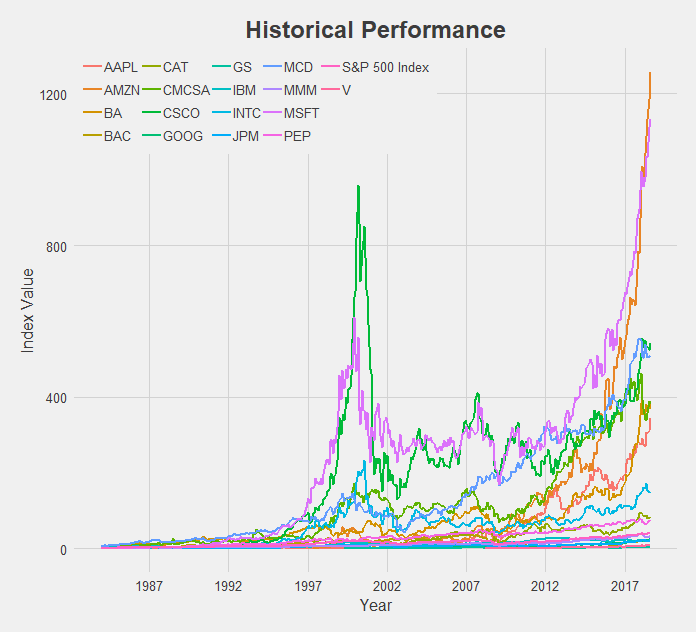
What a mess. But a good starting point! So here we have 17 different stocks, spanning a broad range of the market - financial, technology, industrial, and food sectors. I attempted to choose companies across a variety of industries that were also some of the top performers in those categories. We also have an indicator for the entire market, the S&P 500 Index, which I pulled from the ticker “^GSPC” on Yahoo Finance. This will serve as our baseline for performance as we examine each individual stock. Using the S&P 500 for comparison allows us to reduce the effect of systematic risk on the stocks we observe. That is, events that caused the majority of stocks to fall, are not caused by a single company’s actions alone, and are nearly impossible to avoid. One example of a systematic risk would be the trade war ongoing between the US and China - not caused by any company but influencing the stock price of many. Our interest is on how the individual stocks we will analyze performed relative to the market as a whole. So instead of observing a stock’s performance compared to zero, we will look at how a stock performed relative to the S&P 500 Index. Thus if a systematic even occurs, this shock will apply to the broader market and will be reflected in the S&P 500.
Another important note before jumping into the charts is my methodology. Rather than look at absolute performance of these stocks I chose to index them. This is important! To gather this data I went onto Yahoo Finance and pulled the monthly closing price for each stock. I then indexed the stock performance by dividing each subsequent monthly datapoint by a base datapoint - the first available observation of historical performance. This was done for each individual company. I then indexed our S&P 500 indicator by choosing that company’s first available month as the base point for the S&P 500 as well. So our y-axis is measuring not the actual closing price but the growth rate from the first date of the stock price to today. Thus the y-axis is labeled “Index Value”, and is derived from the closing price of the relevant stock. With that said, let’s begin!
The Tech Sector

At first glance this chart appears to be saying that Cisco (in purple) is much larger than Google (in orange), a fact that is clearly incorrect. Remember, we are looking at indexed values where we are comparing a company’s stock price today relative to its historical price, indexed at 1 from it’s first-ever closing price. So Cisco is much higher on this chart than Google because Cisco first opened at a share price of $0.08 [NOTE: this is the historically adjusted price, accounting for stock splits] and is today at $43.75 (a 56,720% increase) while Google opened at a share price of $50.85 [NOTE: again, historically adjusted price] and is today at $1,235 (a 2,273% increase). In actual value, Google has a market cap of about $840 billion compared to Cisco’s market cap of about $215 billion. Google is nearly 4x larger. So my method of indexing values makes it useful for us to compare time-series data on each company, but not very accurate for comparing across companies. This is fine since the goal of this project was to look at company’s performance over time, not to compare different companies’ performances to each other. I probably shouldn’t even include the charts that compare across companies like this tech sector one, but I think we can still find useful information from them as long as we keep in mind this disclaimer. I’ll make sure to keep bringing it up as we explore the data so that no chart is mistaken in its meaning.
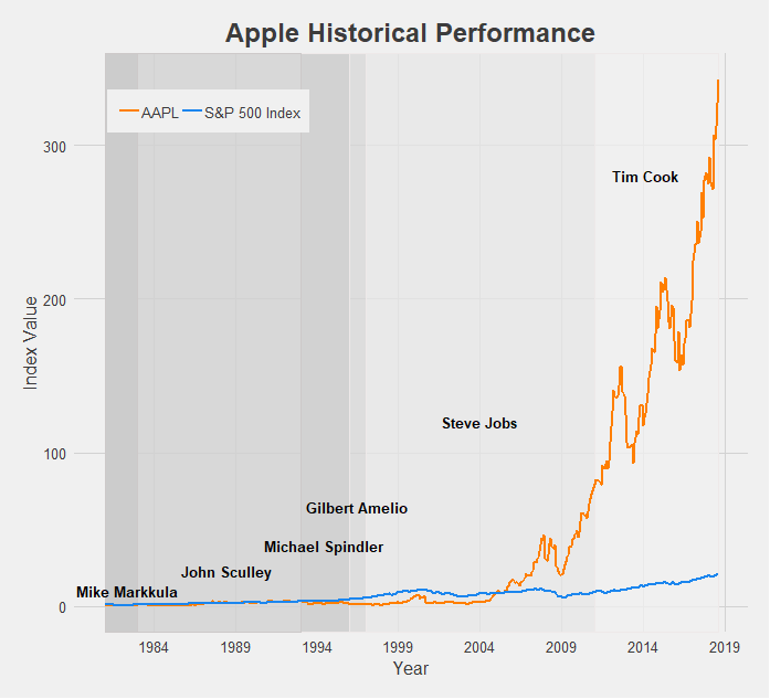
Apple’s growth is tremendous, making the S&P 500 Index look like it has barely grown by comparison. The struggles of the company pre-Steve Jobs era are apparent, as Apple was actually being outperformed by the market until the reveal of the iPhone. After that there was no looking back, and under Tim Cook Apple has become the most valuable company in the world (just recently becoming the first to reach a $1 trillion market cap).

There’s really not much to say here. Amazon is the best possible public company to have invested in for the 21st century. The growth of Amazon’s stock price, especially since 2012, has redefined the phrase “the sky is the limit”. It’s made the growth of the S&P 500 look like a flatline by comparison. With Jeff Bezos at the helm, Amazon has achieved the highest index value of this dataset. In just over a decade and a half it has grown over 1200x it’s original price. Let that sink in. If/when Jeff Bezos steps down, the CEO chosen to fill his shoes may have an impossible task ahead of them.

Comcast is another company that has undergone impressive growth post-recession. For its entire existence it has been managed by the Roberts family, current CEO Brian being the son of founder and original CEO Ralph. Following a long period of turbulence from 2000 to 2010, Comcast found its footing and expanded into the (perhaps not very-liked) corporate machine at the top of the media world today.
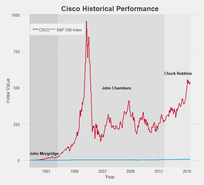
Cisco is another tech company that experienced explosive growth. In fact, it’s 2001 peak, nearly hitting 1000x the stock price since it’s open, is among the highest index value of all the data I collected. The subsequent pop of the dot-com bubble brought it back down to earth, but under CEO Chuck Robbins, Cisco has maintained a very appealing growth rate.

In terms of time being publicly traded, Google (now known as Alphabet, Inc.) is a very young company. As a result its index value is a bit lower compared to some of the other tech companies, but you have to keep in mind the short time frame. 25x growth since 2004 is spectacular, and when accounting for its actual market cap the real size of Google is revealed. Relative to the S&P 500 which grew only about 3x in that same time period also provides a more impressive indicator of Google’s dominance.

IBM has been around for a long time, especially for a tech company. Since 1962 it has gone through 8 different CEOs and in those 56 years experienced mixed growth rates. Hard times recently have been plaguing IBM’s growth as the S&P 500 has widened the gap in performance.

Intel is another company that displays the impact of the early 2000s dot-com bubble. Like Cisco it grew incredibly fast and incredibly large, crashing just as quickly as it rose and has not quite yet reached that 2001 level. Still, under CEO Brian Krzanich’s guidance the company achieved excellent growth. It’s index value practically doubled in less than 5 years! With new CEO Bob Swan just starting earlier this year, it remains to be seen if Intel can sustain that growth rate

Last among the tech stocks is Microsoft. Microsoft’s chart also perhaps provides the clearest indication of a connection between CEO and stock performance. Under founder Bill Gates, Microsoft exploded (although also helped along by the dot-com ubble) and hit the 600x growth mark at the turn of the century. When Steve Ballmer took over this growth floundered, unable to break out of the 300x range. But current CEO Satya Nadella has helped Microsoft rediscover that Gates-era magic and reach new highs. As a result Microsoft is one of the best performing companies by growth, only getting beaten by Amazon.
Next up is the financial sector, but seeing as how long this post has already gotten, we’ll save it for Part II. To be continued…
Final Comments
All historical stock performance data was pulled from yahoo.finance.com. Performance was pulled as monthly data, selecting for closing price. Dates for CEOs were found using simple Google searches, and so may be slightly inaccurate. Start and end dates pulled from official company website where available and found.
Data was then imported in STATA, where I cleaned it and merged in S&P 500 Index data. Values were then indexed to oldest closing date and using a simple growth formula [(closing price at date N)/(closing price at date 1)].
The datasets were then exported and brought into R. All visuals were made in R, using the following packages: readr, ggplot2, dplyr, RColorBrewer, ggthemes, tidyverse, stringr. I styled my charts after one of my favorite websites, FiveThirtyEight, using the ggtheme of the same name.
You may have also noticed that the line colors for each company are that company’s logo colors! Credit to http://www.codeofcolors.com/brand-colors.html for providing the hex color codes for each company. Also credit to http://www.stat.columbia.edu/~tzheng/files/Rcolor.pdf and colorbrewer2.org for providing additional color schemes and R color information.
Additional parts featuring other sectors will be follow soon! If there are any companies you'd like me to take a look at, leave a comment, shoot me an email, or fill out the inquiry form on this website.