
What is the future of the data science job market?
Data science is one of the hottest jobs currently out there. The numbers - and any self-identifying data person has to respect the data - speak for themselves.
Data science is one of the hottest jobs currently out there. And I’m not just saying that because I’m a data scientist myself and have previously written content on the data science job market and how to break into it (shameless plugs). The numbers - and any self-identifying data person has to respect the data - speak for themselves.
Source: BLS Employment Projections, interpolation of 2022-2032 projection
According to the BLS, there is an expected 35% increase in the employment level of data scientists between 2022 and 2032. Compared to an overall projected employment growth of 2.8%, this is significantly higher growth. Even compared to similar data-focused jobs, data scientists frequently come out on the top end of job growth forecasts (more on this later).
In this post, I would like to take a deeper dive into the data science job market and provide a holistic overview of where the opportunities and roadblocks may lay. There is a lot of speculation surrounding the current state of data science - given the mass layoffs in tech recently - and hype for the immense potential for job growth in this relatively new field. New developments in AI and analytical methods, as well as the constantly evolving scope of what exactly the role of a data scientist is, bring further uncertainty. My hope is to cut through these questions and developments that may affect the data science field and shed some light on the forecasts of the job market.
Note: To keep the scope of this already broad article in check, I’m going to focus on the US job market. Apologies to my international data scientist colleagues - I hope to write a future post that will encompass the global job market!
Supply of Data Scientists
As we saw in the first chart, as of 2022 there were an estimated 168,900 data scientists employed in the US. While data scientists have a presence in every industry category in the BLS - reflecting the pervasive nature of data tasks in the modern economy - they are highly concentrated in the Professional Services, Financial, and Information sectors. These three industries together account for 62.6% of data scientists, while the following industries all have less than 1,000 data scientists in total: Real Estate, Utilities, Construction, Arts-entertainment-recreation, and Mining-quarrying-oil-gas-extraction.

Source: BLS Employment Projections
Looking forward, among detailed industry categorizations, the industries expected to have the highest employment growth of data scientists are Computer systems design, Management-scientific-technical-consulting services, and Insurance carriers.

Source: BLS Employment Projections, filtered to Display Level=4
The additional 32,900 data scientists expected to be hired by these top 10 industries account for 55% of the total expected employment increase (+59,400) in the next ten years. These ten industries also account for 53% of total employment for data scientists today. If you’re looking to maximize your chances of employment in the next few years as a data scientist, besides the obvious of applying to tech sector companies, I would recommend looking into the professional sciences and finance industries.
One other way to measure the supply of data scientists is to measure Google Search traffic of data science-related terms. While this is a crude measure that mostly captures interest and volume of data science mentions, it does provide further evidence of the growing interest in the field.

Source: Google Trends
To hammer home how popular data science is becoming, we can look at search traffic for “Data Scientist” relative to other related industries such as software engineering and computer science. Here we see data science fairing well - somewhat overshadowed by even larger explosions in searches for software engineer and data analyst (though there is likely a large amount of cross-traffic between these two terms), but holding its own and in fact being more searched than data engineer and computer scientist.

Source: Google Trends
Zooming in on just the data science trend, we also see that searches for jobs, salary, and masters in data science have all greatly picked up since 2014. There was a substantial drop in 2020-2021, as the COVID pandemic overwhelmed all else, but the overall trend for the past decade is a clear and mostly consistent upward movement. Searches for jobs and masters also show no sign of slowing down, perhaps indicating continued momentum in interest for entering the field by newcomers.
Demand for Data Scientists
Those industry splits we saw earlier of where data scientists are currently employed probably aren’t surprising anyone, as we don’t often think of a computer nerd, data-focused person working at a construction site or art museum. More interestingly, perhaps, is where data scientists will be most in demand looking forward. Here too, however, we see stability - the concentration of data scientists by industry is expected to remain more or less the same through 2023. Looking at the 2032 projected industry breakdown, no industry gains or loses more than 0.7% of its 2022 share of the data science occupation.

Source: BLS Employment Projections
The growth in employment level by industry basically mirrors the current distribution, meaning that there will be the most job openings in the industries currently with the most data scientists already. So while data science employment is expected to continue taking off, that hiring will likely be in industries already heavily hiring data scientists.

Source: BLS Employment Projections
Perhaps more interesting is the employment percent change by industry, showing which industries are forecasted to hire the most data scientists relative to their current employment level of data scientists. While we still see many of the same industries leading the pack, there are some newcomers at the top of the rankings - Transportation and Administrative Services are projected to hire disproportionally more data scientists compared to their current employment share, sitting near the top of the employment percent change list. This may reflect increasing demand for data scientists in these industries, or may just be a reflection of above-average growth in the industries themselves.
However, to put the growth of data science jobs into perspective, we need to compare this growth to other occupations. As I mentioned before, data scientists are at the top end of job growth compared to related jobs. Take, for instance, the growth of all the detailed occupations within the “Mathematical science occupations” group, of which data science is a part:

Source: BLS Employment Projections
Whether we look at employment growth by level or by percent (to account for data science already being a larger field than these related occupations), data scientists come out on top. Okay, but what about other occupations besides mathematical sciences - which is admittedly a very small portion of the overall job market.

Source: BLS Employment Projections
Including the entire universe of detailed occupations, we see that data science still ranks as the 3rd highest occupation for employment growth over the next decade. No matter how you slice it, the job growth for this field is expected to be among the very top, competing with specialized technical workers such as wind turbine service technicians and broad swaths of the labor market like nurse practitioners. Also of note, ranked right below data scientists are Statisticians, a closely related occupation with a very transferable skillset to data science. For those who know how to work with numbers and apply such expertise in the real world, the future of the labor market is looking very, very bright.

Source: BLS Occupational Employment and Wages, May 2022
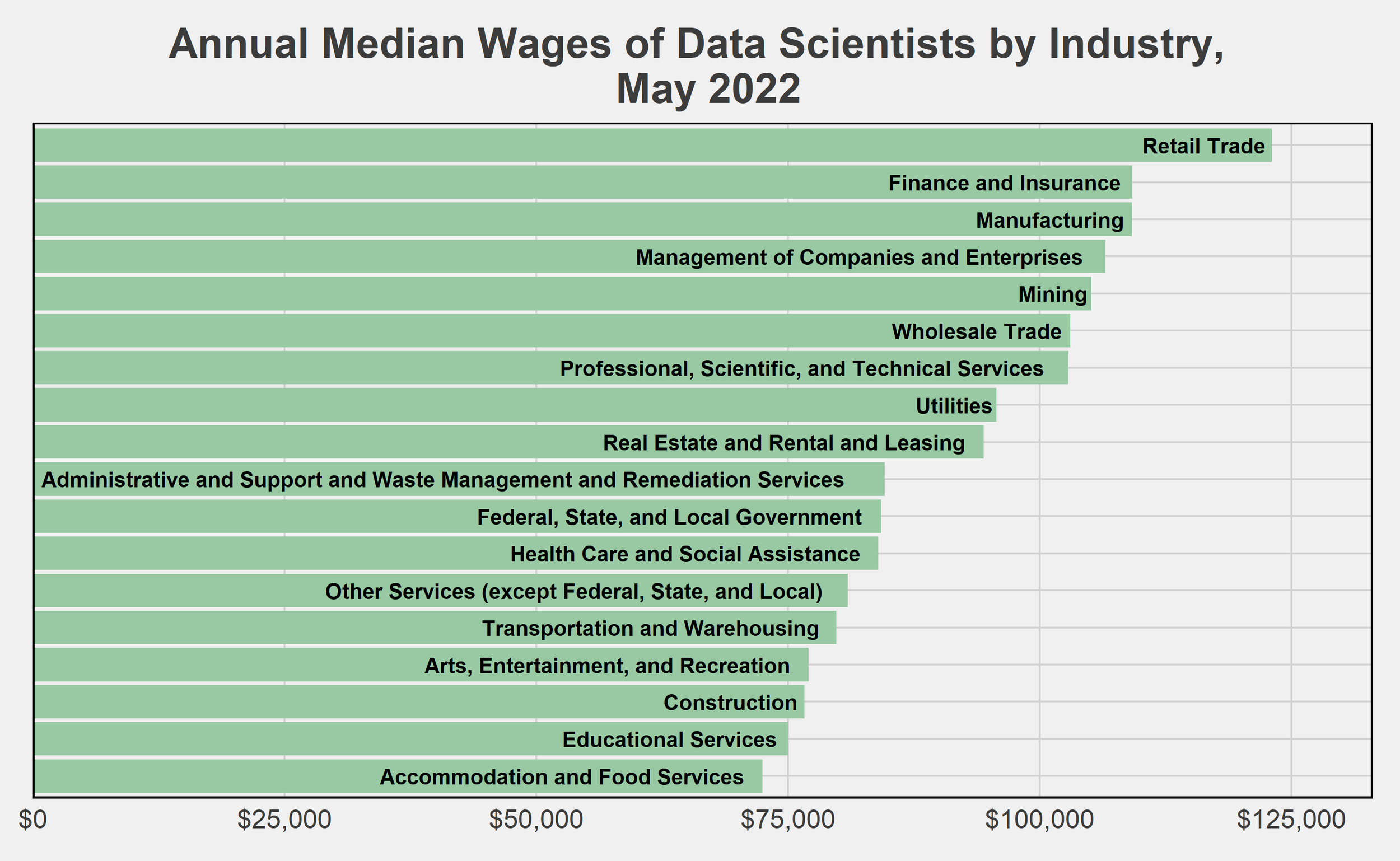
Source: BLS Occupational Employment and Wages, May 2022
To wrap up this post, I lastly want to cover how much one can expect to earn as a data scientist. Here, again, the prospects are very bright. Nationwide, data scientists were earning a $103,500 median annual wage as of May 2022. This ranges as high as a $147,390 mean annual wage in California, and $133,990 in Virginia, which both employ some of the highest numbers of data scientists. Note that this annual wage is simply based on the hourly earnings rate, and thus does not include bonuses or equity offerings that are common in the fields data scientists tend to be hired in (finance, technology, and professional services). Compared to the $61,900 annual mean wage for all workers in May 2022, we can confidently say that data scientists are doing well for themselves.
Final Notes
If this post has you thinking about applying to be a data scientist, check out my educational article on how to break into data science (written for my nonprofit, Menti).
All charts and data visualizations you see in this post were created by me, using the following packages in R: readxl, dplyr, ggplot2, ggthemes, RColorBrewer, reshape, scales, usmap.
If you have questions or constructive feedback, feel free to email me at troded24@gmail.com, submit an inquiry on this website, or leave a comment on this post! Thanks for reading.

Rising House Prices - Winners and Losers
For most of 2022, house prices increased at a faster clip than ever before in U.S. history - and whether you’re happy about that or not likely depends on whether you rent or own a home. Of course, how expensive it is to buy a house is the primary determining factor in the decision to buy or rent itself (and affects rents as well). Higher home prices tend to mean more people renting, changing the pool of who exactly benefits from the increase in prices. For many homeowners, 2022 has provided a massive influx of wealth to what is in all likelihood their most valuable asset. For many renters, it represents a larger chunk being taken out of their monthly budget and increased difficulty in finding housing in urban areas where stock remains limited.

S&P Dow Jones Indices LLC, S&P/Case-Shiller U.S. National Home Price Index [CSUSHPINSA], retrieved from FRED, Federal Reserve Bank of St. Louis; Note: Both lines are indexed so that Jan 2000=100

U.S. Bureau of Labor Statistics, Consumer Price Index for All Urban Consumers: Rent of Shelter in U.S. City Average [CUSR0000SAS2RS], retrieved from FRED, Federal Reserve Bank of St. Louis; Note: Both lines are indexed so that Jan 2000=100
Just as important as the effects on current homeowners is how rising rents and house prices change who is able to transition from being a renter to becoming a homeowner. In this article, I’d like to break down the differences between the groups that compose homeowners and renters and the implications of the historically high cost of owning a home for both groups. Doing so can reveal which groups specifically are benefiting from rising real estate values and which groups may need support as they miss out on the financial gains - and how such support may be provided.
Who is the typical homeowner?
The demographics of the average homeowner have changed greatly in the past several decades as the cost of buying a home (or renting) has vastly outpaced the growth in median income. Simply put, homeownership has increasingly become a privilege to the most well-off and already established economic winners, rather than an attainable goal for anyone with a stable, middle-class job. In 2019, the median income of homeowners (~$72,000) was nearly 80% higher than that of renters (~$40,000). Other long-run trends, like the increase in educational attainment and the increased cost of higher education, also delay the lifetime earnings peak and thus push back the timeline for purchasing a home. More debt, lagging income growth, and delayed peak earnings all at the same time that homes are more expensive than ever - the result is that homeowners today are older and come from positions of greater wealth than in the past.


We also see that homeowners are much more likely to have been men than women over time, though that gender disparity has reduced in recent years. This difference reflects many trends in the U.S. economy and labor market - over the 20th century men were more likely to be employed and particularly in higher income jobs than women, and men had much greater access to financing to purchase a home (not-so-fun fact: women couldn’t open a credit card in their own name without a cosigner until 1974). These disparities reflect similarly along race categories - homeowners were much more likely to be white than black over the 20th century. Unlike the recent balancing out in the gender ratio, however, these racial disparities remain today. African Americans and other minorities have faced many additional barriers to owning homes, such as redlining and segregation, that remain obstacles today. Thus homeownership remains a hurdle itself in reducing the racial wealth gap, even given converging incomes.
There are, of course, a million dimensions you could divide the data on to show how homeownership is concentrated among select privileged groups, and how that imbalance has remained into the 2020s. I would like to highlight just two more: education and age. These are often discussed attributes of homeowners: they are either highly educated (and thus more likely high-earning) or from an older generation. Focusing on education, we see that the proportion of both homeowners and renters with at least a bachelor’s degree has gone up over time, as more Americans in general attain degrees. However, we also see a disparity actually opening up over time - higher education has become more of a marker of homeownership status in recent decades. We also see that the average age of homeowners has gone up over time. Interestingly, so has the average age of renters - partially a reflection of America’s aging population (and people living longer), but perhaps also a result of the increased time people spend as renters while they attempt to save the required amounts to transition to homeownership? With just this data we can’t identify the cause, but the increasing difficulty of affording a home without substantial wealth is hard to ignore.


The main takeaway from these charts is to reinforce with data what is already well-known: owning a home is an increasingly difficult goal to achieve and despite gains in equality in other areas of the economy, the focus of the American Dream remains out of reach for many Americans.
What happens when prices outpace income
By nearly all measures, it is more difficult for the average American to purchase a home today than at any time in the past century. Due to the rapid increase in prices (and rising interest rates causing new mortgage payments for a home to go up even at a fixed price), the situation has become particularly dire in recent years. The National Association of Realtors has, since 2019, compiled a housing affordability index that captures the relative ease with which a family with the median income can qualify for a median-priced home purchase. In the most recent data released for October 2022, that index hit its lowest point. Importantly, the index is now below 100, meaning the median family does not earn enough to afford a home at prevailing prices and fixed mortgage rates. Even more worryingly, research has shown that increased housing costs disproportionately burden low-income and low-education households.

At the same time, as I showed in the chart at the beginning of this post, average rents are rising even faster than home prices. Since renters typically earn less than homeowners, this leads to a devastating poverty trap: rising rents reduce renters’ ability to save, so they can’t afford to purchase a home, so they continue to rent, which eats up a greater share of their income as rents rise faster than earnings. Rising rents eat into other portions of the budget too. When families and individuals are spending upwards of 50% of their income on rent alone, they are unable to purchase better food and healthcare, to go on vacations or take time off from work, or to save for the future. After temporary spikes in the savings rate (mostly thanks to the government transfers during the COVID pandemic), the personal saving rate for Americans fell to a record-low and dismal 2.7% in Q3 of 2022. Americans have never been particularly great at saving compared to other wealthy countries, but this is an especially worrisome level. No savings means no possibility of eventually owning a home, among other things (record low birthrates suddenly starts to make sense…).

An Argument For More Housing
As I’ve said, the causes for these disparities in homeownership are plentiful and have long histories. The good news is that there is a simple solution to increasing homeownership for all groups: build more housing. The economic laws of supply and demand are relevant here. Increasing the supply of homes will reduce their prices over time and allow more people access to owning one. Given a large enough supply, this will also reduce the number of renters, lessening rent prices and benefitting even those not yet looking to purchase a home. Research has shown that building more homes generates loads of positive spillover effects - from reducing local crime and homelessness to actually increasing property values in low-income neighborhoods.
Only when the housing supply is massively increased, particularly in the cities and locations where current supply is in greatest shortfall compared to demand, can we start to reverse the challenges highlighted in this post. And once housing is more affordable, the many other crises facing the nation - homelessness, crime, inequality - can properly be addressed. Trying to solve these issues without tackling their root causes, of which housing is a major piece in each, is policy doomed for failure. Related to directly building more housing is also addressing the rules and regulations that prevent construction of dense housing in the places they’re most needed to relieve pressure on prices - strict land use and zoning laws in city centers and along transit lines in particular.
While house prices have recently reversed some of their steep rise, homes have not become any more affordable due to rising interest rates. Current mortgage rates leave homeownership out of reach for large swaths of young professionals and families. Waiting for both interest rates and prices to drop is not an option - housing supply needs to be increased dramatically and immediately. California has recently heeded this call and the state government has (still much too slowly) been opening the door to finally meet the state’s critical housing shortfall. For the American Dream to become a reality again, other states and the federal government will need to follow suit.
Final Notes
Charts not pulled from FRED in this post were made in R using the tidyverse, readxl, and ggthemes, and RColorBrewer packages. Data was downloaded from IPUMS and cleaned using R.
IPUMS Citation: Sandra L. Hofferth, Sarah M. Flood, Matthew Sobek and Daniel Backman. American Time Use Survey Data Extract Builder: Version 2.8 [dataset]. College Park, MD: University of Maryland and Minneapolis, MN: IPUMS, 2020. https://doi.org/10.18128/D060.V2.8
If you have questions or constructive feedback, feel free to email me at troded24@gmail.com, submit an inquiry on this website, or leave a comment on this post! Thanks for reading.

A K-Shaped Recover in Time? The COVID-19 Pandemic’s Effect on the Time-Spending Habits of the Rich and the Poor
Much has been made of the “shape” of the economic recovery in the wake of the COVID pandemic. Though the pandemic is (still) ongoing, the emerging narrative among economists and the data is that in many ways we experienced a K-shaped recovery through 2020 and 2021. This means that some - in this case higher-educated, higher-earning individuals who are typically able to work from home - had their income and wealth rebound and even quickly surpass pre-pandemic levels, while others - low-wage workers who may have lost their job in the recession or hold no financial investments - were stuck in decline or only partial recovery. The evidence in the employment data for this notion has been clear, while wage growth among low-wage jobs has actually been strengthening in recent months (though many of the recent wage gains have been erased by inflation). Both the stock market and unemployment rate underwent massive fluctuations in the wake of the March 2020 shutdowns. Government stimulus further complicated the inequality picture, providing significant but temporary relief to both the unemployed and middle-class Americans. But employment and the stock market aren’t the only way we can measure well-being or even economic impact. Another important measure is how individuals spend their time.

Source: FRED for employment numbers, Yahoo! Finance for S&P 500 Index
To examine statistically how Americans are spending their time, I want to turn to what I believe is one of the most interesting and unique US government datasets: the American Time Use Survey, or ATUS. The ATUS collects comprehensive information on thousands of individuals every month, ranging from demographic characteristics (age, race, location, etc.) to detailed minute-by-minute “time diaries” of how exactly they spent their previous day. If done correctly, we can summarize the ATUS data to get reasonable estimates of how different groups of people spend their time - such as how the average day varies by income (though there are still some potential issues in the data). To set aside discussion of how time-spending habits evolved over long periods of time, I’m going to restrict the analysis to the 2019 data. So I’ll be comparing the 2020 “COVID era” to the 2019 “pre-COVID era” (ATUS data for 2021 is not yet available).
The Broader Context
First off, let’s note that through the 2020 COVID recession, employment for high-income households remained fairly stable while low-income households spiked in both unemployment and out-of-the-labor force rates. While employment among low-income households remained below pre-COVID levels, the stock market boomed. And the households that tend to own significant amounts of stocks? High-income households.
One more note: income information in the ATUS was only collected for those who were employed at the time of the survey. Therefore when I group results by income levels, I’ll be missing those who were unemployed, which may bias the results. This is especially true for the low-income group since they were more likely to be unemployed through the COVID recession. So keep in mind as I present the comparisons that they are among those who were employed at the time of the survey and thus potentially not representative of the larger universe of Americans (which includes unemployed and those not in the labor force - at least 35% of adults).
Characteristics of the Rich and the Poor
To compare the time use habits of the “rich” and the “poor”, I need to define the actual compositions of these groups (at least for the purposes of this article). I took the weekly earnings variable, which was available for about half of the entire ATUS respondents sample, and multiplied it by 52 to generate a proxy of yearly income. This is an imperfect measurement of income since it assumes respondents earned income every week of the year, and the original earnings variable is missing for many people. Weekly earnings are also top coded at $150,000 to protect the privacy of high-earning respondents. So instead of relying on this income measure exactly, I’m going to place respondents into two bins: “low-income” if their projected yearly income is below $30,000 and “high-income” if it’s above $120,000. These amounts roughly correspond to the 25th and 75th household income percentiles in the U.S. in 2020. This still isn’t a perfect measure of economic status - it’s missing important dimensions of status like wealth and assets, it doesn’t account for the local cost of living, and who is missing income data likely isn’t random - so take that as a caveat for all below results. However, I think it does give us a rough capture of low-income and high-income status people in 2020 to compare against each other.

After weighing the sample to be representative of the entire U.S. population, my measure classifies about 30% of respondents as low-income and about 10% as high-income. Men are disproportionately high-income relative to women: while women make up nearly 63% of the low-income group, they are only 28% of the high-income group. High-income respondents are also on average 8 years older (46 vs. 38 years old), more likely to be Asian, and less likely to be Black than the low-income group. Among those employed at the time of the survey, 45% of low-income respondents were part-time workers, compared to only 3% of high-income respondents. Overall, the data shows these two groups are composed of significantly different types of people - this likely plays a significant role in how the pandemic shifted activities for the people in these groups in disparate ways.


Note: for building and grounds cleaning and maintenance, there were no respondents in the high-income tier that had that occupation, hence the thick single low-income bar.
Since we’re focused on the effect of COVID on time use, it’s important to note how the pandemic affected how work could actually be done. Of those who responded to the question, 58% of high-income workers were working remotely due to COVID-19, while only 14% of low-income workers were working remotely. On the other hand, only 6% of high-income workers were unable to work due to COVID-19 compared to 21% of low-income workers. The higher prevalence of remote work for higher-earning people, and the higher rate of pandemic-induced job loss, is both a reflection of the inequalities worsened by the pandemic as well as a driver in the time use trends that I will look at next. So before even looking into the time use data, we can already see how differently the pandemic affected everyday life for these two groups (and how different they were to start).
Time, time, time - 2019 vs 2020
Okay, now that I’ve provided an armful of caveats and some contextual information, it’s time to dig into the actual time data. I’d like to compare how our income groups were spending their time in 2019 and 2020, before and then during the onset of the pandemic and remote work. ATUS collects information on over 250 activities, so I’m going to focus on several of what I deem to be the more interesting and important for the purposes of this article. The categories I include below represent over 90% of the total time in the day for each group and year. While there is likely interesting variation in many of the other, smaller categories, I’m going to stick to these representative categories. First, I’m going to compare our entire groups of rich and poor in these major activity categories.

Before looking at how time use diverged, we can already see the many ways these groups were different pre-pandemic. High-income respondents spent more of their days, on average, working and on recreation activities, while low-income respondents did more leisure activities. I’d like to again note that these are major activity categories that encompass all manner of actual tasks, so that labels like “leisure” or “traveling” should be interpreted loosely. Also of note is how working, traveling, and shopping time dropped for both groups - replaced by more personal care, leisure, and homecare activities. Only in sports/recreation/exercise do we see diverging trends in time use. So an initial look at the data actually provides potential evidence against divergence!
Next, we can look at how each group’s time-spending habits changed only among those that actually participated in those activities. For some categories - the ones in which basically everyone does at least a little of each day like sleeping or eating - this won’t change anything. But for others that vary on the external margin, this can provide a more comparable subset of people (such as those who are working or who participate in sports) to measure how our groups may diverge.

We now see that among those working through the pandemic, time spent on work dropped much more dramatically for the rich than the poor. While 30 minutes less of work may not seem like much, on the scale of millions of people reducing their working time every day, this can have massive economic effects. This is similarly true for the drops in traveling among the rich and in recreation among the poor - small shifts by an entire population could cause the rise or fall of certain industries. As I highlighted in a previous post, the changing habits of people when it comes to activities like eating out can doom businesses already operating on razor-thin margins. However, making any forecasts is premature even now, with how permanent these trends may be still an open question. As of April 2022, many companies are still grappling with whether to bring workers back to the office and for how many days a week!
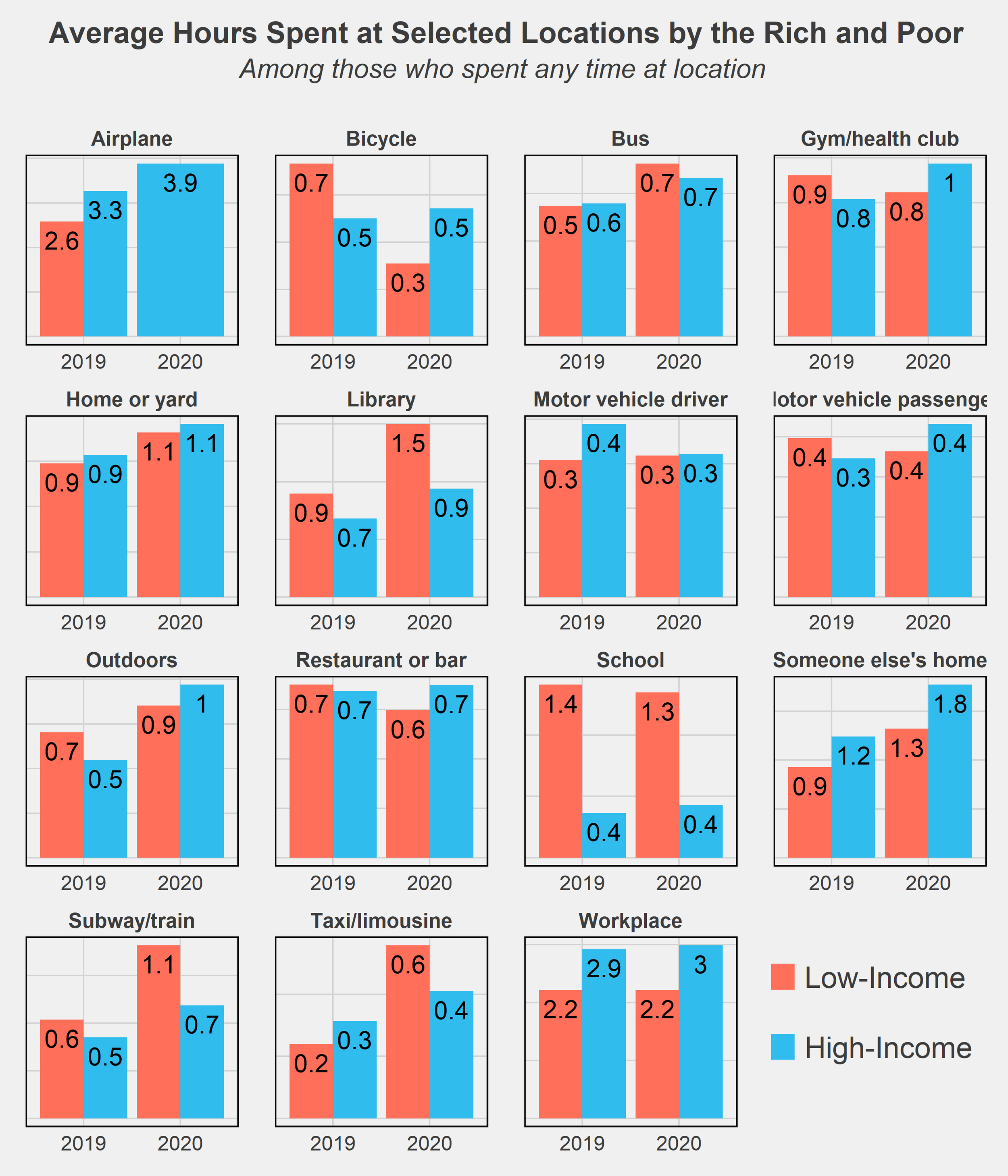
One last chart I wanted to throw in is comparing the time use of rich and poor by the locations of where they spent their time. There aren’t too many surprises here - high-income respondents spend more of their time on airplanes while the low-income spend more on subways and bicycles, generally cheaper modes of transportation. The much higher amount of time spent in libraries and schools by low-income respondents is likely due to many students not working (or only working part-time jobs) while in school and thus falling into that low-income group.
Conclusion
It’s no secret that inequality has worsened in the U.S., a trend beginning at least as far back as the 1970s. The Great Recession was an exacerbator of this trend, as recessions tend to do, and the COVID recession may have further accelerated the growing divide. One key difference, however, is the government's response to these recessions. Most economists will agree that the federal government did a much better job of supporting its citizens following this most recent crisis. The eviction and student loan moratoriums, expanded unemployment benefits, and stimulus checks were among many policies that reduced the severity of the downturn and quickened recovery. This may in part explain the lack of divergence in time use habits as seen in the data above. Yet both the effect of the pandemic and the shape of the recovery remain to be seen. The U.S. continues to struggle with inflation and supply chain issues, and the threat of falling back into recession is non-negligible. Reversing the decades-long increase in inequality will also take much more than temporary relief programs. While the COVID pandemic certainly worsened inequality in many ways, it was not the start nor will it be the end of diverging circumstances and futures for the nation’s rich and poor.
Final Notes
All facts and figures in this post were created from weighted ATUS data. Weights used come from the WT20 variable in the IPUMS data. As their data description notes, “WT20 does not yield annual estimates. It is designed to provide estimates that are representative of the period from January 1 through March 17 and May 10 through December 31. This weight omits the March 18 to May 9 period because 2020 data were not collected on these days due to the COVID-19 pandemic. This weight is required for analyses that include 2020 data.”
ATUS data: https://www.bls.gov/tus/database.htm
IPUMS Citation: Sandra L. Hofferth, Sarah M. Flood, Matthew Sobek and Daniel Backman. American Time Use Survey Data Extract Builder: Version 2.8 [dataset]. College Park, MD: University of Maryland and Minneapolis, MN: IPUMS, 2020. https://doi.org/10.18128/D060.V2.8Â
Charts seen in this post were made in R using the tidyverse, readxl, and ggthemes, directlabels, and RColorBrewer packages. Data was downloaded from IPUMS and cleaned using Stata.
In the future, I’d like to revisit this post with two extensions: delve more into the subcategories of time use and see in more detail how the rich and poor vary their activities at a more granular level, and try out a matching procedure to pair rich and poor on dimensions of education, age, race, etc. The latter method would allow for a (potentially) causal comparison of the two groups’ time usage and may provide more interesting insight into how otherwise-similar people diverge in their daily habits on the basis of income. These were my original plans for this post but I had to stop short as personal matters got in the way - but I hope to return to it when there is more data later on!
If you have questions or constructive feedback, feel free to email me at troded24@gmail.com, submit an inquiry on this website, or leave a comment on this post! Thanks for reading.

21st Century Trends in Immigration
Demographic trends are like the ocean’s undercurrent - from a surface level deceptively still, but actually driving the movement of the entire body of water. Paying close attention to the long-term trends in demographics can therefore be revealing of where a nation may be headed in terms of its politics, culture, and economy. Well-noted by now is the decrease in births occurring in America (and most other developed countries), a decrease so significant that it threatens to actually decrease the total U.S. population for the first time in…ever? Setting aside whether that’s a good or bad thing (most arguments favor bad), I’d like to take a closer look at the myriad components and their trends that contribute to determining America’s changing population.
Change in population is equal to births minus deaths, plus net immigration (immigrants minus emigrants). In America, population growth has historically been driven by immigration (outside of a period of severe immigration restrictions in the early 20th century), and this has particularly been the case as birth rates have fallen over the last several decades. I’ll discuss trends in births and deaths in America in a future post, but in this one, I want to focus on that immigrant component. As a Pew Research article put it, “Immigrants and their descendants are projected to account for 88% of U.S. population growth through 2065, assuming current immigration trends continue”. Where exactly immigrants in the U.S. have originated from and what locations they have resettled in - both of which have drastically changed over the course of American history - is of particular interest to how they will alter U.S. demographics. To analyze these trends I’ll be using data provided by the U.S. Census Bureau’s American Community Survey (ACS) and extracted using IPUMS USA. I’ll be using data from the 2006-2019 samples for consistency of the data and so that I keep the focus on the more recent trends.
Characteristics of Immigrants
Before breaking down where immigrants are moving to in America, let’s take a look at where they’re coming from. For most of its history, the U.S. has been an immigrant magnet, drawing nearly 30 million immigrants from Europe between 1850-1940 alone (Hatton & Ward, 2018). Since the mid-20th century, however, immigrants have increasingly come from outside of Europe - in particular, from Latin/Central America and East Asia. In the chart below, I’ve restricted the sample to include only the top ten birthplaces in 2019 that immigrants were born in - otherwise, there would be way too many lines to tell what was going on. Fortunately, just looking at the top 10 provides us a fairly representative sample, since these ten locations account for 75-80% of total immigration each year since 2006. If I had kept the other birthplaces, most of them would look like flat lines hugging the x-axis relative to the massive inflows from the top 10 birthplaces. You’ll also notice that some of the locations include entire continents - Africa, South America - which unfortunately was the level of aggregation provided in the IPUMS data. Still, it’s incredible to see immigration from single countries such as Mexico, India, or China, eclipsing the total proportion coming from entire continents!

Of course, there are many other ways to group immigrants besides their birthplace or nationality that can provide much more interesting statistics. The above chart doesn’t tell us too much, besides hinting at a recent relative decline in immigrants from Mexico. Other demographics, like age and gender, can provide insight into how immigrants compare to natives - telling us in greater detail how they’re playing into population growth. We can also compare them by their highest educational attainment or their personal incomes. Immigrants in the 21st century tend to be younger than U.S. natives, by an average of about 6 years. Perhaps this is not too surprising - historically immigrants have tended to be young, male, and childless (Hatton & Ward, 2018). Using our more recent sample, however, the gender breakdown of our immigrants is almost identical to natives - 49% male and 51% female. In terms of future population growth, these are promising attributes. Younger correlates with healthier, plus many more working-age years to contribute to the economy. 21st-century immigrants also have a somewhat different distribution of educational attainment and generally lower personal incomes than natives.


This is partly a reflection of how difficult it can be to legally immigrate to the U.S. due to policies that cap the number of visas and other legal forms of entry. The U.S. hands out a very limited number of visas each year, and the policies give priority to higher educated and high-skilled immigrants. This process shapes the overall profile of incoming immigrant cohorts - hence why we see so many immigrants with graduate degrees. Of course, the multitude of premier educational institutions also works as a magnet for drawing in highly educated individuals. Immigration policies alter the distribution of immigrants into certain occupations, though this is also an outcome of many, many other factors. Immigrants really are often the ones to take the undesirable, arduous low-paying jobs - but that’s a discussion for another time. In broader terms, immigrants and natives do have very similar unemployment and labor force participation rates among those age 16 and up - both rates are within 1% of each other in the sample.
While education and income comparisons don’t directly tell us anything about what to expect with population growth and migration decisions, they can be decent predictors. People with higher education and income levels tend to live in dense, urban locations and to have fewer children, often at a later age. We also know that immigrant communities attract new immigrants, for various cultural and economic reasons. So before diving into the data on locations, I can already predict that many immigrants will be residing in cities and likely ones on the coasts (where there are large pre-existing populations of Hispanic and Asian immigrants).
Migrating to Where?
Okay, so I’ve established some basic facts about the background of immigrants to America in the 21st century, but now I’d like to get to the main question of this post. Where are these immigrants settling, and how is that shaping demographic trends in America? The first step is easy: what states do they live in?


As expected, we see that California, New York, and Texas dominate this map. California (the residence of 18% of all immigrants in the sample) and New York (10%) have been immigration magnets for over a century now, and Texas (11%) has certainly been a 21st-century magnet. The next two states with the largest inflow of immigrants are Florida (9%) and New Jersey (4.5%). However, I think a less aggregate view makes for a more interesting comparison.
Breaking the data down by county, we see that immigrants are even more geographically concentrated than the initial state-level view shows. In fact, immigrants are so clustered into a small number of counties that I had to convert the counties map above to a log scale. If I had plotted the raw data, barely any county outside of a few in California, Texas, and New York would be shaded. Outside of California, the Northeast Corridor, and Florida, immigrants are almost entirely clustered into single counties or groups of counties. These counties correspond for the most part to major cities. Over 5% of all immigrants in the sample resided just in Los Angeles County, California; over 4% combined in Queens and Kings counties, New York (portions of New York City); nearly 3% in Harris County, Texas (Houston); over 2% in Cook County, Illinois (Chicago). While these percentages may seem small by themselves, it is astonishing that nearly 15% of millions of immigrants were located in just one of four cities!
In some states, the concentration into small geographic clusters is especially high. 85% of Nevada’s immigrants reside in Clark county - the county of Las Vegas. Cook county, which I mentioned already as Chicago’s location, holds 59% of Illinois’ immigrants, while King County, WA (Seattle) contains 56% of Washington’s immigrant population. While overall state populations are similarly distributed more heavily into cities (hence why they are large cities), the metropolitan bias of immigrants’ residencies has always been a distinguishing feature.


Another way we can break down the data is to compare the share of each county’s total population that is made up of immigrants. Just like with the above “Locations of immigrants” map we are looking at total immigrant populations by county, but now taking into account how that compares to the native population as well. The majority of the counties are gray - these are locations that either have no immigrants or so few immigrants it messes up the heat map scale to include them. For the states that do have significant numbers of immigrants, we see similar results as before: California, the Northeast corridor, and Florida have the highest shares of their population being composed of immigrants.
Since my focus is on trends here, I also compared the percent change in the share of immigrants for each county between 2006 and 2018 - here we see an interesting trend. It seems that while the immigrant population is growing relatively faster than U.S. natives in the Northeast and Midwest, most of the west coast counties have nearly no change in or a decrease in relative share. Part of this may be due to the large already existing immigrant population moderating growth in percentage terms, while counties with small populations can experience large percent increases from small population inflows. Regardless, we continue to see that Florida, Texas, and many individual cities are the primary recipients of new immigrants.
Conclusion
While the changing trends in immigration are a particularly interesting topic to me, it’s certainly not the entire picture. As I mentioned at the start, birth rates have gradually fallen in the US for some time, and these have shaped the socioeconomic landscape as well. In my next post, I’ll replicate the analysis in this post but shift the focus from outside the U.S. to within - by looking at trends in births and deaths. Another important factor is internal migration - how are people moving around across states and within each state? As a native Californian, I’m very familiar with the narrative of Californians moving to Denver, Phoenix, or Texas to escape exorbitant housing prices. The COVID-19 pandemic will surely have long-term effects on people’s decisions to live in cities or suburbs, though the permanency of remote work is yet to be seen.
Any prediction made using only historical data should be taken with a pinch of salt. No one could have predicted how the ongoing pandemic would have unfolded, and such an unexpected event has and will continue to alter the demographic trends. The effect the COVID-19 pandemic will have on immigration, besides the short-term decrease due to border closures, is still in development. Even knowing how immigration will proceed over the next few years is not enough information to characterize long-term demographic trends. Not too long ago, the primary concern was overpopulation. Today, aging societies and stagnating populations appear to be taking center stage.
Notes and Citations
IPUMS Citation: Steven Ruggles, Sarah Flood, Sophia Foster, Ronald Goeken, Jose Pacas, Megan Schouweiler and Matthew Sobek. IPUMS USA: Version 11.0 [dataset]. Minneapolis, MN: IPUMS, 2021. https://doi.org/10.18128/D010.V11.0
Hatton, Timothy and Ward, Zachary, (2018), International Migration in the Atlantic Economy 1850 - 1940, No 02, CEH Discussion Papers, Centre for Economic History, Research School of Economics, Australian National University, https://EconPapers.repec.org/RePEc:auu:hpaper:063.
Charts seen in this post were made in R using the tidyverse, readxl, ggthemes, directlabels, usmap, and RColorBrewer packages. Most of the data collecting, cleaning, and analysis were done in Stata.
If you have questions or constructive feedback, feel free to email me at troded24@gmail.com, submit an inquiry on this website, or leave a comment on this post! Thanks for reading.

Searching for 2020 Election Results Clues Using Voter Registrations
NOTE: For help with forming a voting plan, reading your local ballot, and other voting information, please visit https://votesaveamerica.com/. Do your part and make sure to vote!
The 2020 Presidential Election is less than two weeks away. There’s been a deluge of articles and reporting on the polls as election day nears, and the noise has been almost overwhelming. For anyone trying to stay informed, there’s been an endless number of daily articles to sort through...anyways, this is another article about the election. But rather than discuss the polls and early voting (the latter of which is not very predictive) to predict who may come out ahead in November, I’d like to discuss a different metric. One that may provide us a different insight into forecasting the results: voter registration counts. Looking at trends in voter registration by party affiliation or certain demographic and geographic variables can provide clues into which party has an edge in voter engagement - and thus, potentially, votes. Specifically, I want to look at voter registration patterns in swing states - like Florida and Pennsylvania - since these are the states whose outcomes are currently most unpredictable and whose outcomes will decide the winner. These are the states “on the margin” of the election, so voter registration edges are most important among these specific parts of the electorate. By comparing recent trends as well as comparisons to past elections, we may find hints as to who has the advantage in these battleground states.
Data on voters are, on the whole, surprisingly available. By perusing state government websites, I was able to access public excel sheets with voter registration rolls conveniently broken down by party, demographics, counties, and other interesting characteristics.
Pennsylvania
Let’s start off with the state deemed by FiveThirtyEight to be the tipping point of the election, and my current state of residence: Pennsylvania. An obvious starting point is to compare registrations by political party to see who has the edge. I added another dimension to this chart, including registration counts as of June 2nd - when the primary was held in PA. (Note that October 19 was the last day to register to vote in Pennsylvania, so those numbers are theoretically the final total for the general election). This can inform us if there may be an advantage for one party in recent voter enthusiasm. One very, very important note that I’ll repeatedly emphasize: Republican registrations don’t mean votes for Trump, just as Democrat registrations don’t necessarily mean votes for Biden. There’s a sizable portion of each group that will likely vote for the opposite party’s candidate, and it’s critical to keep in mind that registrations are by no means 1:1 with votes.

That being said, we see a clear advantage for Democrats in terms of raw voter registrations. If we assumed that party registrations are analogous to votes for the party’s candidate, then the key for Biden to win PA is to simply drive up voter turnout. If both parties get all their registrants to vote, Trump’s only hope would be to have nearly all “Other Party” registrants vote for him, an exceedingly unlikely scenario (though not impossible - in 2016, Trump captured a large portion of late-deciders and independents). But perhaps a more interesting comparison would be the most recent registration counts with the 2016 results:

First off, the October 19 data is voter registrations while the 2016 data is actual voters, likely a big reason for the overall lower counts in 2016 - only about 70% of registered voters actually cast a ballot. So again we see a major advantage for Democrats in terms of potential voters. But the key is which party can drive higher turnout (as well as other factors this year such as rejection rates for mail-in vs. in-person ballots, which we won’t be getting in to here).
Another interesting dimension to voter registrations is the breakdown by ages. Comparing within parties the age shares, we see the well-known story of younger votes leaning left and senior citizens leaning right. Younger voters historically have had much lower turnout rates than older voters, to the dismay of liberal candidates like Bernie Sanders that draw huge support from the Gen X and Millenial crowd but lackluster results on election days.

So this could be another area of concern for Biden if he needs to rely on driving up youth turnout. In 2016, Trump’s margins with older voters are what helped carry him to ultimate victory. A larger base is only useful if the base actually shows up to cast votes. Looking at the absolute count (instead of relative as with percents), however, reveals Biden’s strength in 2020.

Though the Democrats certainly lean more on younger voters, in terms of registrations they carry the advantage in every single age bracket except for 55 to 64. Media outlets have noted that Biden’s huge margin over Trump in current polls is largely driven by his margins with older voters, and in PA we see hints of this with registrations. And no state is more associated with senior citizens than…
Florida
The good news with Florida voter data: the state website provides monthly counts by party affiliation! The bad news with Florida voter data: they stopped updating the data at the end of August, so we’re lacking September or October numbers. But when you’re working with public data, you take what you can get.

Comparing registrations over time, we actually see that Republicans began closing the gap in recent months - a trend seemingly confirmed by news outlets. They’re coming from a ways behind, however, as Democrats carried a substantial lead in registrations, likely helped by the competitive primary in the beginning of the year. You can also see total new registrations basically flatline for both Republicans and Democrats in April. Another effect of the pandemic was an inability for in-person voter registration drives, dampening new voter gains until just recently. Whether this will have a significant effect on final registrations compared to previous elections is hard to determine, especially with the increased voting information campaigns held online in the past several months. It seems that expanded voting with mail-in ballots and heightened voter awareness may actually result in record-breaking turnout.
North Carolina
While I was hoping to also cover one of the Upper Midwest states (Wisconsin, Michigan, etc.) that seem particularly crucial for Trump to secure if he wants to be re-elected, I was unable to find data broken down by party affiliation for those states. So instead, let’s take a look at North Carolina - another state that seems close to tied in the polls, and if won by Biden would be a likely sign of his victory on Election Day.
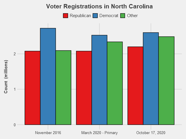
North Carolina has a much higher share of not-affiliated/minor party voters than the previous states we looked at. In fact, there’s more “Other” voters than Republican-registered voters, and almost equal numbers of Other and Democrat. That makes it even harder to determine which candidate has the advantage by registrations. How these voters lean will likely determine the outcome for the state. In other ways, however, NC resembles the trends in other swing states. Democrats overall have the registration edge, having especially gained ground on Republicans thanks to their competitive primary, while recent months have seen Republican registrations closing that gap. The fact that Democrats had such a huge registration lead in 2016, but the state ended up going to Trump, is another reminder that registrations do not mean votes. Certainly in a state with so many Other voters, winning the registration battle is only one component needed for electoral success.
Conclusions
So far, we’re seeing huge margins for Democrats in the early voting. Let the above charts serve as a warning not to make conclusions from those numbers - while Democrats do have leads in many swing states, they are not as advantageous as the early voting data may suggest. It is likely that due to partisan rhetoric, Republicans will at least tighten the current margins on Election Day. And even with voter registration data, we don’t actually know if those registered voters are supporting their party’s candidate, or if they’ll actually even vote. In a world where party affiliation equates to a vote for that candidate, we could say with some confidence that Biden would win. Since we aren’t in that world, the next best thing is to keep an eye on as much data as we can - voter registration counts, early votes results, and especially the polls.
Final Notes
Voter registration data was collected from the following sources:
Charts seen in this post were made in R using the ggplot2, tidyverse, readxl, RColorBrewer, and Cairo packages.
If you have questions or constructive feedback, feel free to email me at troded24@gmail.com, submit an inquiry on this website, or leave a comment on this post! Thanks for reading, and please - make sure to vote this election.

Rainy Days Ahead for Restaurants?
The street I live on in Philadelphia is lined with French restaurants and American bistros. Since these restaurants received the okay to reopen for outdoor dining, this street has been full of diners crowding the hastily set-up tables. All these establishments have basically been turned inside out, their interiors serving solely as facades for the sidewalk now converted into a dining area. Walking down my street, I’ve been wondering about the amount of business these restaurants take in, in the new COVID-19 world. And this ties into another aspect of the current Philly summer life - frequent thunderstorms. Once a minor inconvenience for the city’s restaurants, rain now imposes a harsh limit on their ability to operate. If customers can only eat outside, there’s not going to be much demand on rainy days. But how significant is the weather on consumer traffic to businesses, restaurants and otherwise, and are weather conditions something businesses will have to incorporate into their forecasts while indoor restrictions remain commonplace? While I sadly don’t have access to the daily cash flows of local businesses, there are a number of publicly-available proxies for measuring the day-to-day expenditures at Philly establishments.
First Glance at Business Activity
One excellent source for measuring business activity and consumer habits on a daily basis is Google Mobility Reports. Google has generously provided their collected data from users’ location tracking devices, compiled into daily reports of changes in visits relative to a baseline period to various areas of interest. As Google puts it, “The data shows how visitors to (or time spent in) categorized places change compared to our baseline days. A baseline day represents a normal value for that day of the week. The baseline day is the median value from the 5‑week period Jan 3 – Feb 6, 2020.” So using this measure doesn’t give us an exact picture of the daily level in consumer activity, but it’s close enough for a guy who’s writing a casual post about a random question he had one day. That being said, let’s look at the data for Philly:

We’ve got three categories here: consumer traffic to grocery and pharmaceutical stores, to parks, and to retail and recreation stores. It’s a bit noisy, especially in regards to the parks, which have relatively large high-frequency fluctuations - probably due to the day of the week (week vs. weekend) - and perhaps a first signal of the effect of local weather. This noise is exactly what we want: variation in the time series data that we can exploit to determine if there’s any particular correlation with the weather. For graphing purposes, however, such as viewing the general trends and major differences between the categories, smoothing the data is preferable.

Long-term trends are much more clear here. Parks and retail, which are more optional activities, took bigger hits in April when pandemic regulations were the tightest. Parks have had an especially pronounced rebound since then, which is likely in large part due to improved weather in Philly (this is also likely why traffic was so high in late February, relative to the particularly frigid January-early February period). When the pandemic began winter was still going, and the reopening of public spaces coincided with the warmer spring and summer weather. On the other hand, traffic to grocery & pharmaceutical stores, sellers of much more essential goods, remained relatively stable, though still below pre-pandemic levels. Anyways, we’ll be using the data in it’s raw, noise-filled form for analysis from here on out.
Another useful and graciously shared dataset is OpenTable’s data on seated diners at restaurants. This data is also relative, this time showing the percent change relative to the same day a year ago (year-over-year change).
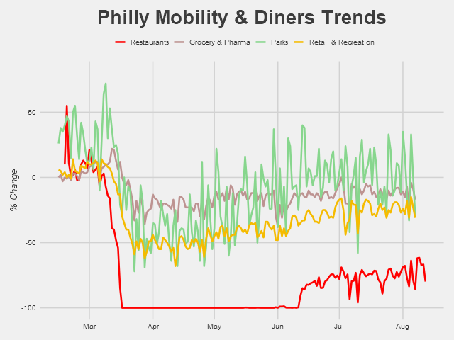
The damaging impact of the pandemic on restaurants is apparent. Even with the reopenings and relatively low COVID-19 case counts in Philly, visits to restaurants remain way below baseline level. We’re also seeing a fair amount of variation since the mid-June reopenings, with several pronounced dips occurring semi-regularly. One of those dips is due to the July 4th holiday - but could the other ones be responses to rainy days?
Identifying Rainy Days
Now that we’ve got our trends, the next step is actually examining the weather. Using the National Weather Service’s data, we can identify exactly which days in Philadelphia it rained.

Days shaded in blue are days when rain was recorded in Philadelphia; that’s a lot of rainy days. I’m also excluding here the days that have a “trace” amount of rain - .01 inches or less. Lining up the dips with those rainy days, it looks like some dips line up with the rain, some don’t. But overall it’s hard to tell, and besides that, some simple chart comparisons aren’t enough to make anything besides educated guesses. For real insight, we’re going to need to do some actual economic analysis.
A Drop of Analysis
There are, of course, a number of methods available to determine if rain had a significant effect on the traffic to restaurants (we’ll be focusing on just restaurants from here on out). One simple and direct method is to run a linear regression of diner traffic on a dummy variable for rainy days. Doing this for our data beginning mid-June (when reopenings began) provides the following results:
Coefficients: Estimate Std. Error t value Pr(>|t|) (Intercept) -74.4886 0.9363 -79.56 < 2e-16 ***raindays$rain_flag -6.4358 1.7826 -3.61 0.000654 ***The above coefficients table tells us that on sunny days, diner traffic averaged -74.5% relative to the same day a year ago, and on rainy days traffic dropped to about -81%. So rain was responsible for a 6.4% drop in business to restaurants and (as indicated by the low p-value) this difference was certainly significant.
Compare these results to the same regression run on the data for February to mid-March, before the pandemic came to Philly:
Coefficients: Estimate Std. Error t value Pr(>|t|)(Intercept) 0.8421 4.7802 0.176 0.862raindays$rain_flag -2.1278 9.2127 -0.231 0.819Before restaurants shifted to outdoor-seating only, the effect of rainy days was only a 2.1% drop in diner traffic - not a large enough difference from the sunny days to be considered significant (for this time period, diner traffic averaged 0.8% higher than the same period a year ago).
One other way we can test for significance in the difference between rainy and sunny days is with a difference of means test. Specifically of use, in our case, a Wilcoxon test that does not assume anything about the underlying distribution of our sample. Difference-of-means tests, as the name implies, determines whether the averages of two groups are significantly different from each other. Running two of these - a two-sample t-test and a Wilcoxon test - on our post-pandemic data results in:
t-Test
t = 2.4544, df = 15, p-value = 0.02681alternative hypothesis: true difference in means is not equal to 0Wilcoxon Test
W = 171.5, p-value = 0.004328alternative hypothesis: true location shift is not equal to 0Both these tests have p-values below .05, indicating that the difference in average diner traffic between rainy days and sunny days is significant. As before, we can run the test on the data pre-shutdowns to see if this is pattern is novel to the reopening period.
t-Test
t = 4.7013, df = 6, p-value = 0.003322alternative hypothesis: true difference in means is not equal to 0Wilcoxon Test
W = 69.5, p-value = 0.885alternative hypothesis: true location shift is not equal to 0While the t-test actually says there is a significant difference here as well, the Wilcoxon test (with a p-value of 0.885) strongly rejects any difference between the means. Given that our data is very likely not following a normal distribution (as assumed by the t-test), we’ll hold the results of the Wilcoxon test in higher esteem.
Conclusions
The above results together support the notion that the shift in dining policy due to the pandemic has created a new dynamic - one where the possibility of rain is now a notable detriment to restaurants’ success. Moving toward the colder seasons, it’ll be interesting to see how inclement weather may continue to have an outsized impact on restaurants relative to pre-pandemic effects. Sitting under an umbrella in a summer rain with 80-degree weather is one thing, but sitting outside when it’s snowing and/or below 30 degrees is another. If COVID-19 remains through early 2021, we may see eating establishments (outside of the warm southwest) in the US struggle with the additional burden of effective closures or diminished traffic on days where diners aren’t willing to brave the weather for a bite to eat.
One last note is not to take the results of the above tests too seriously. First off, the sample sizes are way too small, and the tests I ran are very surface level. Including more explanatory variables in the regression would likely change the results and are one of many additional steps that could be taken to lend results greater legitimacy. While my results may provide a hint of significance, they are only small dips into the real type of analysis that needs to be done to properly establish causation. However, I also don’t think it’s too much of a stretch to conclude that bad weather might prevent a significant portion of people from going out to eat when their only option is to eat outside - in that bad weather. Time, and local weather conditions, well show if this turns out to be true.
Final Notes
Thank you to Google, OpenTable, and the National Weather Service for making the data used in this post publicly available.
Charts seen in this post were made in R using the ggplot2, tidyverse, readxl, and Cairo packages.
A very useful resource for determining which difference of means tests to run and how to do so in R was https://uc-r.github.io/t_test.
An always-helpful resource for picking complementary colors in charts (used in many of my previous posts as well) was https://coolors.co/. Thank you to the folks at Coolors, as well as my friend Vanessa Wong, for advice on creating charts pleasing to the eye.
If you have questions or constructive feedback, feel free to email me at troded24@gmail.com, submit an inquiry on this website, or leave a comment on this post! Thanks for reading.

A Short Stroll with Historical Presidential Approval Ratings
Much has been made in the news lately about Trump’s approval rating, especially with the recent spike in his approval (largely due to a rally-around-the-flag effect) and the 2020 election fast approaching (is it really May already?). To the politically observant, it may even seem the topic has come up even more than its usual over-saturated frequency. With our obsession over Presidential approval ratings, what can we learn from looking at past Presidents’ ratings? In this post, I’d like to cover a somewhat more lighthearted subject than my last topic and explore the data on historical President job approval ratings.
As Gallup puts it, “Presidential job approval is a simple, yet powerful, measure of the public's view of the U.S. president's job performance at a particular point in time.” Of course, it's only one, very limited dimension of assessing the success or even popularity of a President. While much can be gleaned from tracking the movements in this measure, certainly much more context and data is required before drawing any bold conclusions. That being said, approval ratings offer a useful headline summary of how the public contemporaneously perceives the President. In a way, the current approval rating for a president can have a powerful impact on influencing real decisions by the President, their administration, and the political parties.
Speaking of Gallup - one of the most well-respected and well-known pollsters - they first began reporting on PJAR in 1938: the midst of FDR’s permanently record-setting 4 terms in office. Amazingly, for almost its entire run from pre-WW2 to today, the polling and measurement method has remained largely the same. This is excellent news for any time series analysis - we can better justify comparing observations over long periods of time and attributing trends to potential explanatory factors. Often in long-running surveys, the survey methodology tends to change: from the wording of certain questions to the method of data compilation, even the subtlest shifts in how the data is generated can result in significant complications for time series analysis. By using the available Gallup data, we can trust that the data is (relatively) consistent and therefore usable for historical comparisons.
The President’s Job Approval rating (PJAR) really came into the public spotlight starting with Truman, which is when things got interesting. During the Korean War, Truman’s approval rating rapidly dropped dramatically, which was the first such occurrence in the modern era for a president. It was especially unusual since Americans had a high propensity to support the president regardless of political affiliation at this time. As political polarization has resurfaced and surveys and political polls exploded, data on approval ratings have become more prominent, especially in the news. For this reason, and even more so because the data is not as available nor as reliable pre-1940s, I’ll be focusing on the PJAR from Truman onwards in this post.
Note: I’ll only be using the approval rating in this post - not disapproval or net approval. That leaves out some important information, such as the number of undecided/”don’t know” respondents, but for purposes of brevity I’ll only be looking at this one measure.
First Look at the Data

The first step in any decent analysis is to simply plot the raw data. There’s a lot going on here, but from just the raw data alone we can form a number of initial impressions. We see some huge spikes in the data - around 9/11 for W. Bush and the Gulf War for H.W. Bush - as well as some real low points - Nixon after Watergate and Truman as the Korean War dragged on (see chart below). We can start to distinguish between which Presidents’ had more relatively volatile ratings (again, the Bushes), relatively stable ratings (Eisenhower), and who became more or less liked over time. We also notice that for the most part, approval ratings seem to remain within the 40% to 60% range - only Eisenhower and JFK managed to stay above the 60% mark for most of their presidency. Besides that, it’s hard to really tell what’s going on. It’s still too early to generate any conclusions, and the eye test should only be used for general comparisons. Let’s clean things up a bit.


One quick way to clean our chart without significantly transforming the data is to apply a smoothing function to our time series. “Smoothing” is a simple method for making charts more readable (see: prettier) without greatly manipulating the data from its original form. It retains the general trends in each approval rating while minimizing the ‘noise’ - high-frequency movements in the data. One well-known phenomenon with Presidents now becomes clear after smoothing - the “honeymoon period” that often occurs upon assumption of the White House. For many Presidents, such as Truman, LBJ, Ford, and Carter, their highest ratings occurred at the very start of their terms.
High Highs, Low Lows

An excellent way to visualize the distribution of several categories (categories here being Presidents) of data is the boxplot. The median PJAR for each President is represented by the bold line within each box, while the top and bottom of the boxes themselves represent the first and third quartiles. The lines outside the boxes are derived from a slightly more complicated method, but basically capture the majority of the underlying distribution. First, note that the overall average for the approval rating of our entire presidential sample is 49.5%, with most observations falling into the 40-60% approval range. Truman has had the lowest average approval rating through his time in office, falling below the 40% mark. Both Trump (so far) and Truman are the only Presidents to average under 45% for their approval rating in the Gallup poll. On the sunnier side of things, JFK has enjoyed the highest average approval rating - just over 70%! However, his approval rating was falling over time and an argument could justifiably be made that had he spent more time in office he would’ve finished with an average more in line with the other Presidents in our sample. The next most popular after JFK is Eisenhower, impressively clocking in at about 64% approval over his full eight years as Chief.
As can also be gleaned from our boxplots, both Obama and Trump’s approval ratings remained for the most part within a remarkably narrow band of about 5% (with Obama having a cluster of outlier data points represented by the dots). Contrast this with W. Bush, whose bottom and top quartiles are separated by over 20% - the widest spread among all Presidents! What’s to explain for this recent diminishing of approval rating variance? Theories range from increasing political polarization to the Presidents’ personalities - but there’s no solid answer.
Red vs. Blue
Another relevant dimension to divide the data is by political party affiliation of Presidents. Grouping our Presidents by their party label and averaging their approval ratings by days into office, we can compare the average PJAR of a Republican versus a Democrat over time.

The shaded gray areas represent confidence intervals. An interesting pattern emerges here, where Democrats seem to be more popular at the beginning and end of their terms, while Republicans follow almost a mirror of that pattern and tend to peak sometime in their first term, then steadily drop. We see the honeymoon effect in action again, though much stronger for Democrats initially. Either way, neither party on average seems to repeat the peaks in approval reached during their first 1,000 days in office. Perhaps there’s some hidden political wisdom to FDR’s first 100 days strategy. In the end, this chart should be taken with a very large grain of salt - sample size here is small, as we are averaging over only 6 Democrats and 7 Republicans. Sample size in the second half of the chart is even smaller since not all Presidents held office for the full 2,920 days represented by two terms. Looking at only the PJAR also restricts any conclusions we may wish to make. Certainly other factors, among them economic conditions and wars, played outsized roles in determining the approval rating of a President, regardless of the party affiliation.

Another angle to compare the average performance by political party is to return to the beloved boxplots. This time the results are less visually impressive, although perhaps the very fact that the chart appears boring is itself an interesting result! Democrats just barely squeak out a higher average approval rating, and also seem to have slightly less variance than Republicans. So despite significant differences in the distribution of approval ratings over time between the parties (as seen in the above chart), the end result is numerically similar: about 50% average approval and a tendency to stick in the 40-60% range. Of course, removing the time dimension as we do here is removing a very important, very relevant factor.
Concluding Thoughts
Even though we stuck to just one measure of a President’s popularity - the job approval rating as surveyed by Gallup - we were still able to come away with several initial findings. Most Presidents tend to start at an above-average approval rating, a phenomenon known as the honeymoon period. Individually, all Presidents since Truman have gone through a fair amount of “popularity turbulence” during their time in office, ranging from the high 60 %s to the low 40%’s. Wars and recessions, in particular, can hike or drop approval by double-digits in a matter of weeks. However, in recent times the PJAR has stabilized. Whether this narrowed range in approval is a fad or paradigm shift is yet to be seen, and far beyond the scope of this article, which was only meant to be a casual discussion of the PJAR over time.
Final Comments
Astute readers may have noticed that Obama’s PJAR line is somewhat noisier (visualized in the charts, the line appears thicker than the other Presidents’) - the measurement method was changed for his term which resulted in a different frequency of observations - but overall comparability is the same.
Special thank you to Gerhard Peters at UCSD for making the Gallup Poll data publicly available and easily accessible at https://www.presidency.ucsb.edu/statistics/data/presidential-job-approval.
Charts and maps seen in this post were created in R, using the ggplot2 and RColorBrewer packages.
If you have questions or constructive feedback, feel free to email me at troded24@gmail.com, submit an inquiry on this website, or leave a comment on this post! Thanks for reading.

Charting the Effects of a Pandemic with High-Frequency Data
The singular topic on every person’s mind these dates is the coronavirus epidemic, and rightly so. The virus has shaped or influenced nearly every aspect of our lives, from work to socializing to our very lives themselves. In tandem with this, there has been a flood of attempts to chart the course of the outbreak in the US and the corresponding recession following in its wake. Such forecasting, which is always complex, is made increasingly difficult for a number of reasons. Obviously, the virus itself is not yet entirely understood and our knowledge of its underlying characteristics that determine its spread is still under development. The situation in most affected nations is rapidly changing, with new numbers being watched closely for every day.
Anyone actively following the news has taken notice of two fundamental aspects in the reporting: a desire to understand where we’re headed, and a distinct lack of data to facilitate such understanding. In this post, I will focus on the unfolding recessionary aspect of the pandemic, where the available data is appreciably better (and more in my realm of knowledge). However, here too exist many obstacles preventing accurate forecasting from being done. Again, to those who have followed the news persistently, you may have noticed that forecasts of various economic measures - GDP and unemployment in particular - have a great variance.
Economic data is often “lagged” from it’s release. In other words, data on macro measures for the current month won’t be released, or not very accurately so, until weeks or even months following the time period covered. This is a symptom of trying to measure such large and complex processes such as GDP growth and unemployment, which requires a significant number of sources and compiling effort, not to mention successive cleaning and adjustments for published figures. The upshot here being that forecasting the severity of the crisis we now face is made further difficult by the lack of accurate economic data actually reflecting the current situation. It is much to ask for a prediction of Q2 GDP growth when we don’t even as of yet have a solid estimation of Q1 GDP growth.
However, the proliferation of data and its public availability offers an alternative to waiting around for such lagged data to be released. Data has become increasingly opened to the public by businesses, cities, and independent researchers. A key feature of much of this data is it’s high-frequency structure: much of the data these entities collect and share is available up to the daily level. Through the good will of these data sources, we can track the ripples of COVID-19 through our economy in the most up-to-date way possible - treating our high-frequency data as “coincident” indicators. Doing so allows us to more quickly and accurately understand the unfolding situation and better forecast (to the near-future, at least) where we might be headed. Such knowledge can then help inform rapid policy decisions and short-term expectations.
One caveat to this data, particularly the ones used in this article, is that they are only proxies for our macro statistics of interest. High-frequency data may provide more attention to “noise” and miss larger trends. Or, as is often the case with data released by individual firms, it will only be focused on a certain region or industry that makes up one small part of the broad macroeconomy. Still, when analyzed cautiously and combined with lower frequency data, using such sources can aid in quickly forming needed forecasts or at least provide a hint of what’s to come. So keep in mind that with high-frequency data like this there is a high degree of error and volatility. Using this data can help provide some useful information on current conditions, but to truly grasp the bigger picture accurately will take months or even years - likely not until this entire outbreak is controlled.
Hourly Workers, Daily Data
There has been much discussion in the news surrounding the unemployment numbers - certainly a key measure, but a very lagging index as well. National unemployment statistics come out on a weekly basis at best, and even then the week they represent is several weeks behind the current one. More concise reports come out on a monthly frequency. A different statistic that can provide insight on unemployment at a much higher frequency is provided by Homebase - a scheduling and time tracking software. This data was shared on Greg Mankiw’s blog (which is how I came across it), so thank you to him and to Homebase for sharing this fascinating data. Using Homebase data, we can gain insights into employment for hourly workers - consisting of employment in the restaurant, food & beverage, retail and services industries - and how that has changed on a day-to-day basis.

Note: Data covers March 2, 2020 - March 31, 2020.
The above chart shows the day by day change in hours worked, compared to a base period in January 2020. Right around March 9th the average hours began dipping dramatically, bottoming out at around -60% on March 22nd. The steep drop begins almost immediately after the White House declared a national emergency on March 13th - prompting states and businesses to ramp up social distancing measures. Although the data here is just a sample of one type of worker from businesses covered by Homebase, it reveals just how hard hourly workers - who constitute a significant portion of the service industry - have been hit by business closures. It is almost certain that the full effect of this work reduction has not been realized throughout the economy yet. Likely we will see a further rise in the overall unemployment rate for much longer, as both the economic freeze takes hold and the unemployment data itself catches up to reality. The good news, perhaps, is that the reduction seems to have stabilized at this level since March 22nd.

Note: Data covers March 2, 2020 - March 31, 2020.
Another perspective, again using Homebase data, focuses on the number of hourly employees working compared to a base period covering January 2020. Rather than looking at the change among hours worked by employees, we can compare how many employees are still working at all. A slightly different perspective on the same sample, but we see very similar results. By the end of March we have a 60% decrease in the number of employees working compared to a similar weekday in January, a huge reduction in just two short months. The trend for this series closely tracks the reduction in hours worked by those remaining on the job.
In fact, if we overlay the two series, we see that they’ve followed almost an identical pattern:

So we have a major drop in both hours worked and number of people working among the hourly employees in the Homebase dataset - a drop not yet fully captured in the nation-wide macro figures.
Restaurants and OpenTable Data
Another daily tracker, this time made available by OpenTable, is the number of customers at restaurants. This “diner index” (including online reservations, phone reservations, and walk-ins) is a clear indicator for the hardest hit businesses, and it shows just how bad the reality is for restaurants. Instead of looking at how businesses are affected through the labor market, we’re now looking at the economic trend from the consumer’s perspective.

On March 1st, coronavirus had not yet impacted diners in any meaningful manner. Compared to the same day a year before (year-over-year, or YoY), most restaurants were serving as many, or slightly more, customers. On average, the number of seated diners was about 8% higher across all states than the previous year. Kansas and Missouri establishments were thriving, up 69% and 72% YoY, but I would attribute this to small sample sizes in the OpenTable data for those states rather than hungrier than usual Midwesterners. Still, the point is we see what you would expect for an economy chugging along with no immediate known threats - average to good performance.

Just two weeks later, we see a very different picture. Average restaurant traffic is down nearly 50% across all states, ranging from down 31% in South Carolina to down 67% in Maryland. At this point business closures had begun in some states - particularly the most affected such as California and Washington (-55% and -57%) - and many chose to avoid eating out as the virus was spreading rapidly.

By the end of March, the change in seated diners hit rock bottom - down 100% in nearly every single state. By this point most states had mandatory shutdowns, and the few restaurants remaining open offer only delivery/take-out options - not measured in this data. Although not shown in the maps above, most states were already down 100% by March 23rd, just 3 weeks from a normal day business-wise. It’s fascinating to see just how quickly the situation was evolving, and how even the most financially-prepared businesses can be thrown into chaos and ruin before they even realize what hit them.
Stock Market Blues and Clues
A well-known high-frequency measure of the state of the economy is the stock market. Stock prices are updated every second and using daily closing prices can, at the very least, provide us with knowledge of investor sentiment for the current path of the economy. Further, markets are forward-looking and prices theoretically reflect expectations of the future. In this manner we can look at the market - through the S&P 500 Index - as a leading indicator, hinting at what may be to come. In reality, stock prices and expectations are much more complicated than that and are a reflection of a wide range of factors, some not so directly tied to the economic situation. Federal Reserve injections, information from other countries, and company- and sector-specific idiosyncrasies all play important roles in determining market movement. Still, when a global and structural shock occurs like a pandemic, markets and event timelines tend to be closely correlated.

I decided to focus on three broad indices: the S&P 500, meant to reflect the entire market, AWAY, an ETF consisting of travel and tourism companies, and JETS, an ETF consisting of airlines. We could consider the S&P 500 as a representative for the general economy, and our two ETFs as representatives for some of the most affected industries due to COVID-19. This is clearly reflected in their 2020 YTD performance, as AWAY and JETS have lost about half their value since January 2, 2020 - about 20% worse than the S&P 500 index. These latter indices reflect the worst-case scenario: a result of an industry’s entire revenue stream being abruptly shut off.

How do market indicators compare to our previously looked at data? Actually, pretty similar! In the above chart, I added the Homebase data on change in hourly employees hours worked (the dashed purple line) and the OpenTable diner index data (for the entire US, the dashed blue line) to our market indices chart. The stock market appears to have anticipated the decline in the consumer and labor markets by several weeks, the actual business figures only catching up to their stock prices in mid-March.
Keep on the Lookout
Maintaining an awareness of high-frequency data series such as these can provide an indication of when we hit bottom or when things are looking up. By the time that unemployment and GDP statistics capture a more complete economic picture of this crisis, the worst may have already passed. Or maybe not. Even if emergency declarations become unnecessary or current “economic coma” policies are removed, it may take some time for the economy to start its engine again. Stock market indices appear to have begun picking up in the last week or so, but this doesn’t exactly imply quick economic recovery - restaurants and the job market remain at their lows and social distancing regulations propose to stay in place for the foreseeable future. When the recovery may begin and how tenacious the bounce back will be remains anyone’s guess.
Final Comments
This post was written in the first week of April 2020, and as such the views of this author reflect information available at that time. Data used in this post has already been further updated and elongated at the time of publication.
Homebase dataset is generously made available, and regularly updated, here: https://docs.google.com/spreadsheets/d/e/2PACX-1vTf0Ce37p3B0Qy-5BZPh1p9-WwEekPOxVdpMsumy6JFeCIt9EO6ZxbGNpnNxjdf9Mr9USeIMqjq9YU0/pubhtml#
OpenTable data is available on their website, here: https://www.opentable.com/state-of-industry
Historical data on stock market prices was pulled from finance.yahoo.com.
Charts and maps seen in this post were created in R, using the ggplot2 and ggmaps packages.
If you have questions or constructive feedback, feel free to email me at troded24@gmail.com, submit an inquiry on this website, or leave a comment on this post! Thanks for reading - and stay safe.

Is There A Student Loan Bubble? - Part II
Part I of my exploration of the current state of the student loan market basically established the groundwork. Key takeaways are that the majority of federal student loans are now Direct Loans (which are lent by the federal government itself and carry interest rates in the 5%-7.6% range) and that while debt is spread across several types of schools, public schools contain the most borrowers by far and private schools have the highest average balance. None of these facts really come across as shocking, but they do provide us the context to look at some of the more interesting statistics that will be shown in this post.
As I said last time, the goal of this project is to ask, “What level of worry should we have regarding the state of the student loan market?” Obviously the market is large, and undoubtedly the growth of student loan portfolios has become a heavy burden for many students. But are we in a bubble that’s about to pop, are we in a dangerous situation that still has time to be fixed, or are we just witnessing the natural growth of what will become a central loan market in the United States? The next financial crisis, a paradigm shift, or something else? With Part II of this project I hope to shine some light on the answers to that question.

Note: Totals represent the value at the end of Q4 for each respective year (Sep. 30) except for 2018, in which data is currently available up to end of Q2 (Mar. 30). 2018 numbers can be expected to be somewhat larger by end of Q4 2018.
One key component toward reaching a (hopefully) somewhat accurate prediction is to simply look at growth of total student loan balances. Again using federal data, we see a depiction of a clearly surging market. Since 2007, the total outstanding balance of federal student loans has increased from $516 billion to over $1.4 trillion. This represents a 173% cumulative growth of student loan balances from 2007 to (the data we have so far on) 2018. However, we actually see that loan growth has slowed down relatively in recent years, with yearly growth around half what it was a decade ago. One likely explanation for this is improved economic conditions. Household wealth and income were severely diminished not only during the financial crisis but for several years afterward (and arguably still are) as recovery remained sluggish. The housing bust also served to drastically impact household wealth as home prices plummeted and many Americans experienced foreclosure. While some of these effects are still ongoing, such as housing prices remaining depressed in many regions, economic conditions in 2018 are certainly much improved for the majority of Americans. Unemployment is at a historical floor and household income is the highest it has ever been. Thus we see a slowdown in the student loan market as less financing is required to pay for tuition.
Still, overall economic health is not the only determining factor of loan generation, and especially in the case of student loans there is much more at play. As discussed before, rising costs of tuition and number of college attendees are just two of the most basic aspects. Another way we can look at student loans is also by recipients rather than balances.

As expected we again see substantial growth in the market. Compared to balances, however, the growth in borrowers is not quite as dramatic. Since 2007, the number of borrowers has increased from 28.3 million to 42.6 million, a 51% total increase. Perhaps the growth doesn’t seem as impressive, but the fact that about 42.6 million people currently hold at least some student loans should be an eyebrow-raiser. Similar to the previous chart, we see a slowdown in growth, with growth rates even less than half of the Great Recession rates. We only have 1% growth in 2018, but seeing as how we also only have data on the first half of 2018 we can expect that number to go up by end of the year. Still, the 2% growth rates of recent years is much lower than sensationalist news and fear-mongers may lead one to expect.
Put together, these two charts tell us several things. The growth of the student loan market has, in general, been marked and strong. It has also slowed in recent years. And possibly most interesting is that the average amount each recipient has borrowed has increased, as the growth of loan balances has outpaced the growth of borrowers. This is where I believe the primary concern with student loans should focus. Growth of student loans isn’t necessarily bad and certainly not economically fatal. But such a pronounced rise of average loan portfolios is a concern. While the collective weight of student loans has eased up relatively, individual portfolio sizes continue to grow. A greater loan burden also often results in higher delinquency rates, which no one wants.

Here we have a chart of the total value of loan delinquencies, sorted by length of time delinquent, over time. Unfortunately, data was only available going back to 2013. In that period, we see a generally modest upward trend in every category of delinquency . The amount of student loans going unpaid, whether for a month or a year, has increased. We do see variation in the strength of that increase, with an inverse between length of delinquency and growth rate. We also see a downtick in the amounts for 2018, though again this may just be due to lack of complete data for the year or noise in the data. So clearly higher delinquency rates are bad. But a total increase in student loan balances can be expected to correlate with greater delinquency balances. A bigger pie is going to have bigger slices. While $30 billion sounds like a lot, it is only 2% of the $1.4 trillion outstanding total balance in 2018. The situation is not as dire as it may seem. Still, I see this as the main area of concern as high delinquency rates are the real warning sign for the market - something to be closely monitored. If/when another recession occurs, it would be expected that the ability of students and young adults to complete payments on their loans will become diminished. So while rates are relatively low now, the situation could quickly become worrisome given an economic downturn.
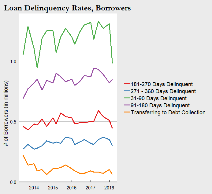
For consistency and further context here is the chart of delinquency rates by borrower counts as well. The trends are in line with the balances chart above and we can draw basically the same information.
Conclusion
That concludes (for now) my first look into the current state of the student loan market. There are plenty more statistics equally relevant and significant to consider, but I think we have seen enough to draw some basic conclusions. Student loans have expanded to a formidable size that place it among the giants of the loan markets. By all measures the already large portfolios for students have blown up in the past decade. Yet at the same time, we see signs of stability. Delinquency rates have not grown proportionally with total balances, and overall growth has slowed down in the past few years. Safe to say the situation is not dire as it currently stands. We must be forward-looking however. As I noted above, the next recession has potential to cascade into a much more severe situation for those with student loans. Especially those who attended private schools and are now carrying $30,000+ balances, or those working jobs that have stagnant wages, or a multitude of other scenarios that exist in the current economy.
Since these loans are now completely government-owned, a financial crisis caused by student loans is unlikely. But a crisis or economic downturn originating elsewhere is directly tied to the student loan situation and can result in a negative feedback loop. How to resolve this is a question with many possible answers. Finding ways to lower tuition costs and cap tuition growth, providing additional financial aid and other support for students, or a variety of other solutions proposed and enacted may be the key. Some combination is likely the answer. Whether they will be implemented and how soon is another important question.
For fun, one more figure I created is the geographic disparity of student loans. As most people could guess, states like California and New York are at the top in student loan debt by total balance and total borrowers. They also have some of the largest populations and top colleges, so no surprise there. I thought it would be much more illuminating to examine how the average student loan balance differs from the national average balance by state.

I’m not entirely sure why Colorado is one of the best and Georgia/Maryland one of the worst - it may have to do with state laws or likely other localized factors. Maybe it will be the subject of a future student loans post! I would also love to hear from any readers from these states or knowledgable about these states if they know why or have any of their own theories.
Final Notes
Other notes on overall data: Total may not be exactly equal to 100% or the sum of their parts due to rounding. Time-series data is by federal fiscal year which ends September 30. Data for 2018 is currently available for up to Q2 which ends March 30, 2018. “Recipient” refers to the receiver of the loan, most often the student but can also be the parent of said student.
Loan Delinquencies: Includes outstanding principal and interest balances of Direct Loan borrowers in the Repayment status as identified in Direct Loan Portfolio by Loan Status Report. While technical default is 271 days delinquent, default is defined as 361 days delinquent for reporting purposes to ensure consistency with Federal Family Education Loans (FFEL) reporting. Loans already transferred to DMCS are not included in this report. Recipient counts are based at the loan level. As a result, recipients may be counted multiple times across varying loan statuses.
For more information on the differences between loan types and details on the terms of each, check out https://studentaid.ed.gov/sa/types/loans and https://studentaid.ed.gov/sa/sites/default/files/federal-loan-programs.pdf.
Data was collected from https://studentaid.ed.gov/sa/about/data-center/student/portfolio, cleaned and transformed in STATA, then visualized using ggplot2 in R.

Is There A Student Loan Bubble? - Part I
A subject that I have found personally engaging, and is undoubtedly rising in importance every year, is the student loan market. More Americans are enrolling in college than ever before, and a college education is increasingly crucial for any chance at social mobility or simply a stable career. The proportion of jobs requiring at least a bachelor’s degree has been growing for decades now. At the same time, the cost of a college education - predominantly tuition, but also other relevant costs such as textbooks and housing - has skyrocketed. Attending an average 4-year university today costs more than twice as much as in 1986 (with CPI adjustment) based on tuition alone. Clearly the cost of college has outpaced inflation, and more importantly it has outpaced the growth of household income. So we have record numbers of Americans attending (see: paying) for college and soaring tuition and living expenses. The result of these intersecting trends is the explosive growth of student loans. The student loan market is one of the biggest loan markets today, larger than any other besides the mortgage market. Families and students unable to pay out-of-pocket for college are forced to take out loans or find another route. And while this is definitely an option - community colleges, scholarships, and trade jobs are all viable and persuasive - many choose loans. The number of individuals with student loans is higher than ever before, and the average amount of student loans per individual is greater than ever before.
Okay, so we’ve established the fact that the student loan market is big. This is a well-known and hot topic, as worries of the student loan burden grow with the market. Why are people so worried about student loans? Not too long ago we had this subprime mortgage crisis which was partially rooted in another loan market getting a little too big for its own good. Without oversimplifying the Great Recession too badly, the pop of the housing bubble resulted in one of the worst financial crises and economic downturn in America’s history. So it’s fair to say that there remains a degree of wariness for people taking out loans they can’t afford. But again, let’s not oversimplify things. Loans aren’t necessarily bad. Used responsibly they can relieve financial burdens, offer opportunities to open business or buy homes, and build credit. In the case of student loans, they offer working-class and low-income families especially the opportunity to provide their children the same higher education as the richest families.
So how do we know if the current state of the student loan market is cause to ring alarm bells, or if it’s too early to overreact?
We need to dive into the details of these loans and break down where they’re going, who they’re going to, and what’s being done with them. If that sounds vague, don’t worry - we are about to get a lot more specific. My goal is to paint a comprehensive picture of today’s student loan market by attributing significance to every relevant factor available. This means looking at loan terms, loan types, loan portfolios, and loan delinquency rates among other measures. Like modern economics, we need to build a model that builds from the ground up if we want to accurately portray the student loan market and possibly predict where it's headed. Of course, this isn’t really something that can be accomplished in just one blog post or even a series of them. But if I can make a start, and perhaps contribute to the ongoing conversation regarding a “student loan bubble”, then I would consider that a success.
One last thing before we jump into the data. As always, I have to provide some explanations and disclaimers concerning the data itself. At least for this post, I will only be looking at federal student loans. I pulled all data for this project from https://studentaid.ed.gov/sa/about/data-center/student/portfolio, which proved an amazingly useful data source but sadly limited to only federal loans. In 2018, total student loan debt in the US is at $1.2 trillion, with about $1 trillion of that being held or guaranteed by the federal government. So while the data I use does not cover all student loans, it does cover a very great majority of it. Private student loans have different terms than federal loans however, so I would like to note that any claims about student loans in this post are meant solely for federal student loans and should not be applied to private student loans. That being said, let’s take a look at what the data tells us.
See final comments section for more information on the data.
To begin, I wanted to examine what types of loans comprise the market, and how that has changed over time.


Federal student loans can be broken down into three broad categories: Federal Family Education (FFE) Loans, Direct Loans, and Perkins Loans. FFE Loans was the main program for student loans in the USA, until 2010 when the government began phasing out the program. There were a variety of loans given out under FFEL, subsequently with a variety of interest rates, all capped at around 8-9%. The structural difference between FFE Loans and Direct Loans are that FFE Loans are made by private lenders and guaranteed by the federal government, while Direct Loans are directly (the name fits) lent to students by the federal government. Propelled by concerns that private lenders did not have students’ best interests in mind when providing loans, the government decided to take over the role banks and financial institutions had filled for decades. Thus since 2010 FFE Loans have been shrinking as Direct Loans take their place as the primary offering of federal student loans. Direct Loans carry interest rates between 5.05%-7.6% depending on the type and, also depending on the type, contain different terms of when payments and interest accumulation begin on the loans. The fact that the vast majority of student loans are now provided strictly by the federal government and not through private lenders is significant. That changes not only the terms of these loans but their nature and purpose. We’ll revisit this later when after looking at some more graphs.
The third category of federal student loans, comprising less than 1% today, are Perkins Loans. The Perkins program offers perhaps the friendliest terms - 5% fixed interest rate, no interest accrued while a student or until 9 months after graduating, and loan forgiveness paths for those who enter public service and take on roles such as teachers or nurses. However these loans also have some more strict requirements regarding limits and student status. In September 2017, Congress failed to renew the Perkins program, and so no Perkins loans have been granted for the new school year. Thus federal student loan offerings today can be narrowed down to the Direct Loans program, although 21.5% of existing student loans are still from the other two "dead" programs.

Another helpful way to break down our student loan data is by school types. I narrowed it down to three types of schools - public, private, and proprietary (a.k.a. for-profit) schools. Clearly public schools are a plurality of the student loan outstanding balance as of the end of March 2018, but this is also because public schools make up nearly half of all student loan recipients. What could make for a more interesting comparison is how the average student loan portfolio diverges by school type.

The average loan balance for a student attending a private school in 2018 is $35,052. Ouch. That’s over ten grand greater than the next highest average balance, at public schools. Not very surprising, since tuition at private schools are much higher than at public schools. It is shocking however to see how substantial student loan balances have become overall. Public universities, once considered the cheaper and more affordable path of higher education, are now turning out students with nearly a quarter of a hundred grand in debt. Taking into account that interest rates on these loans ranges anywhere from 5% up to 8.5%, you arrive at a fairly significant burden for newly-graduated students. Entering a job market that has been mired in stagnant wages and ever-increasing qualification requirements, it isn’t difficult to understand how many young adults may fail to make payments, or at the very least pay down interest, on their student loans. The result is a quick build-up of the loan balance, further punishing already struggling students. Also consider that those numbers are just the average, so there are many students with outstanding balances even greater than in the numbers in the graphic above. It also doesn’t include private loans, which could even contain potentially larger interest rates. Due to the growing student loan burden, failing to land on your feet with a well-paying job straight out of college transforms from a moderate concern to a financial death sentence.
I’m going to pause here. So far I have set the foundation and background on today’s student loan market, categorized the loan types of the last decade, and broken down where these loans are by school type. Next time I will look at the actual growth of loan balances and recipients over time, provide a geographic context to the federal student loan market, and examine loan delinquency rates. Stay tuned, and in the meantime, you might want check your own student loan portfolio to see how you compare.
Final Comments
Note: More information and resources on student loans are available at lendedu.com. For an especially deeper dive into the pros and cons of private student loans see https://lendedu.com/blog/what-to-consider-before-taking-out-a-private-student-loan/.
Other notes on overall data: Total may not be exactly equal to 100% or the sum of their parts due to rounding. Time-series data is by federal fiscal year which ends September 30. Data for 2018 is currently available for up to Q2 which ends March 30, 2018. “Recipient” refers to the receiver of the loan, most often the student but can also be the parent of said student.
Loan School Types Notes: Balance is total outstanding principal and interest balances of federal student loans in Q2 2018. "Other" includes consolidation loans made prior to 2004 that cannot currently be linked to a specific school in the Enterprise Data Warehouse. Includes Direct Loan, Federal Family Education Loan, and Perkins Loan borrowers in an Open loan status. Recipient counts are based at the loan level. If a recipient received loans from more than one school type, they are counted in each applicable school type. There were also two other categories in the data: foreign schools and “other”. Since foreign schools only constituted about 1% of the total loan market I decided to exclude that category. “Other” was a bit more significant, about 6% of the total loan balance, but that category simply consists of loans that cannot be traced to a specific school (due to consolidation or other factors) so I also decided to exclude it.
For more information on the differences between loan types and details on the terms of each, check out https://studentaid.ed.gov/sa/types/loans and https://studentaid.ed.gov/sa/sites/default/files/federal-loan-programs.pdf.
Data was collected from https://studentaid.ed.gov/sa/about/data-center/student/portfolio, cleaned and transformed in STATA, then visualized using ggplot2 in R.

The CEO Investment Strategy: Part II
Part II of the CEO Investment Strategy project is here, and this time we’re going to be looking at some different sectors’ historical performance. In Part I I focused on the tech sector. For almost all the companies we looked at, they had significantly outperformed our S&P 500 Index in terms of growth. Now we’re going to look at the financial and food sectors, where perhaps less “growth-driven” stocks may not have had such explosive returns over their timeline. Let’s jump back into it.
The Financial Sector

Here we have a collection of big banks, plus Visa (financial services). Unfortunately we do not have as much historical information for these stocks compared to tech, especially for Visa and Goldman Sachs. One apparent and predictable trend we do have, however, is the effect of the 2008 financial crisis. Let’s focus on that for a moment.

The 2008-2009 drop in financial sector stocks is significant - as it is for the entire market as well. The Great Recession was rooted in the financial crisis, and that is readily apparent in the drop to the earth’s core by BAC. Yet we also see an impressive rally by the stock market as the S&P 500 Index recovered its value by 2013. At the same time, we also see the effect of a booming economy (and perhaps tax cuts?) helping along the recovery in 2017 and 2018.

This is a brutal chart to look at. Bank of America was hit hard by the financial crisis, the worst Great Recession performance of any of the stocks I looked at. Credit where it is due, however, to Brian Moynihan. Under his leadership BAC recaptured stable ground and has even been surging in recent years. Still plenty of ground to make up though. Ultimately I see BAC’s chart as a fitting proxy for the pattern of the financial sector in the 21st century. Unsustainable growth followed by a near-fatal crash and then back to fast growth (though more slow and cautious than before the recession).
Note: Although I had historical data on BAC going back to the 1980s, I could only find CEO information going back to Hugh McColl so had to cut off this chart at that point.

Goldman Sachs is an excellent example of two lessons learned from this project. First is that a company’s performance and value extends past just the growth of it’s stock price. While the stock hasn’t hit 4x it’s initial price (which makes it a lower bound for growth compared to many of the other stocks we have observed), it would be difficult to argue Goldman itself hasn’t grown tremendous amounts and become an industry giant in those same 19 years. Other measures are necessary to see those near-two decades of sustained success. The other lesson is that time in the market beats all other investment strategies. Just look at how quickly GS stock rebounded from the financial crisis! While not all stocks recovered quite so rapidly, and some have certainly been losing bets as well, I see this chart as an affirmation of the time-tested investing trope:
“Time in the market beats timing the market”.
Another interesting piece about Goldman Sachs in these charts is that it appears to be outperformed by the S&P 500 in the financial sector charts but outperforms the S&P 500 in this one. Again, this is because I indexed the performance of every stock to the available start date of that stock. So indexing the S&P 500 from the 1980s vs 1999 provides two different interpretations. And again, this is why the one-to-one charts provide a better representation to compare historical performance.

Jamie Dimon is one of the most well-known names in finance today. This chart provides some backing for the reason why. He could not have taken over a major financial institution at a worse time, just before the start of the financial crisis. But in the subsequent years he has navigated JP Morgan to new highs and taken place as not just leader of the big bank but of the entire financial sector.
The Food Sector

Let’s look at one more sector - food! Two of the biggest companies under this category are McDonald’s and PepsiCo. Unlucky for Pepsi to be compared to the fast food giant that has become a common household name. McDonald’s is so prevalent, especially in American culture, that Ronald McDonald ranks among one of the most recognized figures today. Few things are as symbolic of modern culture in the USA as the McDonald’s drive-thru. If they ever make a single museum to represent the power of capitalism, the golden arches should be the gateway to the entrance. But PepsiCo is impressive in its own right and no less talented at branding.
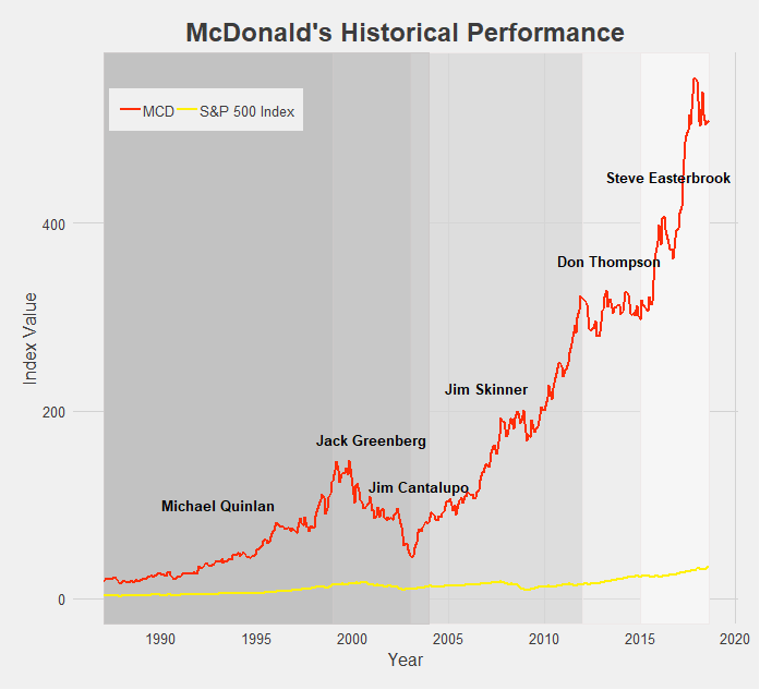
For such a successful company and fast growing stock, McDonald’s sure has gone through a lot of CEOs - five since the turn of the century. The successive chain of leaders attempting to follow Ray Kroc’s path have seen mixed results. The backlash against unhealthy foods in the mid 2000s, exemplified by Morgan Spurlock’s Super Size Me documentary released in 2004, contributed to MCD’s tumble in the early 2000s. However MCD has mostly seen good times and consistent growth, and the rebranding of recent years has really pushed the stock to all-time highs. Such a breakneck growth rate is practically unprecedented for stocks outside the tech sector.

Last but not least we have PepsiCo. It’s tough to place PEP under one label, as the food conglomerate has taken ownership of or become involved in dozens of popular snack foods, beverages, and other household items. What isn’t tough is praising Indra Nooyi’s leadership of the big brand, contributing to her consistently ranking as one of the world’s most powerful women. Her directives to rebrand PEP products and shift focus to more healthy options (though the results may be controversial) have brought the company over a decade of growth. Sadly for PepsiCo Nooyi recently announced her retirement from the CEO position, but she certainly leaves the company in good standing.
Conclusion
Besides all the other disclaimers and cautions I have given throughout these last two posts of the CEO Investment Strategy, one other to keep in mind is survivorship bias. It is easy to look at all the above charts and think that nearly every stock experiences massive growth and incredible success. But keep in mind that what you don’t see are all the companies that ended up failing or have continued to struggle on the market. I did not look at those companies’ historical performances because I wanted to focus on the performance of successful and well-known CEOs for this project. Just the same, the media and popular culture tend to focus on and tell the stories of the most successful and well-known CEOs. Part of this is because they are the leaders of society and often the drivers of change - attributes that tend to draw the attention of others - and part of it is because reporting on a mediocre company with average growth simply doesn’t make for exciting news. Either way, keep in mind that for every company we have looked at there are hundreds of others that haven’t performed nearly as well, at least from a stock-growth perspective. It would make for a good project in the future to take a look at some of these unknown or left-behind companies (Enron? Lehman Brothers?), but for the time being, I think we’ve had enough discussion of historical stock performances.
Final Comments
All historical stock performance data was pulled from yahoo.finance.com. Performance was pulled as monthly data, selecting for closing price. Dates for CEOs were found using simple Google searches, and so may be slightly inaccurate. Start and end dates pulled from official company website where available and found.
Data was then imported in STATA, where I cleaned it and merged in S&P 500 Index data. Values were then indexed to oldest closing date and using a simple growth formula [(closing price at date N)/(closing price at date 1)].
The datasets were then exported and brought into R. All visuals were made in R, using the following packages: readr, ggplot2, dplyr, RColorBrewer, ggthemes, tidyverse, stringr. I styled my charts after one of my favorite websites, FiveThirtyEight, using the ggtheme of the same name.
You may have also noticed that the line colors for each company are that company’s logo colors! Credit to http://www.codeofcolors.com/brand-colors.html for providing the hex color codes for each company. Also credit to http://www.stat.columbia.edu/~tzheng/files/Rcolor.pdf and colorbrewer2.org for providing additional color schemes and R color information.
If you want me to take a look at historical performance of other stocks, or simply have questions or constructive feedback, feel free to email me at troded24@gmail.com, submit an inquiry on this website, or leave a comment on this post! Thanks for reading.

The CEO Investment Strategy: Part I
This has been the most fun I’ve had working on a post so far. Well, maybe that’s not fair to say since this is only my second project post. But still, this was a lot of fun to work on. So what was this project about? Let’s begin with some backstory.
Personal investing today is easier than it has ever been. The popularization of low-cost, no-fee passive investing offerings - such as Vanguard’s mutual funds - made it easy to throw your money into an account and forget about it. More recently, this low-cost low-management trend has entered the active investing market as well. Perhaps most popular among the young adult crowd, certainly among my peer group, has been the Robinhood app. Robinhood let’s anyone trade on the stock market, given you have a bank account to deposit money from and a social security number. It charges no fees, requires no minimum deposit, and has in recent months introduced cryptocurrency trading, option trading, and extended market hours. Robinhood’s business model could be an interesting post by itself, but let’s save that for another time. The point is, most anyone with a couple bucks to spare nowadays can jump into the market and begin trading pretty much immediately.
So with the proliferation of traders so too has the number of trading strategies grown rapidly. Investment strategies act as guides [for] an investor's actions with respect to asset allocation. Strategies vary, but they are based on individual goals, risk tolerance and future needs for capital. To put it another way, investment strategies are a simple set of rules an investor follows based on their personal parameters such as their market sector of interest, timeline, amount of risk they are willing to accept, and tons of other variables. Traditional strategies have varied from simple rules such as “technology sector” or “energy” stocks-focused portfolios, to more complicated principles involving market cap size, asset betas, and other financial measures. More recently we have seen strategies pop up such as “female CEO’s” or “environmentally-friendly companies” - strategies often clearly aimed toward drawing in millenial’s interests. While it’s hard to vouch for the success of these strategies, it’s definitely an appealing idea. Based off your passions or simple likes/dislikes, devise a simple set of rules for where to put your money. Follow these rules and there you have it, your investment strategy! All the stress and worry of financial management reduced to a simple binary choice: does this stock fall into my the bounds set by my rule. Yes? Buy that stock. No? Move on.
Investment strategies, especially the way they have evolved to accommodate the changing capital market and entry of millennial investors more recently, is something I plan to continue researching and hopefully make several posts about. To begin this topic, however, I want to explore the simple idea of breaking stock performance into categories or segments based off some rule. So let’s devise a simple ‘dummy’ investment strategy. What if we invest based on the CEO of a company? Which CEOs would have made us the most money? How have certain stocks performed under successive CEOs? Note that I’m not actually advocating to determine your investing strategy solely by the CEO of a company - that is a way oversimplified method. I’m also not suggesting that any company’s stock performed better or worse strictly because of it’s CEO - again, that would be an oversimplification. At its root, I’d like this post to simply be a straightforward look at historical stock performance partitioned by company leadership.
At this point I think I’ve written way too much without showing any data if I want to keep calling this website “data-driven”. So let’s toss up a chart.
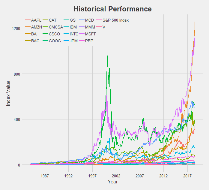
What a mess. But a good starting point! So here we have 17 different stocks, spanning a broad range of the market - financial, technology, industrial, and food sectors. I attempted to choose companies across a variety of industries that were also some of the top performers in those categories. We also have an indicator for the entire market, the S&P 500 Index, which I pulled from the ticker “^GSPC” on Yahoo Finance. This will serve as our baseline for performance as we examine each individual stock. Using the S&P 500 for comparison allows us to reduce the effect of systematic risk on the stocks we observe. That is, events that caused the majority of stocks to fall, are not caused by a single company’s actions alone, and are nearly impossible to avoid. One example of a systematic risk would be the trade war ongoing between the US and China - not caused by any company but influencing the stock price of many. Our interest is on how the individual stocks we will analyze performed relative to the market as a whole. So instead of observing a stock’s performance compared to zero, we will look at how a stock performed relative to the S&P 500 Index. Thus if a systematic even occurs, this shock will apply to the broader market and will be reflected in the S&P 500.
Another important note before jumping into the charts is my methodology. Rather than look at absolute performance of these stocks I chose to index them. This is important! To gather this data I went onto Yahoo Finance and pulled the monthly closing price for each stock. I then indexed the stock performance by dividing each subsequent monthly datapoint by a base datapoint - the first available observation of historical performance. This was done for each individual company. I then indexed our S&P 500 indicator by choosing that company’s first available month as the base point for the S&P 500 as well. So our y-axis is measuring not the actual closing price but the growth rate from the first date of the stock price to today. Thus the y-axis is labeled “Index Value”, and is derived from the closing price of the relevant stock. With that said, let’s begin!
The Tech Sector

At first glance this chart appears to be saying that Cisco (in purple) is much larger than Google (in orange), a fact that is clearly incorrect. Remember, we are looking at indexed values where we are comparing a company’s stock price today relative to its historical price, indexed at 1 from it’s first-ever closing price. So Cisco is much higher on this chart than Google because Cisco first opened at a share price of $0.08 [NOTE: this is the historically adjusted price, accounting for stock splits] and is today at $43.75 (a 56,720% increase) while Google opened at a share price of $50.85 [NOTE: again, historically adjusted price] and is today at $1,235 (a 2,273% increase). In actual value, Google has a market cap of about $840 billion compared to Cisco’s market cap of about $215 billion. Google is nearly 4x larger. So my method of indexing values makes it useful for us to compare time-series data on each company, but not very accurate for comparing across companies. This is fine since the goal of this project was to look at company’s performance over time, not to compare different companies’ performances to each other. I probably shouldn’t even include the charts that compare across companies like this tech sector one, but I think we can still find useful information from them as long as we keep in mind this disclaimer. I’ll make sure to keep bringing it up as we explore the data so that no chart is mistaken in its meaning.
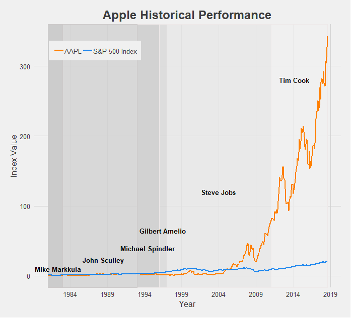
Apple’s growth is tremendous, making the S&P 500 Index look like it has barely grown by comparison. The struggles of the company pre-Steve Jobs era are apparent, as Apple was actually being outperformed by the market until the reveal of the iPhone. After that there was no looking back, and under Tim Cook Apple has become the most valuable company in the world (just recently becoming the first to reach a $1 trillion market cap).

There’s really not much to say here. Amazon is the best possible public company to have invested in for the 21st century. The growth of Amazon’s stock price, especially since 2012, has redefined the phrase “the sky is the limit”. It’s made the growth of the S&P 500 look like a flatline by comparison. With Jeff Bezos at the helm, Amazon has achieved the highest index value of this dataset. In just over a decade and a half it has grown over 1200x it’s original price. Let that sink in. If/when Jeff Bezos steps down, the CEO chosen to fill his shoes may have an impossible task ahead of them.

Comcast is another company that has undergone impressive growth post-recession. For its entire existence it has been managed by the Roberts family, current CEO Brian being the son of founder and original CEO Ralph. Following a long period of turbulence from 2000 to 2010, Comcast found its footing and expanded into the (perhaps not very-liked) corporate machine at the top of the media world today.
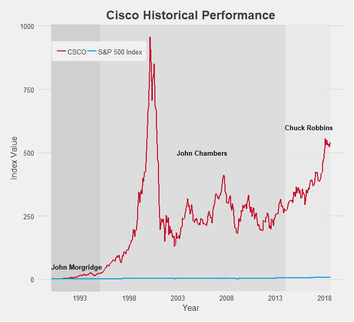
Cisco is another tech company that experienced explosive growth. In fact, it’s 2001 peak, nearly hitting 1000x the stock price since it’s open, is among the highest index value of all the data I collected. The subsequent pop of the dot-com bubble brought it back down to earth, but under CEO Chuck Robbins, Cisco has maintained a very appealing growth rate.

In terms of time being publicly traded, Google (now known as Alphabet, Inc.) is a very young company. As a result its index value is a bit lower compared to some of the other tech companies, but you have to keep in mind the short time frame. 25x growth since 2004 is spectacular, and when accounting for its actual market cap the real size of Google is revealed. Relative to the S&P 500 which grew only about 3x in that same time period also provides a more impressive indicator of Google’s dominance.

IBM has been around for a long time, especially for a tech company. Since 1962 it has gone through 8 different CEOs and in those 56 years experienced mixed growth rates. Hard times recently have been plaguing IBM’s growth as the S&P 500 has widened the gap in performance.

Intel is another company that displays the impact of the early 2000s dot-com bubble. Like Cisco it grew incredibly fast and incredibly large, crashing just as quickly as it rose and has not quite yet reached that 2001 level. Still, under CEO Brian Krzanich’s guidance the company achieved excellent growth. It’s index value practically doubled in less than 5 years! With new CEO Bob Swan just starting earlier this year, it remains to be seen if Intel can sustain that growth rate

Last among the tech stocks is Microsoft. Microsoft’s chart also perhaps provides the clearest indication of a connection between CEO and stock performance. Under founder Bill Gates, Microsoft exploded (although also helped along by the dot-com ubble) and hit the 600x growth mark at the turn of the century. When Steve Ballmer took over this growth floundered, unable to break out of the 300x range. But current CEO Satya Nadella has helped Microsoft rediscover that Gates-era magic and reach new highs. As a result Microsoft is one of the best performing companies by growth, only getting beaten by Amazon.
Next up is the financial sector, but seeing as how long this post has already gotten, we’ll save it for Part II. To be continued…
Final Comments
All historical stock performance data was pulled from yahoo.finance.com. Performance was pulled as monthly data, selecting for closing price. Dates for CEOs were found using simple Google searches, and so may be slightly inaccurate. Start and end dates pulled from official company website where available and found.
Data was then imported in STATA, where I cleaned it and merged in S&P 500 Index data. Values were then indexed to oldest closing date and using a simple growth formula [(closing price at date N)/(closing price at date 1)].
The datasets were then exported and brought into R. All visuals were made in R, using the following packages: readr, ggplot2, dplyr, RColorBrewer, ggthemes, tidyverse, stringr. I styled my charts after one of my favorite websites, FiveThirtyEight, using the ggtheme of the same name.
You may have also noticed that the line colors for each company are that company’s logo colors! Credit to http://www.codeofcolors.com/brand-colors.html for providing the hex color codes for each company. Also credit to http://www.stat.columbia.edu/~tzheng/files/Rcolor.pdf and colorbrewer2.org for providing additional color schemes and R color information.
Additional parts featuring other sectors will be follow soon! If there are any companies you'd like me to take a look at, leave a comment, shoot me an email, or fill out the inquiry form on this website.
Project #1: Walking A Mile In My Shoes
To kick off this website, I wanted to write about something simple and relatable. And what is more relatable than walking? Almost everyone walks, and we’ve spent nearly our entire lives doing it. We walk to work, to school, to the bathroom, in circles. When we’re mad or need to think, we’re told to “take a walk”. One of humanity’s greatest accomplishments has been walking on the moon (one small step for a man, one giant leap...you get it). In fact, perhaps our greatest accomplishment as a species has been evolving to walk on two legs, which allowed us to become the effective and terrifying hunters that now sit at the top of the food chain. Walking is a big deal. As one of America’s founding fathers proclaimed,
“Walking is the best exercise. Habituate yourself to walk very far.”
Thomas Jefferson
Okay, let’s bring this back down to earth. Millions of people carrying around their Apple iPhones in their pockets have been tracking information on a variety of statistics for several years now. Thanks to the Apple Health app, we’ve all been keeping count of how many steps we take every day. As many articles have pointed out, this is not the most accurate source on steps taken or distance traveled. But it is the most available, and this is a blog post, not a research paper, so we’ll make do. Anyways, I was able to pull data going back to October 2014. That’s a time period that goes from my senior year of high school up to the current summer before my senior year of college. Included in this set is my time on the Cross Country and Track & Field teams of my high school, vacations and trips that involved plenty of walking around, lots of hikes, and steps throughout the communities and campuses that have comprised my life so far.
Maybe this post would have been better-timed for October 2018 - but I’m impatient.
Note: According to Google, 1 mile is about equivalent to 2,000 steps. While I cannot attest to the accuracy of this claim, I choose to trust the almighty Internet on this fact.


One neat way to track the progression of my number of steps taken - and how that has changed over time - is to plot the data by month. For each of these visuals I made two versions: one is steps taken and the other is converted to miles traveled. Also note that I decided to exclude 2014 data from these first two charts as they would only include the last 3 months of the year.
Looking at the data, it seems I walked around a lot more in 2015 and 2016 compared to more recent years. This can probably be attributed to my daily long-distance runs as part of Cross Country and Track practices, as well as the more physically active lifestyle I had as a result of being on those teams. This theory makes even more sense when you consider Cross Country season was primarily September-November, and in 2015 those are some of my most traveled months.
April 2016 was my “best” month - and this is an unexpected observation. While I did take a trip to San Francisco that had plenty of exploring around the city for several days, the majority of that month was relatively average. Possible explanations for this anomaly of a month are that the Apple Health app erroneously recorded some high-step days (very likely) or that I’ve lost all memory of the personal record-setting long-distance walks that resulted in me traveling nearly 200 miles that month (less likely).
As for my being less active in 2017 and 2018, I’d like to blame that on the heavy workload brought on by my college classes, extracurriculars, and jobs. It’s difficult to get as much exercise or be as physically active as before when I’m spending most of my day working at the library. That’s my excuse, anyway.


Next up are my favorite visuals of this post - heat maps!! Fun to create, fun to look at. To make these I totaled up how much I walked throughout the last few years by day of the week and then by hour (this is a total, not an average by those times - that’s why the numbers are so high).
It appears my most active time of day is between 12:00 pm and 1:00 pm, which lines up well with lunchtime. I’m willing to travel a great distance for my lunches apparently. Interestingly, Tuesday and Thursday seem to be the most active days, topping out at the 12-1 pm block. This is likely because many of my college classes have taken place around those times on TTH, while the MWF classes have been more scattered throughout the day.
Unsurprisingly, Saturday also has some pretty dark colors throughout the day. This is a result of my favorite weekend activity - hiking!


Another method of visualizing the data is to collapse by day of the week, allowing us to easily compare each day to one another. Like the heat maps, I took totals of steps taken rather than averages, day by day.
These charts bring up an interesting correlation. Apparently, the later it is in the week the more I walked around. Lazy Sunday is definitely a true moniker for me, being the only day of the week I failed to crack the 625 mile benchmark. No Monday blues here though, as I quickly bring that step count up the next day and don’t match that point again until Friday. Also interestingly, Friday is my most active day of the week, even beating out Saturday with all those hikes. If there is any lesson to take from this post, perhaps it’s that I should go on longer weekend hikes.
Final Comments
All data used in this post was taken from the Apple Health app. The visuals were made in R, with much of the code inspired or adapted from Ryan Praski. Ggplot2 and RColorBrewer used to create the graphs and create color schemes. If you have any questions or helpful feedback please leave a comment, submit an inquiry, or send me an email at troded24@gmail.com
More posts (that cover much more interesting topics) to come soon!
- Tal
Hello World!
Welcome to Visualize Curiosity! I started this website as a passion project, hoping to share my love of visualizing data with the world. If you're like me, then you are constantly asking questions about the world we interact with.
Why are certain things - businesses, institutions, people - the way they are?
Well, I can't answer that. But I can use data to attempt to learn as much as possible and perhaps even reach a potential answer. And if anything new comes out of trying, or I can derive any sort of enjoyment out of the process, then that makes it worth it.