Project #1: Walking A Mile In My Shoes
To kick off this website, I wanted to write about something simple and relatable. And what is more relatable than walking? Almost everyone walks, and we’ve spent nearly our entire lives doing it. We walk to work, to school, to the bathroom, in circles. When we’re mad or need to think, we’re told to “take a walk”. One of humanity’s greatest accomplishments has been walking on the moon (one small step for a man, one giant leap...you get it). In fact, perhaps our greatest accomplishment as a species has been evolving to walk on two legs, which allowed us to become the effective and terrifying hunters that now sit at the top of the food chain. Walking is a big deal. As one of America’s founding fathers proclaimed,
“Walking is the best exercise. Habituate yourself to walk very far.”
Thomas Jefferson
Okay, let’s bring this back down to earth. Millions of people carrying around their Apple iPhones in their pockets have been tracking information on a variety of statistics for several years now. Thanks to the Apple Health app, we’ve all been keeping count of how many steps we take every day. As many articles have pointed out, this is not the most accurate source on steps taken or distance traveled. But it is the most available, and this is a blog post, not a research paper, so we’ll make do. Anyways, I was able to pull data going back to October 2014. That’s a time period that goes from my senior year of high school up to the current summer before my senior year of college. Included in this set is my time on the Cross Country and Track & Field teams of my high school, vacations and trips that involved plenty of walking around, lots of hikes, and steps throughout the communities and campuses that have comprised my life so far.
Maybe this post would have been better-timed for October 2018 - but I’m impatient.
Note: According to Google, 1 mile is about equivalent to 2,000 steps. While I cannot attest to the accuracy of this claim, I choose to trust the almighty Internet on this fact.


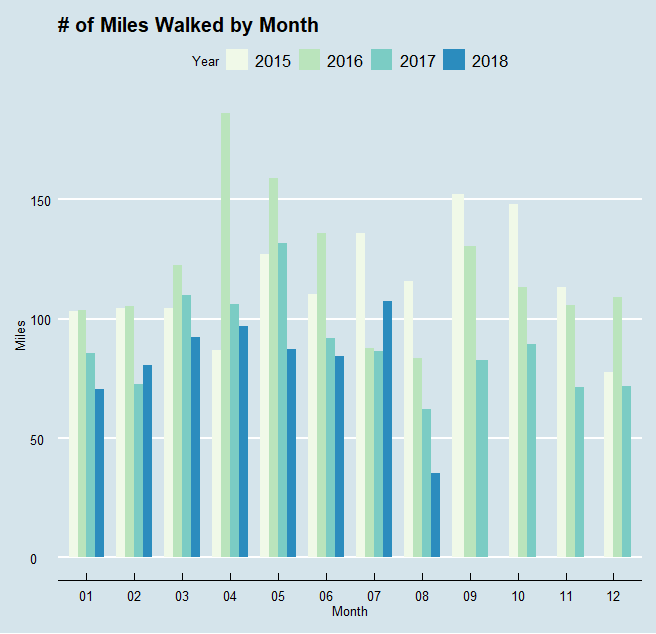
One neat way to track the progression of my number of steps taken - and how that has changed over time - is to plot the data by month. For each of these visuals I made two versions: one is steps taken and the other is converted to miles traveled. Also note that I decided to exclude 2014 data from these first two charts as they would only include the last 3 months of the year.
Looking at the data, it seems I walked around a lot more in 2015 and 2016 compared to more recent years. This can probably be attributed to my daily long-distance runs as part of Cross Country and Track practices, as well as the more physically active lifestyle I had as a result of being on those teams. This theory makes even more sense when you consider Cross Country season was primarily September-November, and in 2015 those are some of my most traveled months.
April 2016 was my “best” month - and this is an unexpected observation. While I did take a trip to San Francisco that had plenty of exploring around the city for several days, the majority of that month was relatively average. Possible explanations for this anomaly of a month are that the Apple Health app erroneously recorded some high-step days (very likely) or that I’ve lost all memory of the personal record-setting long-distance walks that resulted in me traveling nearly 200 miles that month (less likely).
As for my being less active in 2017 and 2018, I’d like to blame that on the heavy workload brought on by my college classes, extracurriculars, and jobs. It’s difficult to get as much exercise or be as physically active as before when I’m spending most of my day working at the library. That’s my excuse, anyway.


Next up are my favorite visuals of this post - heat maps!! Fun to create, fun to look at. To make these I totaled up how much I walked throughout the last few years by day of the week and then by hour (this is a total, not an average by those times - that’s why the numbers are so high).
It appears my most active time of day is between 12:00 pm and 1:00 pm, which lines up well with lunchtime. I’m willing to travel a great distance for my lunches apparently. Interestingly, Tuesday and Thursday seem to be the most active days, topping out at the 12-1 pm block. This is likely because many of my college classes have taken place around those times on TTH, while the MWF classes have been more scattered throughout the day.
Unsurprisingly, Saturday also has some pretty dark colors throughout the day. This is a result of my favorite weekend activity - hiking!


Another method of visualizing the data is to collapse by day of the week, allowing us to easily compare each day to one another. Like the heat maps, I took totals of steps taken rather than averages, day by day.
These charts bring up an interesting correlation. Apparently, the later it is in the week the more I walked around. Lazy Sunday is definitely a true moniker for me, being the only day of the week I failed to crack the 625 mile benchmark. No Monday blues here though, as I quickly bring that step count up the next day and don’t match that point again until Friday. Also interestingly, Friday is my most active day of the week, even beating out Saturday with all those hikes. If there is any lesson to take from this post, perhaps it’s that I should go on longer weekend hikes.
Final Comments
All data used in this post was taken from the Apple Health app. The visuals were made in R, with much of the code inspired or adapted from Ryan Praski. Ggplot2 and RColorBrewer used to create the graphs and create color schemes. If you have any questions or helpful feedback please leave a comment, submit an inquiry, or send me an email at troded24@gmail.com
More posts (that cover much more interesting topics) to come soon!
- Tal