
Is There A Student Loan Bubble? - Part II
Part I of my exploration of the current state of the student loan market basically established the groundwork. Key takeaways are that the majority of federal student loans are now Direct Loans (which are lent by the federal government itself and carry interest rates in the 5%-7.6% range) and that while debt is spread across several types of schools, public schools contain the most borrowers by far and private schools have the highest average balance. None of these facts really come across as shocking, but they do provide us the context to look at some of the more interesting statistics that will be shown in this post.
As I said last time, the goal of this project is to ask, “What level of worry should we have regarding the state of the student loan market?” Obviously the market is large, and undoubtedly the growth of student loan portfolios has become a heavy burden for many students. But are we in a bubble that’s about to pop, are we in a dangerous situation that still has time to be fixed, or are we just witnessing the natural growth of what will become a central loan market in the United States? The next financial crisis, a paradigm shift, or something else? With Part II of this project I hope to shine some light on the answers to that question.

Note: Totals represent the value at the end of Q4 for each respective year (Sep. 30) except for 2018, in which data is currently available up to end of Q2 (Mar. 30). 2018 numbers can be expected to be somewhat larger by end of Q4 2018.
One key component toward reaching a (hopefully) somewhat accurate prediction is to simply look at growth of total student loan balances. Again using federal data, we see a depiction of a clearly surging market. Since 2007, the total outstanding balance of federal student loans has increased from $516 billion to over $1.4 trillion. This represents a 173% cumulative growth of student loan balances from 2007 to (the data we have so far on) 2018. However, we actually see that loan growth has slowed down relatively in recent years, with yearly growth around half what it was a decade ago. One likely explanation for this is improved economic conditions. Household wealth and income were severely diminished not only during the financial crisis but for several years afterward (and arguably still are) as recovery remained sluggish. The housing bust also served to drastically impact household wealth as home prices plummeted and many Americans experienced foreclosure. While some of these effects are still ongoing, such as housing prices remaining depressed in many regions, economic conditions in 2018 are certainly much improved for the majority of Americans. Unemployment is at a historical floor and household income is the highest it has ever been. Thus we see a slowdown in the student loan market as less financing is required to pay for tuition.
Still, overall economic health is not the only determining factor of loan generation, and especially in the case of student loans there is much more at play. As discussed before, rising costs of tuition and number of college attendees are just two of the most basic aspects. Another way we can look at student loans is also by recipients rather than balances.

As expected we again see substantial growth in the market. Compared to balances, however, the growth in borrowers is not quite as dramatic. Since 2007, the number of borrowers has increased from 28.3 million to 42.6 million, a 51% total increase. Perhaps the growth doesn’t seem as impressive, but the fact that about 42.6 million people currently hold at least some student loans should be an eyebrow-raiser. Similar to the previous chart, we see a slowdown in growth, with growth rates even less than half of the Great Recession rates. We only have 1% growth in 2018, but seeing as how we also only have data on the first half of 2018 we can expect that number to go up by end of the year. Still, the 2% growth rates of recent years is much lower than sensationalist news and fear-mongers may lead one to expect.
Put together, these two charts tell us several things. The growth of the student loan market has, in general, been marked and strong. It has also slowed in recent years. And possibly most interesting is that the average amount each recipient has borrowed has increased, as the growth of loan balances has outpaced the growth of borrowers. This is where I believe the primary concern with student loans should focus. Growth of student loans isn’t necessarily bad and certainly not economically fatal. But such a pronounced rise of average loan portfolios is a concern. While the collective weight of student loans has eased up relatively, individual portfolio sizes continue to grow. A greater loan burden also often results in higher delinquency rates, which no one wants.

Here we have a chart of the total value of loan delinquencies, sorted by length of time delinquent, over time. Unfortunately, data was only available going back to 2013. In that period, we see a generally modest upward trend in every category of delinquency . The amount of student loans going unpaid, whether for a month or a year, has increased. We do see variation in the strength of that increase, with an inverse between length of delinquency and growth rate. We also see a downtick in the amounts for 2018, though again this may just be due to lack of complete data for the year or noise in the data. So clearly higher delinquency rates are bad. But a total increase in student loan balances can be expected to correlate with greater delinquency balances. A bigger pie is going to have bigger slices. While $30 billion sounds like a lot, it is only 2% of the $1.4 trillion outstanding total balance in 2018. The situation is not as dire as it may seem. Still, I see this as the main area of concern as high delinquency rates are the real warning sign for the market - something to be closely monitored. If/when another recession occurs, it would be expected that the ability of students and young adults to complete payments on their loans will become diminished. So while rates are relatively low now, the situation could quickly become worrisome given an economic downturn.
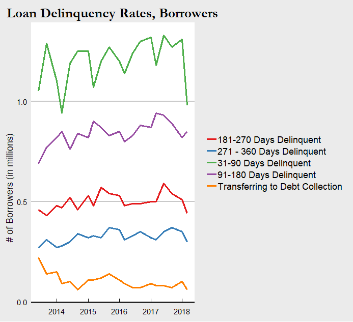
For consistency and further context here is the chart of delinquency rates by borrower counts as well. The trends are in line with the balances chart above and we can draw basically the same information.
Conclusion
That concludes (for now) my first look into the current state of the student loan market. There are plenty more statistics equally relevant and significant to consider, but I think we have seen enough to draw some basic conclusions. Student loans have expanded to a formidable size that place it among the giants of the loan markets. By all measures the already large portfolios for students have blown up in the past decade. Yet at the same time, we see signs of stability. Delinquency rates have not grown proportionally with total balances, and overall growth has slowed down in the past few years. Safe to say the situation is not dire as it currently stands. We must be forward-looking however. As I noted above, the next recession has potential to cascade into a much more severe situation for those with student loans. Especially those who attended private schools and are now carrying $30,000+ balances, or those working jobs that have stagnant wages, or a multitude of other scenarios that exist in the current economy.
Since these loans are now completely government-owned, a financial crisis caused by student loans is unlikely. But a crisis or economic downturn originating elsewhere is directly tied to the student loan situation and can result in a negative feedback loop. How to resolve this is a question with many possible answers. Finding ways to lower tuition costs and cap tuition growth, providing additional financial aid and other support for students, or a variety of other solutions proposed and enacted may be the key. Some combination is likely the answer. Whether they will be implemented and how soon is another important question.
For fun, one more figure I created is the geographic disparity of student loans. As most people could guess, states like California and New York are at the top in student loan debt by total balance and total borrowers. They also have some of the largest populations and top colleges, so no surprise there. I thought it would be much more illuminating to examine how the average student loan balance differs from the national average balance by state.

I’m not entirely sure why Colorado is one of the best and Georgia/Maryland one of the worst - it may have to do with state laws or likely other localized factors. Maybe it will be the subject of a future student loans post! I would also love to hear from any readers from these states or knowledgable about these states if they know why or have any of their own theories.
Final Notes
Other notes on overall data: Total may not be exactly equal to 100% or the sum of their parts due to rounding. Time-series data is by federal fiscal year which ends September 30. Data for 2018 is currently available for up to Q2 which ends March 30, 2018. “Recipient” refers to the receiver of the loan, most often the student but can also be the parent of said student.
Loan Delinquencies: Includes outstanding principal and interest balances of Direct Loan borrowers in the Repayment status as identified in Direct Loan Portfolio by Loan Status Report. While technical default is 271 days delinquent, default is defined as 361 days delinquent for reporting purposes to ensure consistency with Federal Family Education Loans (FFEL) reporting. Loans already transferred to DMCS are not included in this report. Recipient counts are based at the loan level. As a result, recipients may be counted multiple times across varying loan statuses.
For more information on the differences between loan types and details on the terms of each, check out https://studentaid.ed.gov/sa/types/loans and https://studentaid.ed.gov/sa/sites/default/files/federal-loan-programs.pdf.
Data was collected from https://studentaid.ed.gov/sa/about/data-center/student/portfolio, cleaned and transformed in STATA, then visualized using ggplot2 in R.

Is There A Student Loan Bubble? - Part I
A subject that I have found personally engaging, and is undoubtedly rising in importance every year, is the student loan market. More Americans are enrolling in college than ever before, and a college education is increasingly crucial for any chance at social mobility or simply a stable career. The proportion of jobs requiring at least a bachelor’s degree has been growing for decades now. At the same time, the cost of a college education - predominantly tuition, but also other relevant costs such as textbooks and housing - has skyrocketed. Attending an average 4-year university today costs more than twice as much as in 1986 (with CPI adjustment) based on tuition alone. Clearly the cost of college has outpaced inflation, and more importantly it has outpaced the growth of household income. So we have record numbers of Americans attending (see: paying) for college and soaring tuition and living expenses. The result of these intersecting trends is the explosive growth of student loans. The student loan market is one of the biggest loan markets today, larger than any other besides the mortgage market. Families and students unable to pay out-of-pocket for college are forced to take out loans or find another route. And while this is definitely an option - community colleges, scholarships, and trade jobs are all viable and persuasive - many choose loans. The number of individuals with student loans is higher than ever before, and the average amount of student loans per individual is greater than ever before.
Okay, so we’ve established the fact that the student loan market is big. This is a well-known and hot topic, as worries of the student loan burden grow with the market. Why are people so worried about student loans? Not too long ago we had this subprime mortgage crisis which was partially rooted in another loan market getting a little too big for its own good. Without oversimplifying the Great Recession too badly, the pop of the housing bubble resulted in one of the worst financial crises and economic downturn in America’s history. So it’s fair to say that there remains a degree of wariness for people taking out loans they can’t afford. But again, let’s not oversimplify things. Loans aren’t necessarily bad. Used responsibly they can relieve financial burdens, offer opportunities to open business or buy homes, and build credit. In the case of student loans, they offer working-class and low-income families especially the opportunity to provide their children the same higher education as the richest families.
So how do we know if the current state of the student loan market is cause to ring alarm bells, or if it’s too early to overreact?
We need to dive into the details of these loans and break down where they’re going, who they’re going to, and what’s being done with them. If that sounds vague, don’t worry - we are about to get a lot more specific. My goal is to paint a comprehensive picture of today’s student loan market by attributing significance to every relevant factor available. This means looking at loan terms, loan types, loan portfolios, and loan delinquency rates among other measures. Like modern economics, we need to build a model that builds from the ground up if we want to accurately portray the student loan market and possibly predict where it's headed. Of course, this isn’t really something that can be accomplished in just one blog post or even a series of them. But if I can make a start, and perhaps contribute to the ongoing conversation regarding a “student loan bubble”, then I would consider that a success.
One last thing before we jump into the data. As always, I have to provide some explanations and disclaimers concerning the data itself. At least for this post, I will only be looking at federal student loans. I pulled all data for this project from https://studentaid.ed.gov/sa/about/data-center/student/portfolio, which proved an amazingly useful data source but sadly limited to only federal loans. In 2018, total student loan debt in the US is at $1.2 trillion, with about $1 trillion of that being held or guaranteed by the federal government. So while the data I use does not cover all student loans, it does cover a very great majority of it. Private student loans have different terms than federal loans however, so I would like to note that any claims about student loans in this post are meant solely for federal student loans and should not be applied to private student loans. That being said, let’s take a look at what the data tells us.
See final comments section for more information on the data.
To begin, I wanted to examine what types of loans comprise the market, and how that has changed over time.


Federal student loans can be broken down into three broad categories: Federal Family Education (FFE) Loans, Direct Loans, and Perkins Loans. FFE Loans was the main program for student loans in the USA, until 2010 when the government began phasing out the program. There were a variety of loans given out under FFEL, subsequently with a variety of interest rates, all capped at around 8-9%. The structural difference between FFE Loans and Direct Loans are that FFE Loans are made by private lenders and guaranteed by the federal government, while Direct Loans are directly (the name fits) lent to students by the federal government. Propelled by concerns that private lenders did not have students’ best interests in mind when providing loans, the government decided to take over the role banks and financial institutions had filled for decades. Thus since 2010 FFE Loans have been shrinking as Direct Loans take their place as the primary offering of federal student loans. Direct Loans carry interest rates between 5.05%-7.6% depending on the type and, also depending on the type, contain different terms of when payments and interest accumulation begin on the loans. The fact that the vast majority of student loans are now provided strictly by the federal government and not through private lenders is significant. That changes not only the terms of these loans but their nature and purpose. We’ll revisit this later when after looking at some more graphs.
The third category of federal student loans, comprising less than 1% today, are Perkins Loans. The Perkins program offers perhaps the friendliest terms - 5% fixed interest rate, no interest accrued while a student or until 9 months after graduating, and loan forgiveness paths for those who enter public service and take on roles such as teachers or nurses. However these loans also have some more strict requirements regarding limits and student status. In September 2017, Congress failed to renew the Perkins program, and so no Perkins loans have been granted for the new school year. Thus federal student loan offerings today can be narrowed down to the Direct Loans program, although 21.5% of existing student loans are still from the other two "dead" programs.

Another helpful way to break down our student loan data is by school types. I narrowed it down to three types of schools - public, private, and proprietary (a.k.a. for-profit) schools. Clearly public schools are a plurality of the student loan outstanding balance as of the end of March 2018, but this is also because public schools make up nearly half of all student loan recipients. What could make for a more interesting comparison is how the average student loan portfolio diverges by school type.

The average loan balance for a student attending a private school in 2018 is $35,052. Ouch. That’s over ten grand greater than the next highest average balance, at public schools. Not very surprising, since tuition at private schools are much higher than at public schools. It is shocking however to see how substantial student loan balances have become overall. Public universities, once considered the cheaper and more affordable path of higher education, are now turning out students with nearly a quarter of a hundred grand in debt. Taking into account that interest rates on these loans ranges anywhere from 5% up to 8.5%, you arrive at a fairly significant burden for newly-graduated students. Entering a job market that has been mired in stagnant wages and ever-increasing qualification requirements, it isn’t difficult to understand how many young adults may fail to make payments, or at the very least pay down interest, on their student loans. The result is a quick build-up of the loan balance, further punishing already struggling students. Also consider that those numbers are just the average, so there are many students with outstanding balances even greater than in the numbers in the graphic above. It also doesn’t include private loans, which could even contain potentially larger interest rates. Due to the growing student loan burden, failing to land on your feet with a well-paying job straight out of college transforms from a moderate concern to a financial death sentence.
I’m going to pause here. So far I have set the foundation and background on today’s student loan market, categorized the loan types of the last decade, and broken down where these loans are by school type. Next time I will look at the actual growth of loan balances and recipients over time, provide a geographic context to the federal student loan market, and examine loan delinquency rates. Stay tuned, and in the meantime, you might want check your own student loan portfolio to see how you compare.
Final Comments
Note: More information and resources on student loans are available at lendedu.com. For an especially deeper dive into the pros and cons of private student loans see https://lendedu.com/blog/what-to-consider-before-taking-out-a-private-student-loan/.
Other notes on overall data: Total may not be exactly equal to 100% or the sum of their parts due to rounding. Time-series data is by federal fiscal year which ends September 30. Data for 2018 is currently available for up to Q2 which ends March 30, 2018. “Recipient” refers to the receiver of the loan, most often the student but can also be the parent of said student.
Loan School Types Notes: Balance is total outstanding principal and interest balances of federal student loans in Q2 2018. "Other" includes consolidation loans made prior to 2004 that cannot currently be linked to a specific school in the Enterprise Data Warehouse. Includes Direct Loan, Federal Family Education Loan, and Perkins Loan borrowers in an Open loan status. Recipient counts are based at the loan level. If a recipient received loans from more than one school type, they are counted in each applicable school type. There were also two other categories in the data: foreign schools and “other”. Since foreign schools only constituted about 1% of the total loan market I decided to exclude that category. “Other” was a bit more significant, about 6% of the total loan balance, but that category simply consists of loans that cannot be traced to a specific school (due to consolidation or other factors) so I also decided to exclude it.
For more information on the differences between loan types and details on the terms of each, check out https://studentaid.ed.gov/sa/types/loans and https://studentaid.ed.gov/sa/sites/default/files/federal-loan-programs.pdf.
Data was collected from https://studentaid.ed.gov/sa/about/data-center/student/portfolio, cleaned and transformed in STATA, then visualized using ggplot2 in R.