
A K-Shaped Recover in Time? The COVID-19 Pandemic’s Effect on the Time-Spending Habits of the Rich and the Poor
Much has been made of the “shape” of the economic recovery in the wake of the COVID pandemic. Though the pandemic is (still) ongoing, the emerging narrative among economists and the data is that in many ways we experienced a K-shaped recovery through 2020 and 2021. This means that some - in this case higher-educated, higher-earning individuals who are typically able to work from home - had their income and wealth rebound and even quickly surpass pre-pandemic levels, while others - low-wage workers who may have lost their job in the recession or hold no financial investments - were stuck in decline or only partial recovery. The evidence in the employment data for this notion has been clear, while wage growth among low-wage jobs has actually been strengthening in recent months (though many of the recent wage gains have been erased by inflation). Both the stock market and unemployment rate underwent massive fluctuations in the wake of the March 2020 shutdowns. Government stimulus further complicated the inequality picture, providing significant but temporary relief to both the unemployed and middle-class Americans. But employment and the stock market aren’t the only way we can measure well-being or even economic impact. Another important measure is how individuals spend their time.

Source: FRED for employment numbers, Yahoo! Finance for S&P 500 Index
To examine statistically how Americans are spending their time, I want to turn to what I believe is one of the most interesting and unique US government datasets: the American Time Use Survey, or ATUS. The ATUS collects comprehensive information on thousands of individuals every month, ranging from demographic characteristics (age, race, location, etc.) to detailed minute-by-minute “time diaries” of how exactly they spent their previous day. If done correctly, we can summarize the ATUS data to get reasonable estimates of how different groups of people spend their time - such as how the average day varies by income (though there are still some potential issues in the data). To set aside discussion of how time-spending habits evolved over long periods of time, I’m going to restrict the analysis to the 2019 data. So I’ll be comparing the 2020 “COVID era” to the 2019 “pre-COVID era” (ATUS data for 2021 is not yet available).
The Broader Context
First off, let’s note that through the 2020 COVID recession, employment for high-income households remained fairly stable while low-income households spiked in both unemployment and out-of-the-labor force rates. While employment among low-income households remained below pre-COVID levels, the stock market boomed. And the households that tend to own significant amounts of stocks? High-income households.
One more note: income information in the ATUS was only collected for those who were employed at the time of the survey. Therefore when I group results by income levels, I’ll be missing those who were unemployed, which may bias the results. This is especially true for the low-income group since they were more likely to be unemployed through the COVID recession. So keep in mind as I present the comparisons that they are among those who were employed at the time of the survey and thus potentially not representative of the larger universe of Americans (which includes unemployed and those not in the labor force - at least 35% of adults).
Characteristics of the Rich and the Poor
To compare the time use habits of the “rich” and the “poor”, I need to define the actual compositions of these groups (at least for the purposes of this article). I took the weekly earnings variable, which was available for about half of the entire ATUS respondents sample, and multiplied it by 52 to generate a proxy of yearly income. This is an imperfect measurement of income since it assumes respondents earned income every week of the year, and the original earnings variable is missing for many people. Weekly earnings are also top coded at $150,000 to protect the privacy of high-earning respondents. So instead of relying on this income measure exactly, I’m going to place respondents into two bins: “low-income” if their projected yearly income is below $30,000 and “high-income” if it’s above $120,000. These amounts roughly correspond to the 25th and 75th household income percentiles in the U.S. in 2020. This still isn’t a perfect measure of economic status - it’s missing important dimensions of status like wealth and assets, it doesn’t account for the local cost of living, and who is missing income data likely isn’t random - so take that as a caveat for all below results. However, I think it does give us a rough capture of low-income and high-income status people in 2020 to compare against each other.

After weighing the sample to be representative of the entire U.S. population, my measure classifies about 30% of respondents as low-income and about 10% as high-income. Men are disproportionately high-income relative to women: while women make up nearly 63% of the low-income group, they are only 28% of the high-income group. High-income respondents are also on average 8 years older (46 vs. 38 years old), more likely to be Asian, and less likely to be Black than the low-income group. Among those employed at the time of the survey, 45% of low-income respondents were part-time workers, compared to only 3% of high-income respondents. Overall, the data shows these two groups are composed of significantly different types of people - this likely plays a significant role in how the pandemic shifted activities for the people in these groups in disparate ways.


Note: for building and grounds cleaning and maintenance, there were no respondents in the high-income tier that had that occupation, hence the thick single low-income bar.
Since we’re focused on the effect of COVID on time use, it’s important to note how the pandemic affected how work could actually be done. Of those who responded to the question, 58% of high-income workers were working remotely due to COVID-19, while only 14% of low-income workers were working remotely. On the other hand, only 6% of high-income workers were unable to work due to COVID-19 compared to 21% of low-income workers. The higher prevalence of remote work for higher-earning people, and the higher rate of pandemic-induced job loss, is both a reflection of the inequalities worsened by the pandemic as well as a driver in the time use trends that I will look at next. So before even looking into the time use data, we can already see how differently the pandemic affected everyday life for these two groups (and how different they were to start).
Time, time, time - 2019 vs 2020
Okay, now that I’ve provided an armful of caveats and some contextual information, it’s time to dig into the actual time data. I’d like to compare how our income groups were spending their time in 2019 and 2020, before and then during the onset of the pandemic and remote work. ATUS collects information on over 250 activities, so I’m going to focus on several of what I deem to be the more interesting and important for the purposes of this article. The categories I include below represent over 90% of the total time in the day for each group and year. While there is likely interesting variation in many of the other, smaller categories, I’m going to stick to these representative categories. First, I’m going to compare our entire groups of rich and poor in these major activity categories.

Before looking at how time use diverged, we can already see the many ways these groups were different pre-pandemic. High-income respondents spent more of their days, on average, working and on recreation activities, while low-income respondents did more leisure activities. I’d like to again note that these are major activity categories that encompass all manner of actual tasks, so that labels like “leisure” or “traveling” should be interpreted loosely. Also of note is how working, traveling, and shopping time dropped for both groups - replaced by more personal care, leisure, and homecare activities. Only in sports/recreation/exercise do we see diverging trends in time use. So an initial look at the data actually provides potential evidence against divergence!
Next, we can look at how each group’s time-spending habits changed only among those that actually participated in those activities. For some categories - the ones in which basically everyone does at least a little of each day like sleeping or eating - this won’t change anything. But for others that vary on the external margin, this can provide a more comparable subset of people (such as those who are working or who participate in sports) to measure how our groups may diverge.

We now see that among those working through the pandemic, time spent on work dropped much more dramatically for the rich than the poor. While 30 minutes less of work may not seem like much, on the scale of millions of people reducing their working time every day, this can have massive economic effects. This is similarly true for the drops in traveling among the rich and in recreation among the poor - small shifts by an entire population could cause the rise or fall of certain industries. As I highlighted in a previous post, the changing habits of people when it comes to activities like eating out can doom businesses already operating on razor-thin margins. However, making any forecasts is premature even now, with how permanent these trends may be still an open question. As of April 2022, many companies are still grappling with whether to bring workers back to the office and for how many days a week!
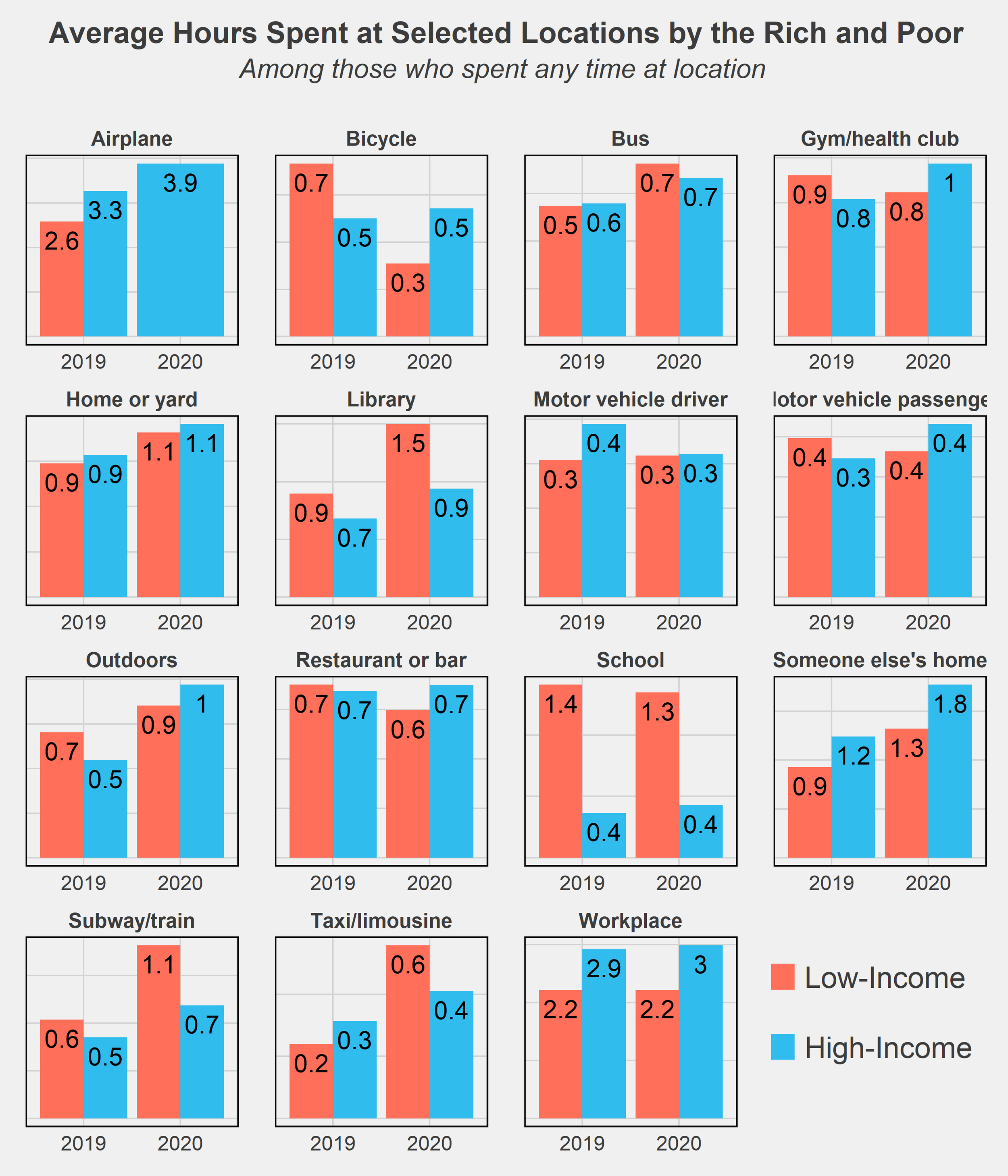
One last chart I wanted to throw in is comparing the time use of rich and poor by the locations of where they spent their time. There aren’t too many surprises here - high-income respondents spend more of their time on airplanes while the low-income spend more on subways and bicycles, generally cheaper modes of transportation. The much higher amount of time spent in libraries and schools by low-income respondents is likely due to many students not working (or only working part-time jobs) while in school and thus falling into that low-income group.
Conclusion
It’s no secret that inequality has worsened in the U.S., a trend beginning at least as far back as the 1970s. The Great Recession was an exacerbator of this trend, as recessions tend to do, and the COVID recession may have further accelerated the growing divide. One key difference, however, is the government's response to these recessions. Most economists will agree that the federal government did a much better job of supporting its citizens following this most recent crisis. The eviction and student loan moratoriums, expanded unemployment benefits, and stimulus checks were among many policies that reduced the severity of the downturn and quickened recovery. This may in part explain the lack of divergence in time use habits as seen in the data above. Yet both the effect of the pandemic and the shape of the recovery remain to be seen. The U.S. continues to struggle with inflation and supply chain issues, and the threat of falling back into recession is non-negligible. Reversing the decades-long increase in inequality will also take much more than temporary relief programs. While the COVID pandemic certainly worsened inequality in many ways, it was not the start nor will it be the end of diverging circumstances and futures for the nation’s rich and poor.
Final Notes
All facts and figures in this post were created from weighted ATUS data. Weights used come from the WT20 variable in the IPUMS data. As their data description notes, “WT20 does not yield annual estimates. It is designed to provide estimates that are representative of the period from January 1 through March 17 and May 10 through December 31. This weight omits the March 18 to May 9 period because 2020 data were not collected on these days due to the COVID-19 pandemic. This weight is required for analyses that include 2020 data.”
ATUS data: https://www.bls.gov/tus/database.htm
IPUMS Citation: Sandra L. Hofferth, Sarah M. Flood, Matthew Sobek and Daniel Backman. American Time Use Survey Data Extract Builder: Version 2.8 [dataset]. College Park, MD: University of Maryland and Minneapolis, MN: IPUMS, 2020. https://doi.org/10.18128/D060.V2.8Â
Charts seen in this post were made in R using the tidyverse, readxl, and ggthemes, directlabels, and RColorBrewer packages. Data was downloaded from IPUMS and cleaned using Stata.
In the future, I’d like to revisit this post with two extensions: delve more into the subcategories of time use and see in more detail how the rich and poor vary their activities at a more granular level, and try out a matching procedure to pair rich and poor on dimensions of education, age, race, etc. The latter method would allow for a (potentially) causal comparison of the two groups’ time usage and may provide more interesting insight into how otherwise-similar people diverge in their daily habits on the basis of income. These were my original plans for this post but I had to stop short as personal matters got in the way - but I hope to return to it when there is more data later on!
If you have questions or constructive feedback, feel free to email me at troded24@gmail.com, submit an inquiry on this website, or leave a comment on this post! Thanks for reading.

21st Century Trends in Immigration
Demographic trends are like the ocean’s undercurrent - from a surface level deceptively still, but actually driving the movement of the entire body of water. Paying close attention to the long-term trends in demographics can therefore be revealing of where a nation may be headed in terms of its politics, culture, and economy. Well-noted by now is the decrease in births occurring in America (and most other developed countries), a decrease so significant that it threatens to actually decrease the total U.S. population for the first time in…ever? Setting aside whether that’s a good or bad thing (most arguments favor bad), I’d like to take a closer look at the myriad components and their trends that contribute to determining America’s changing population.
Change in population is equal to births minus deaths, plus net immigration (immigrants minus emigrants). In America, population growth has historically been driven by immigration (outside of a period of severe immigration restrictions in the early 20th century), and this has particularly been the case as birth rates have fallen over the last several decades. I’ll discuss trends in births and deaths in America in a future post, but in this one, I want to focus on that immigrant component. As a Pew Research article put it, “Immigrants and their descendants are projected to account for 88% of U.S. population growth through 2065, assuming current immigration trends continue”. Where exactly immigrants in the U.S. have originated from and what locations they have resettled in - both of which have drastically changed over the course of American history - is of particular interest to how they will alter U.S. demographics. To analyze these trends I’ll be using data provided by the U.S. Census Bureau’s American Community Survey (ACS) and extracted using IPUMS USA. I’ll be using data from the 2006-2019 samples for consistency of the data and so that I keep the focus on the more recent trends.
Characteristics of Immigrants
Before breaking down where immigrants are moving to in America, let’s take a look at where they’re coming from. For most of its history, the U.S. has been an immigrant magnet, drawing nearly 30 million immigrants from Europe between 1850-1940 alone (Hatton & Ward, 2018). Since the mid-20th century, however, immigrants have increasingly come from outside of Europe - in particular, from Latin/Central America and East Asia. In the chart below, I’ve restricted the sample to include only the top ten birthplaces in 2019 that immigrants were born in - otherwise, there would be way too many lines to tell what was going on. Fortunately, just looking at the top 10 provides us a fairly representative sample, since these ten locations account for 75-80% of total immigration each year since 2006. If I had kept the other birthplaces, most of them would look like flat lines hugging the x-axis relative to the massive inflows from the top 10 birthplaces. You’ll also notice that some of the locations include entire continents - Africa, South America - which unfortunately was the level of aggregation provided in the IPUMS data. Still, it’s incredible to see immigration from single countries such as Mexico, India, or China, eclipsing the total proportion coming from entire continents!

Of course, there are many other ways to group immigrants besides their birthplace or nationality that can provide much more interesting statistics. The above chart doesn’t tell us too much, besides hinting at a recent relative decline in immigrants from Mexico. Other demographics, like age and gender, can provide insight into how immigrants compare to natives - telling us in greater detail how they’re playing into population growth. We can also compare them by their highest educational attainment or their personal incomes. Immigrants in the 21st century tend to be younger than U.S. natives, by an average of about 6 years. Perhaps this is not too surprising - historically immigrants have tended to be young, male, and childless (Hatton & Ward, 2018). Using our more recent sample, however, the gender breakdown of our immigrants is almost identical to natives - 49% male and 51% female. In terms of future population growth, these are promising attributes. Younger correlates with healthier, plus many more working-age years to contribute to the economy. 21st-century immigrants also have a somewhat different distribution of educational attainment and generally lower personal incomes than natives.


This is partly a reflection of how difficult it can be to legally immigrate to the U.S. due to policies that cap the number of visas and other legal forms of entry. The U.S. hands out a very limited number of visas each year, and the policies give priority to higher educated and high-skilled immigrants. This process shapes the overall profile of incoming immigrant cohorts - hence why we see so many immigrants with graduate degrees. Of course, the multitude of premier educational institutions also works as a magnet for drawing in highly educated individuals. Immigration policies alter the distribution of immigrants into certain occupations, though this is also an outcome of many, many other factors. Immigrants really are often the ones to take the undesirable, arduous low-paying jobs - but that’s a discussion for another time. In broader terms, immigrants and natives do have very similar unemployment and labor force participation rates among those age 16 and up - both rates are within 1% of each other in the sample.
While education and income comparisons don’t directly tell us anything about what to expect with population growth and migration decisions, they can be decent predictors. People with higher education and income levels tend to live in dense, urban locations and to have fewer children, often at a later age. We also know that immigrant communities attract new immigrants, for various cultural and economic reasons. So before diving into the data on locations, I can already predict that many immigrants will be residing in cities and likely ones on the coasts (where there are large pre-existing populations of Hispanic and Asian immigrants).
Migrating to Where?
Okay, so I’ve established some basic facts about the background of immigrants to America in the 21st century, but now I’d like to get to the main question of this post. Where are these immigrants settling, and how is that shaping demographic trends in America? The first step is easy: what states do they live in?


As expected, we see that California, New York, and Texas dominate this map. California (the residence of 18% of all immigrants in the sample) and New York (10%) have been immigration magnets for over a century now, and Texas (11%) has certainly been a 21st-century magnet. The next two states with the largest inflow of immigrants are Florida (9%) and New Jersey (4.5%). However, I think a less aggregate view makes for a more interesting comparison.
Breaking the data down by county, we see that immigrants are even more geographically concentrated than the initial state-level view shows. In fact, immigrants are so clustered into a small number of counties that I had to convert the counties map above to a log scale. If I had plotted the raw data, barely any county outside of a few in California, Texas, and New York would be shaded. Outside of California, the Northeast Corridor, and Florida, immigrants are almost entirely clustered into single counties or groups of counties. These counties correspond for the most part to major cities. Over 5% of all immigrants in the sample resided just in Los Angeles County, California; over 4% combined in Queens and Kings counties, New York (portions of New York City); nearly 3% in Harris County, Texas (Houston); over 2% in Cook County, Illinois (Chicago). While these percentages may seem small by themselves, it is astonishing that nearly 15% of millions of immigrants were located in just one of four cities!
In some states, the concentration into small geographic clusters is especially high. 85% of Nevada’s immigrants reside in Clark county - the county of Las Vegas. Cook county, which I mentioned already as Chicago’s location, holds 59% of Illinois’ immigrants, while King County, WA (Seattle) contains 56% of Washington’s immigrant population. While overall state populations are similarly distributed more heavily into cities (hence why they are large cities), the metropolitan bias of immigrants’ residencies has always been a distinguishing feature.


Another way we can break down the data is to compare the share of each county’s total population that is made up of immigrants. Just like with the above “Locations of immigrants” map we are looking at total immigrant populations by county, but now taking into account how that compares to the native population as well. The majority of the counties are gray - these are locations that either have no immigrants or so few immigrants it messes up the heat map scale to include them. For the states that do have significant numbers of immigrants, we see similar results as before: California, the Northeast corridor, and Florida have the highest shares of their population being composed of immigrants.
Since my focus is on trends here, I also compared the percent change in the share of immigrants for each county between 2006 and 2018 - here we see an interesting trend. It seems that while the immigrant population is growing relatively faster than U.S. natives in the Northeast and Midwest, most of the west coast counties have nearly no change in or a decrease in relative share. Part of this may be due to the large already existing immigrant population moderating growth in percentage terms, while counties with small populations can experience large percent increases from small population inflows. Regardless, we continue to see that Florida, Texas, and many individual cities are the primary recipients of new immigrants.
Conclusion
While the changing trends in immigration are a particularly interesting topic to me, it’s certainly not the entire picture. As I mentioned at the start, birth rates have gradually fallen in the US for some time, and these have shaped the socioeconomic landscape as well. In my next post, I’ll replicate the analysis in this post but shift the focus from outside the U.S. to within - by looking at trends in births and deaths. Another important factor is internal migration - how are people moving around across states and within each state? As a native Californian, I’m very familiar with the narrative of Californians moving to Denver, Phoenix, or Texas to escape exorbitant housing prices. The COVID-19 pandemic will surely have long-term effects on people’s decisions to live in cities or suburbs, though the permanency of remote work is yet to be seen.
Any prediction made using only historical data should be taken with a pinch of salt. No one could have predicted how the ongoing pandemic would have unfolded, and such an unexpected event has and will continue to alter the demographic trends. The effect the COVID-19 pandemic will have on immigration, besides the short-term decrease due to border closures, is still in development. Even knowing how immigration will proceed over the next few years is not enough information to characterize long-term demographic trends. Not too long ago, the primary concern was overpopulation. Today, aging societies and stagnating populations appear to be taking center stage.
Notes and Citations
IPUMS Citation: Steven Ruggles, Sarah Flood, Sophia Foster, Ronald Goeken, Jose Pacas, Megan Schouweiler and Matthew Sobek. IPUMS USA: Version 11.0 [dataset]. Minneapolis, MN: IPUMS, 2021. https://doi.org/10.18128/D010.V11.0
Hatton, Timothy and Ward, Zachary, (2018), International Migration in the Atlantic Economy 1850 - 1940, No 02, CEH Discussion Papers, Centre for Economic History, Research School of Economics, Australian National University, https://EconPapers.repec.org/RePEc:auu:hpaper:063.
Charts seen in this post were made in R using the tidyverse, readxl, ggthemes, directlabels, usmap, and RColorBrewer packages. Most of the data collecting, cleaning, and analysis were done in Stata.
If you have questions or constructive feedback, feel free to email me at troded24@gmail.com, submit an inquiry on this website, or leave a comment on this post! Thanks for reading.

Searching for 2020 Election Results Clues Using Voter Registrations
NOTE: For help with forming a voting plan, reading your local ballot, and other voting information, please visit https://votesaveamerica.com/. Do your part and make sure to vote!
The 2020 Presidential Election is less than two weeks away. There’s been a deluge of articles and reporting on the polls as election day nears, and the noise has been almost overwhelming. For anyone trying to stay informed, there’s been an endless number of daily articles to sort through...anyways, this is another article about the election. But rather than discuss the polls and early voting (the latter of which is not very predictive) to predict who may come out ahead in November, I’d like to discuss a different metric. One that may provide us a different insight into forecasting the results: voter registration counts. Looking at trends in voter registration by party affiliation or certain demographic and geographic variables can provide clues into which party has an edge in voter engagement - and thus, potentially, votes. Specifically, I want to look at voter registration patterns in swing states - like Florida and Pennsylvania - since these are the states whose outcomes are currently most unpredictable and whose outcomes will decide the winner. These are the states “on the margin” of the election, so voter registration edges are most important among these specific parts of the electorate. By comparing recent trends as well as comparisons to past elections, we may find hints as to who has the advantage in these battleground states.
Data on voters are, on the whole, surprisingly available. By perusing state government websites, I was able to access public excel sheets with voter registration rolls conveniently broken down by party, demographics, counties, and other interesting characteristics.
Pennsylvania
Let’s start off with the state deemed by FiveThirtyEight to be the tipping point of the election, and my current state of residence: Pennsylvania. An obvious starting point is to compare registrations by political party to see who has the edge. I added another dimension to this chart, including registration counts as of June 2nd - when the primary was held in PA. (Note that October 19 was the last day to register to vote in Pennsylvania, so those numbers are theoretically the final total for the general election). This can inform us if there may be an advantage for one party in recent voter enthusiasm. One very, very important note that I’ll repeatedly emphasize: Republican registrations don’t mean votes for Trump, just as Democrat registrations don’t necessarily mean votes for Biden. There’s a sizable portion of each group that will likely vote for the opposite party’s candidate, and it’s critical to keep in mind that registrations are by no means 1:1 with votes.

That being said, we see a clear advantage for Democrats in terms of raw voter registrations. If we assumed that party registrations are analogous to votes for the party’s candidate, then the key for Biden to win PA is to simply drive up voter turnout. If both parties get all their registrants to vote, Trump’s only hope would be to have nearly all “Other Party” registrants vote for him, an exceedingly unlikely scenario (though not impossible - in 2016, Trump captured a large portion of late-deciders and independents). But perhaps a more interesting comparison would be the most recent registration counts with the 2016 results:

First off, the October 19 data is voter registrations while the 2016 data is actual voters, likely a big reason for the overall lower counts in 2016 - only about 70% of registered voters actually cast a ballot. So again we see a major advantage for Democrats in terms of potential voters. But the key is which party can drive higher turnout (as well as other factors this year such as rejection rates for mail-in vs. in-person ballots, which we won’t be getting in to here).
Another interesting dimension to voter registrations is the breakdown by ages. Comparing within parties the age shares, we see the well-known story of younger votes leaning left and senior citizens leaning right. Younger voters historically have had much lower turnout rates than older voters, to the dismay of liberal candidates like Bernie Sanders that draw huge support from the Gen X and Millenial crowd but lackluster results on election days.

So this could be another area of concern for Biden if he needs to rely on driving up youth turnout. In 2016, Trump’s margins with older voters are what helped carry him to ultimate victory. A larger base is only useful if the base actually shows up to cast votes. Looking at the absolute count (instead of relative as with percents), however, reveals Biden’s strength in 2020.

Though the Democrats certainly lean more on younger voters, in terms of registrations they carry the advantage in every single age bracket except for 55 to 64. Media outlets have noted that Biden’s huge margin over Trump in current polls is largely driven by his margins with older voters, and in PA we see hints of this with registrations. And no state is more associated with senior citizens than…
Florida
The good news with Florida voter data: the state website provides monthly counts by party affiliation! The bad news with Florida voter data: they stopped updating the data at the end of August, so we’re lacking September or October numbers. But when you’re working with public data, you take what you can get.

Comparing registrations over time, we actually see that Republicans began closing the gap in recent months - a trend seemingly confirmed by news outlets. They’re coming from a ways behind, however, as Democrats carried a substantial lead in registrations, likely helped by the competitive primary in the beginning of the year. You can also see total new registrations basically flatline for both Republicans and Democrats in April. Another effect of the pandemic was an inability for in-person voter registration drives, dampening new voter gains until just recently. Whether this will have a significant effect on final registrations compared to previous elections is hard to determine, especially with the increased voting information campaigns held online in the past several months. It seems that expanded voting with mail-in ballots and heightened voter awareness may actually result in record-breaking turnout.
North Carolina
While I was hoping to also cover one of the Upper Midwest states (Wisconsin, Michigan, etc.) that seem particularly crucial for Trump to secure if he wants to be re-elected, I was unable to find data broken down by party affiliation for those states. So instead, let’s take a look at North Carolina - another state that seems close to tied in the polls, and if won by Biden would be a likely sign of his victory on Election Day.
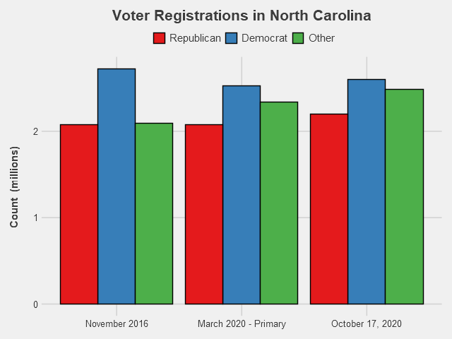
North Carolina has a much higher share of not-affiliated/minor party voters than the previous states we looked at. In fact, there’s more “Other” voters than Republican-registered voters, and almost equal numbers of Other and Democrat. That makes it even harder to determine which candidate has the advantage by registrations. How these voters lean will likely determine the outcome for the state. In other ways, however, NC resembles the trends in other swing states. Democrats overall have the registration edge, having especially gained ground on Republicans thanks to their competitive primary, while recent months have seen Republican registrations closing that gap. The fact that Democrats had such a huge registration lead in 2016, but the state ended up going to Trump, is another reminder that registrations do not mean votes. Certainly in a state with so many Other voters, winning the registration battle is only one component needed for electoral success.
Conclusions
So far, we’re seeing huge margins for Democrats in the early voting. Let the above charts serve as a warning not to make conclusions from those numbers - while Democrats do have leads in many swing states, they are not as advantageous as the early voting data may suggest. It is likely that due to partisan rhetoric, Republicans will at least tighten the current margins on Election Day. And even with voter registration data, we don’t actually know if those registered voters are supporting their party’s candidate, or if they’ll actually even vote. In a world where party affiliation equates to a vote for that candidate, we could say with some confidence that Biden would win. Since we aren’t in that world, the next best thing is to keep an eye on as much data as we can - voter registration counts, early votes results, and especially the polls.
Final Notes
Voter registration data was collected from the following sources:
Charts seen in this post were made in R using the ggplot2, tidyverse, readxl, RColorBrewer, and Cairo packages.
If you have questions or constructive feedback, feel free to email me at troded24@gmail.com, submit an inquiry on this website, or leave a comment on this post! Thanks for reading, and please - make sure to vote this election.

Rainy Days Ahead for Restaurants?
The street I live on in Philadelphia is lined with French restaurants and American bistros. Since these restaurants received the okay to reopen for outdoor dining, this street has been full of diners crowding the hastily set-up tables. All these establishments have basically been turned inside out, their interiors serving solely as facades for the sidewalk now converted into a dining area. Walking down my street, I’ve been wondering about the amount of business these restaurants take in, in the new COVID-19 world. And this ties into another aspect of the current Philly summer life - frequent thunderstorms. Once a minor inconvenience for the city’s restaurants, rain now imposes a harsh limit on their ability to operate. If customers can only eat outside, there’s not going to be much demand on rainy days. But how significant is the weather on consumer traffic to businesses, restaurants and otherwise, and are weather conditions something businesses will have to incorporate into their forecasts while indoor restrictions remain commonplace? While I sadly don’t have access to the daily cash flows of local businesses, there are a number of publicly-available proxies for measuring the day-to-day expenditures at Philly establishments.
First Glance at Business Activity
One excellent source for measuring business activity and consumer habits on a daily basis is Google Mobility Reports. Google has generously provided their collected data from users’ location tracking devices, compiled into daily reports of changes in visits relative to a baseline period to various areas of interest. As Google puts it, “The data shows how visitors to (or time spent in) categorized places change compared to our baseline days. A baseline day represents a normal value for that day of the week. The baseline day is the median value from the 5‑week period Jan 3 – Feb 6, 2020.” So using this measure doesn’t give us an exact picture of the daily level in consumer activity, but it’s close enough for a guy who’s writing a casual post about a random question he had one day. That being said, let’s look at the data for Philly:

We’ve got three categories here: consumer traffic to grocery and pharmaceutical stores, to parks, and to retail and recreation stores. It’s a bit noisy, especially in regards to the parks, which have relatively large high-frequency fluctuations - probably due to the day of the week (week vs. weekend) - and perhaps a first signal of the effect of local weather. This noise is exactly what we want: variation in the time series data that we can exploit to determine if there’s any particular correlation with the weather. For graphing purposes, however, such as viewing the general trends and major differences between the categories, smoothing the data is preferable.

Long-term trends are much more clear here. Parks and retail, which are more optional activities, took bigger hits in April when pandemic regulations were the tightest. Parks have had an especially pronounced rebound since then, which is likely in large part due to improved weather in Philly (this is also likely why traffic was so high in late February, relative to the particularly frigid January-early February period). When the pandemic began winter was still going, and the reopening of public spaces coincided with the warmer spring and summer weather. On the other hand, traffic to grocery & pharmaceutical stores, sellers of much more essential goods, remained relatively stable, though still below pre-pandemic levels. Anyways, we’ll be using the data in it’s raw, noise-filled form for analysis from here on out.
Another useful and graciously shared dataset is OpenTable’s data on seated diners at restaurants. This data is also relative, this time showing the percent change relative to the same day a year ago (year-over-year change).
The damaging impact of the pandemic on restaurants is apparent. Even with the reopenings and relatively low COVID-19 case counts in Philly, visits to restaurants remain way below baseline level. We’re also seeing a fair amount of variation since the mid-June reopenings, with several pronounced dips occurring semi-regularly. One of those dips is due to the July 4th holiday - but could the other ones be responses to rainy days?
Identifying Rainy Days
Now that we’ve got our trends, the next step is actually examining the weather. Using the National Weather Service’s data, we can identify exactly which days in Philadelphia it rained.

Days shaded in blue are days when rain was recorded in Philadelphia; that’s a lot of rainy days. I’m also excluding here the days that have a “trace” amount of rain - .01 inches or less. Lining up the dips with those rainy days, it looks like some dips line up with the rain, some don’t. But overall it’s hard to tell, and besides that, some simple chart comparisons aren’t enough to make anything besides educated guesses. For real insight, we’re going to need to do some actual economic analysis.
A Drop of Analysis
There are, of course, a number of methods available to determine if rain had a significant effect on the traffic to restaurants (we’ll be focusing on just restaurants from here on out). One simple and direct method is to run a linear regression of diner traffic on a dummy variable for rainy days. Doing this for our data beginning mid-June (when reopenings began) provides the following results:
Coefficients: Estimate Std. Error t value Pr(>|t|) (Intercept) -74.4886 0.9363 -79.56 < 2e-16 ***raindays$rain_flag -6.4358 1.7826 -3.61 0.000654 ***The above coefficients table tells us that on sunny days, diner traffic averaged -74.5% relative to the same day a year ago, and on rainy days traffic dropped to about -81%. So rain was responsible for a 6.4% drop in business to restaurants and (as indicated by the low p-value) this difference was certainly significant.
Compare these results to the same regression run on the data for February to mid-March, before the pandemic came to Philly:
Coefficients: Estimate Std. Error t value Pr(>|t|)(Intercept) 0.8421 4.7802 0.176 0.862raindays$rain_flag -2.1278 9.2127 -0.231 0.819Before restaurants shifted to outdoor-seating only, the effect of rainy days was only a 2.1% drop in diner traffic - not a large enough difference from the sunny days to be considered significant (for this time period, diner traffic averaged 0.8% higher than the same period a year ago).
One other way we can test for significance in the difference between rainy and sunny days is with a difference of means test. Specifically of use, in our case, a Wilcoxon test that does not assume anything about the underlying distribution of our sample. Difference-of-means tests, as the name implies, determines whether the averages of two groups are significantly different from each other. Running two of these - a two-sample t-test and a Wilcoxon test - on our post-pandemic data results in:
t-Test
t = 2.4544, df = 15, p-value = 0.02681alternative hypothesis: true difference in means is not equal to 0Wilcoxon Test
W = 171.5, p-value = 0.004328alternative hypothesis: true location shift is not equal to 0Both these tests have p-values below .05, indicating that the difference in average diner traffic between rainy days and sunny days is significant. As before, we can run the test on the data pre-shutdowns to see if this is pattern is novel to the reopening period.
t-Test
t = 4.7013, df = 6, p-value = 0.003322alternative hypothesis: true difference in means is not equal to 0Wilcoxon Test
W = 69.5, p-value = 0.885alternative hypothesis: true location shift is not equal to 0While the t-test actually says there is a significant difference here as well, the Wilcoxon test (with a p-value of 0.885) strongly rejects any difference between the means. Given that our data is very likely not following a normal distribution (as assumed by the t-test), we’ll hold the results of the Wilcoxon test in higher esteem.
Conclusions
The above results together support the notion that the shift in dining policy due to the pandemic has created a new dynamic - one where the possibility of rain is now a notable detriment to restaurants’ success. Moving toward the colder seasons, it’ll be interesting to see how inclement weather may continue to have an outsized impact on restaurants relative to pre-pandemic effects. Sitting under an umbrella in a summer rain with 80-degree weather is one thing, but sitting outside when it’s snowing and/or below 30 degrees is another. If COVID-19 remains through early 2021, we may see eating establishments (outside of the warm southwest) in the US struggle with the additional burden of effective closures or diminished traffic on days where diners aren’t willing to brave the weather for a bite to eat.
One last note is not to take the results of the above tests too seriously. First off, the sample sizes are way too small, and the tests I ran are very surface level. Including more explanatory variables in the regression would likely change the results and are one of many additional steps that could be taken to lend results greater legitimacy. While my results may provide a hint of significance, they are only small dips into the real type of analysis that needs to be done to properly establish causation. However, I also don’t think it’s too much of a stretch to conclude that bad weather might prevent a significant portion of people from going out to eat when their only option is to eat outside - in that bad weather. Time, and local weather conditions, well show if this turns out to be true.
Final Notes
Thank you to Google, OpenTable, and the National Weather Service for making the data used in this post publicly available.
Charts seen in this post were made in R using the ggplot2, tidyverse, readxl, and Cairo packages.
A very useful resource for determining which difference of means tests to run and how to do so in R was https://uc-r.github.io/t_test.
An always-helpful resource for picking complementary colors in charts (used in many of my previous posts as well) was https://coolors.co/. Thank you to the folks at Coolors, as well as my friend Vanessa Wong, for advice on creating charts pleasing to the eye.
If you have questions or constructive feedback, feel free to email me at troded24@gmail.com, submit an inquiry on this website, or leave a comment on this post! Thanks for reading.

A Short Stroll with Historical Presidential Approval Ratings
Much has been made in the news lately about Trump’s approval rating, especially with the recent spike in his approval (largely due to a rally-around-the-flag effect) and the 2020 election fast approaching (is it really May already?). To the politically observant, it may even seem the topic has come up even more than its usual over-saturated frequency. With our obsession over Presidential approval ratings, what can we learn from looking at past Presidents’ ratings? In this post, I’d like to cover a somewhat more lighthearted subject than my last topic and explore the data on historical President job approval ratings.
As Gallup puts it, “Presidential job approval is a simple, yet powerful, measure of the public's view of the U.S. president's job performance at a particular point in time.” Of course, it's only one, very limited dimension of assessing the success or even popularity of a President. While much can be gleaned from tracking the movements in this measure, certainly much more context and data is required before drawing any bold conclusions. That being said, approval ratings offer a useful headline summary of how the public contemporaneously perceives the President. In a way, the current approval rating for a president can have a powerful impact on influencing real decisions by the President, their administration, and the political parties.
Speaking of Gallup - one of the most well-respected and well-known pollsters - they first began reporting on PJAR in 1938: the midst of FDR’s permanently record-setting 4 terms in office. Amazingly, for almost its entire run from pre-WW2 to today, the polling and measurement method has remained largely the same. This is excellent news for any time series analysis - we can better justify comparing observations over long periods of time and attributing trends to potential explanatory factors. Often in long-running surveys, the survey methodology tends to change: from the wording of certain questions to the method of data compilation, even the subtlest shifts in how the data is generated can result in significant complications for time series analysis. By using the available Gallup data, we can trust that the data is (relatively) consistent and therefore usable for historical comparisons.
The President’s Job Approval rating (PJAR) really came into the public spotlight starting with Truman, which is when things got interesting. During the Korean War, Truman’s approval rating rapidly dropped dramatically, which was the first such occurrence in the modern era for a president. It was especially unusual since Americans had a high propensity to support the president regardless of political affiliation at this time. As political polarization has resurfaced and surveys and political polls exploded, data on approval ratings have become more prominent, especially in the news. For this reason, and even more so because the data is not as available nor as reliable pre-1940s, I’ll be focusing on the PJAR from Truman onwards in this post.
Note: I’ll only be using the approval rating in this post - not disapproval or net approval. That leaves out some important information, such as the number of undecided/”don’t know” respondents, but for purposes of brevity I’ll only be looking at this one measure.
First Look at the Data

The first step in any decent analysis is to simply plot the raw data. There’s a lot going on here, but from just the raw data alone we can form a number of initial impressions. We see some huge spikes in the data - around 9/11 for W. Bush and the Gulf War for H.W. Bush - as well as some real low points - Nixon after Watergate and Truman as the Korean War dragged on (see chart below). We can start to distinguish between which Presidents’ had more relatively volatile ratings (again, the Bushes), relatively stable ratings (Eisenhower), and who became more or less liked over time. We also notice that for the most part, approval ratings seem to remain within the 40% to 60% range - only Eisenhower and JFK managed to stay above the 60% mark for most of their presidency. Besides that, it’s hard to really tell what’s going on. It’s still too early to generate any conclusions, and the eye test should only be used for general comparisons. Let’s clean things up a bit.


One quick way to clean our chart without significantly transforming the data is to apply a smoothing function to our time series. “Smoothing” is a simple method for making charts more readable (see: prettier) without greatly manipulating the data from its original form. It retains the general trends in each approval rating while minimizing the ‘noise’ - high-frequency movements in the data. One well-known phenomenon with Presidents now becomes clear after smoothing - the “honeymoon period” that often occurs upon assumption of the White House. For many Presidents, such as Truman, LBJ, Ford, and Carter, their highest ratings occurred at the very start of their terms.
High Highs, Low Lows

An excellent way to visualize the distribution of several categories (categories here being Presidents) of data is the boxplot. The median PJAR for each President is represented by the bold line within each box, while the top and bottom of the boxes themselves represent the first and third quartiles. The lines outside the boxes are derived from a slightly more complicated method, but basically capture the majority of the underlying distribution. First, note that the overall average for the approval rating of our entire presidential sample is 49.5%, with most observations falling into the 40-60% approval range. Truman has had the lowest average approval rating through his time in office, falling below the 40% mark. Both Trump (so far) and Truman are the only Presidents to average under 45% for their approval rating in the Gallup poll. On the sunnier side of things, JFK has enjoyed the highest average approval rating - just over 70%! However, his approval rating was falling over time and an argument could justifiably be made that had he spent more time in office he would’ve finished with an average more in line with the other Presidents in our sample. The next most popular after JFK is Eisenhower, impressively clocking in at about 64% approval over his full eight years as Chief.
As can also be gleaned from our boxplots, both Obama and Trump’s approval ratings remained for the most part within a remarkably narrow band of about 5% (with Obama having a cluster of outlier data points represented by the dots). Contrast this with W. Bush, whose bottom and top quartiles are separated by over 20% - the widest spread among all Presidents! What’s to explain for this recent diminishing of approval rating variance? Theories range from increasing political polarization to the Presidents’ personalities - but there’s no solid answer.
Red vs. Blue
Another relevant dimension to divide the data is by political party affiliation of Presidents. Grouping our Presidents by their party label and averaging their approval ratings by days into office, we can compare the average PJAR of a Republican versus a Democrat over time.

The shaded gray areas represent confidence intervals. An interesting pattern emerges here, where Democrats seem to be more popular at the beginning and end of their terms, while Republicans follow almost a mirror of that pattern and tend to peak sometime in their first term, then steadily drop. We see the honeymoon effect in action again, though much stronger for Democrats initially. Either way, neither party on average seems to repeat the peaks in approval reached during their first 1,000 days in office. Perhaps there’s some hidden political wisdom to FDR’s first 100 days strategy. In the end, this chart should be taken with a very large grain of salt - sample size here is small, as we are averaging over only 6 Democrats and 7 Republicans. Sample size in the second half of the chart is even smaller since not all Presidents held office for the full 2,920 days represented by two terms. Looking at only the PJAR also restricts any conclusions we may wish to make. Certainly other factors, among them economic conditions and wars, played outsized roles in determining the approval rating of a President, regardless of the party affiliation.

Another angle to compare the average performance by political party is to return to the beloved boxplots. This time the results are less visually impressive, although perhaps the very fact that the chart appears boring is itself an interesting result! Democrats just barely squeak out a higher average approval rating, and also seem to have slightly less variance than Republicans. So despite significant differences in the distribution of approval ratings over time between the parties (as seen in the above chart), the end result is numerically similar: about 50% average approval and a tendency to stick in the 40-60% range. Of course, removing the time dimension as we do here is removing a very important, very relevant factor.
Concluding Thoughts
Even though we stuck to just one measure of a President’s popularity - the job approval rating as surveyed by Gallup - we were still able to come away with several initial findings. Most Presidents tend to start at an above-average approval rating, a phenomenon known as the honeymoon period. Individually, all Presidents since Truman have gone through a fair amount of “popularity turbulence” during their time in office, ranging from the high 60 %s to the low 40%’s. Wars and recessions, in particular, can hike or drop approval by double-digits in a matter of weeks. However, in recent times the PJAR has stabilized. Whether this narrowed range in approval is a fad or paradigm shift is yet to be seen, and far beyond the scope of this article, which was only meant to be a casual discussion of the PJAR over time.
Final Comments
Astute readers may have noticed that Obama’s PJAR line is somewhat noisier (visualized in the charts, the line appears thicker than the other Presidents’) - the measurement method was changed for his term which resulted in a different frequency of observations - but overall comparability is the same.
Special thank you to Gerhard Peters at UCSD for making the Gallup Poll data publicly available and easily accessible at https://www.presidency.ucsb.edu/statistics/data/presidential-job-approval.
Charts and maps seen in this post were created in R, using the ggplot2 and RColorBrewer packages.
If you have questions or constructive feedback, feel free to email me at troded24@gmail.com, submit an inquiry on this website, or leave a comment on this post! Thanks for reading.