
The CEO Investment Strategy: Part II
Part II of the CEO Investment Strategy project is here, and this time we’re going to be looking at some different sectors’ historical performance. In Part I I focused on the tech sector. For almost all the companies we looked at, they had significantly outperformed our S&P 500 Index in terms of growth. Now we’re going to look at the financial and food sectors, where perhaps less “growth-driven” stocks may not have had such explosive returns over their timeline. Let’s jump back into it.
The Financial Sector

Here we have a collection of big banks, plus Visa (financial services). Unfortunately we do not have as much historical information for these stocks compared to tech, especially for Visa and Goldman Sachs. One apparent and predictable trend we do have, however, is the effect of the 2008 financial crisis. Let’s focus on that for a moment.

The 2008-2009 drop in financial sector stocks is significant - as it is for the entire market as well. The Great Recession was rooted in the financial crisis, and that is readily apparent in the drop to the earth’s core by BAC. Yet we also see an impressive rally by the stock market as the S&P 500 Index recovered its value by 2013. At the same time, we also see the effect of a booming economy (and perhaps tax cuts?) helping along the recovery in 2017 and 2018.

This is a brutal chart to look at. Bank of America was hit hard by the financial crisis, the worst Great Recession performance of any of the stocks I looked at. Credit where it is due, however, to Brian Moynihan. Under his leadership BAC recaptured stable ground and has even been surging in recent years. Still plenty of ground to make up though. Ultimately I see BAC’s chart as a fitting proxy for the pattern of the financial sector in the 21st century. Unsustainable growth followed by a near-fatal crash and then back to fast growth (though more slow and cautious than before the recession).
Note: Although I had historical data on BAC going back to the 1980s, I could only find CEO information going back to Hugh McColl so had to cut off this chart at that point.

Goldman Sachs is an excellent example of two lessons learned from this project. First is that a company’s performance and value extends past just the growth of it’s stock price. While the stock hasn’t hit 4x it’s initial price (which makes it a lower bound for growth compared to many of the other stocks we have observed), it would be difficult to argue Goldman itself hasn’t grown tremendous amounts and become an industry giant in those same 19 years. Other measures are necessary to see those near-two decades of sustained success. The other lesson is that time in the market beats all other investment strategies. Just look at how quickly GS stock rebounded from the financial crisis! While not all stocks recovered quite so rapidly, and some have certainly been losing bets as well, I see this chart as an affirmation of the time-tested investing trope:
“Time in the market beats timing the market”.
Another interesting piece about Goldman Sachs in these charts is that it appears to be outperformed by the S&P 500 in the financial sector charts but outperforms the S&P 500 in this one. Again, this is because I indexed the performance of every stock to the available start date of that stock. So indexing the S&P 500 from the 1980s vs 1999 provides two different interpretations. And again, this is why the one-to-one charts provide a better representation to compare historical performance.

Jamie Dimon is one of the most well-known names in finance today. This chart provides some backing for the reason why. He could not have taken over a major financial institution at a worse time, just before the start of the financial crisis. But in the subsequent years he has navigated JP Morgan to new highs and taken place as not just leader of the big bank but of the entire financial sector.
The Food Sector

Let’s look at one more sector - food! Two of the biggest companies under this category are McDonald’s and PepsiCo. Unlucky for Pepsi to be compared to the fast food giant that has become a common household name. McDonald’s is so prevalent, especially in American culture, that Ronald McDonald ranks among one of the most recognized figures today. Few things are as symbolic of modern culture in the USA as the McDonald’s drive-thru. If they ever make a single museum to represent the power of capitalism, the golden arches should be the gateway to the entrance. But PepsiCo is impressive in its own right and no less talented at branding.
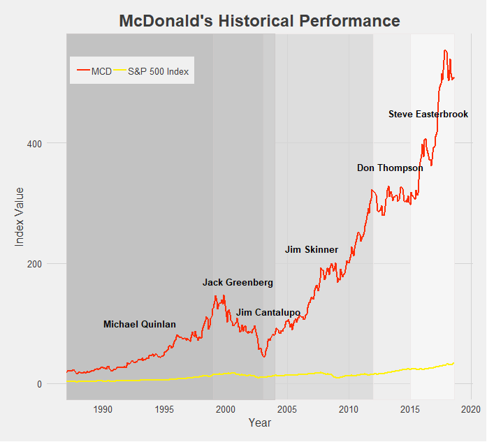
For such a successful company and fast growing stock, McDonald’s sure has gone through a lot of CEOs - five since the turn of the century. The successive chain of leaders attempting to follow Ray Kroc’s path have seen mixed results. The backlash against unhealthy foods in the mid 2000s, exemplified by Morgan Spurlock’s Super Size Me documentary released in 2004, contributed to MCD’s tumble in the early 2000s. However MCD has mostly seen good times and consistent growth, and the rebranding of recent years has really pushed the stock to all-time highs. Such a breakneck growth rate is practically unprecedented for stocks outside the tech sector.

Last but not least we have PepsiCo. It’s tough to place PEP under one label, as the food conglomerate has taken ownership of or become involved in dozens of popular snack foods, beverages, and other household items. What isn’t tough is praising Indra Nooyi’s leadership of the big brand, contributing to her consistently ranking as one of the world’s most powerful women. Her directives to rebrand PEP products and shift focus to more healthy options (though the results may be controversial) have brought the company over a decade of growth. Sadly for PepsiCo Nooyi recently announced her retirement from the CEO position, but she certainly leaves the company in good standing.
Conclusion
Besides all the other disclaimers and cautions I have given throughout these last two posts of the CEO Investment Strategy, one other to keep in mind is survivorship bias. It is easy to look at all the above charts and think that nearly every stock experiences massive growth and incredible success. But keep in mind that what you don’t see are all the companies that ended up failing or have continued to struggle on the market. I did not look at those companies’ historical performances because I wanted to focus on the performance of successful and well-known CEOs for this project. Just the same, the media and popular culture tend to focus on and tell the stories of the most successful and well-known CEOs. Part of this is because they are the leaders of society and often the drivers of change - attributes that tend to draw the attention of others - and part of it is because reporting on a mediocre company with average growth simply doesn’t make for exciting news. Either way, keep in mind that for every company we have looked at there are hundreds of others that haven’t performed nearly as well, at least from a stock-growth perspective. It would make for a good project in the future to take a look at some of these unknown or left-behind companies (Enron? Lehman Brothers?), but for the time being, I think we’ve had enough discussion of historical stock performances.
Final Comments
All historical stock performance data was pulled from yahoo.finance.com. Performance was pulled as monthly data, selecting for closing price. Dates for CEOs were found using simple Google searches, and so may be slightly inaccurate. Start and end dates pulled from official company website where available and found.
Data was then imported in STATA, where I cleaned it and merged in S&P 500 Index data. Values were then indexed to oldest closing date and using a simple growth formula [(closing price at date N)/(closing price at date 1)].
The datasets were then exported and brought into R. All visuals were made in R, using the following packages: readr, ggplot2, dplyr, RColorBrewer, ggthemes, tidyverse, stringr. I styled my charts after one of my favorite websites, FiveThirtyEight, using the ggtheme of the same name.
You may have also noticed that the line colors for each company are that company’s logo colors! Credit to http://www.codeofcolors.com/brand-colors.html for providing the hex color codes for each company. Also credit to http://www.stat.columbia.edu/~tzheng/files/Rcolor.pdf and colorbrewer2.org for providing additional color schemes and R color information.
If you want me to take a look at historical performance of other stocks, or simply have questions or constructive feedback, feel free to email me at troded24@gmail.com, submit an inquiry on this website, or leave a comment on this post! Thanks for reading.